NeoPOP
NeoPOP is CRED's inbuilt library for using NeoPOP components in your app.
What really is NeoPOP?
NeoPOP was created with one simple goal; to create the next generation of a beautiful, affirmative design system. NeoPOP stays true to everything that design at CRED stands for.
NeoPOP is built for Android, iOS, Flutter and Web

Installation
CocoaPods
NeoPOP is available through CocoaPods. To install it, add the following line to your Podfile:
pod 'NeoPop'
Swift Package Manager
Follow this doc to add a new dependency to your project. If your Package.swift is already setup, add this line to project dependencies.
dependencies: [
    .package(url: "https://github.com/CRED-CLUB/neopop-ios", from: "1.0.0")
],
Requirements
- iOS 11.0+
- Swift 5.5+
Usage
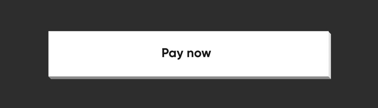
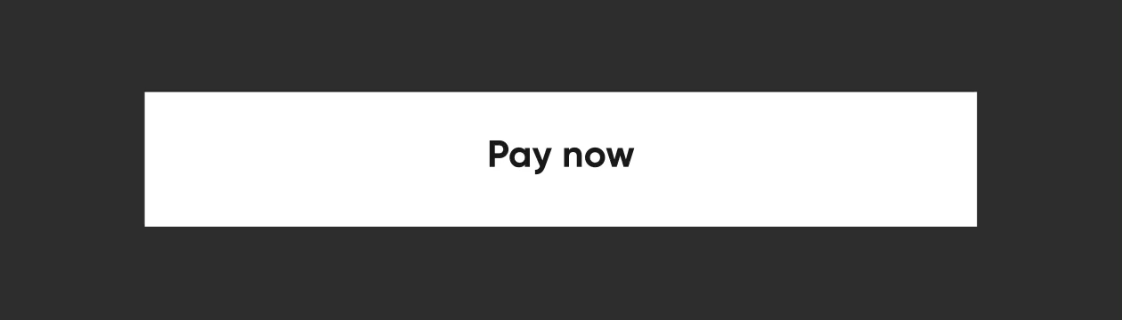
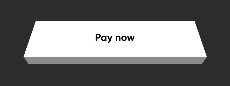
PopView
PopView is a subclass of UIView, which can exhibit the NeoPOP effect.
The design of a PopView can be primarily classified with respect to the direction of viewing the PopView. those are called the EdgeDirection of the PopView, which are:
- topLeft
- topRight
- bottomLeft
- bottomRight
- top
- bottom
- left
- right
PopView.Model holds the properties of a PopView, which helps you to customise the view with respect to your requirements.
PopView.Model can be initialised as follows.
let model = PopView.Model(
    popEdgeDirection: .bottomRight,
    backgroundColor: UIColor.gray
)
Let's see some of the examples of drawing a PopView with different EdgeDirections
- topLeft

PopView.Model(
	popEdgeDirection: .topLeft,
	backgroundColor: UIColor.black,
	verticalEdgeColor: PopHelper.verticalEdgeColor(for: UIColor.green),
	horizontalEdgeColor: PopHelper.horizontalEdgeColor(for: UIColor.green)
)
- topRight

PopView.Model(
    popEdgeDirection: .topRight,
	backgroundColor: UIColor.black,
	verticalEdgeColor: PopHelper.verticalEdgeColor(for: UIColor.green),
	horizontalEdgeColor: PopHelper.horizontalEdgeColor(for: UIColor.green)
)
- bottomLeft

PopView.Model(
	popEdgeDirection: .bottomLeft,
	backgroundColor: UIColor.black,
	verticalEdgeColor: PopHelper.verticalEdgeColor(for: UIColor.green),
	horizontalEdgeColor: PopHelper.horizontalEdgeColor(for: UIColor.green)
)
- bottomRight

PopView.Model(
	popEdgeDirection: .bottomRight,
	backgroundColor: UIColor.black,
	verticalEdgeColor: PopHelper.verticalEdgeColor(for: UIColor.green),
	horizontalEdgeColor: PopHelper.horizontalEdgeColor(for: UIColor.green)
)
similarly you can use other directions too.
for more customisations you may use the properties of PopView.Model
PopView.Model initialiser arguments
| attribute | description | value |
|---|---|---|
neoPopEdgeDirection |
Direction of edge of the pop view. | EdgeDirection |
customEdgeVisibility |
Change the visibility of the available edges.. | EdgeVisibilityModel |
customBorderVisibility |
Change the visibility of the border. | EdgeVisibilityModel |
edgeOffSet |
depth of the edge. | CGFloat |
backgroundColor |
Background color of the view. | UIColor |
verticalEdgeColor |
Color of the vertical edge in the view. (either of left/right). Optional input as it will be derived from background color. | UIColor |
horizontalEdgeColor |
Color of the horizontal edge in the view. (either of top/bottom). Optional input as it will be derived from background color. | UIColor |
verticalBorderColors |
Color of the vertical edge borders. (customisable for each side of the edge). | EdgeColors |
horizontalBorderColors |
Color of the horizontal edge borders. (customisable for each side of the edge). | EdgeColors |
clipsToOffSetWidth |
Whether clipping needs to be done to the horizontal edge (clipping position options are available here). | EdgeDirection |
clipsToOffSetHeight |
Whether clipping needs to be done to the vertical edge (clipping position options are available here). | EdgeDirection |
delegate |
Delegate to handle the callbacks. customisations in the drawing path can be achieved through this delegate. | PopViewDrawable |
modelIdentifier |
Identifier for model/view for reference | String? |
borderWidth |
width for the border. | CGFloat |
Initialising a PopView
You can create a PopView through code using the below approach.
let model = PopView.Model(
    popEdgeDirection: .bottomRight,
    backgroundColor: UIColor.black
)

let popView = PopView(
	frame: CGRect(x: 0, y: 0, width: 100, height: 100),
	model: model
)
apply NeoPOP effect on a PopView as:
@IBOutlet private weak var popView: PopView!
...
let model = PopView.Model(
    popEdgeDirection: .bottomRight,
    backgroundColor: UIColor.black
)
popView.configurePopView(withModel: model)
There is also an extension created on UIView, which enables to apply NeoPOP Style in any existing UIView element,
var view: UIView!
let model = PopView.Model(
    popEdgeDirection: .bottomRight,
    backgroundColor: UIColor.black
)
view.applyNeoPopStyle(model: model)
Buttons
PopButton

The structure and the behaviour of a PopButton mainly depends on two parameters which are EdgeDirection & PopButton.Position.
EdgeDirection is the possible directions of viewing a 3-dimensional PopButton, which are :
- topLeft
- topRight
- bottomLeft
- bottomRight
- top
- bottom
- left
- right
All the below examples are derives with EdgeDirection as bottomRight.
PopButton.Position is the possible positions of a PopButton when you place it in a 3-dimensional PopView, like mentioned in this image:

here 1-9 are the buttons placed at different possible positions of a popView. which are :
- topLeft
- topEdge
- topRight
- leftEdge
- center
- rightEdge
- bottomLeft
- bottomEdge
- bottomRight
PopButton.Model is an entity which holds the behavioural properties of a PopButton, which can help you to customise the PopButton w.r.t your requirements.
Initialising a PopButton.Model
let model = PopButton.Model(
    position: .bottomRight,
    backgroundColor: UIColor.gray
)
The above case of buttons appearing on the different edges of a PopView is achieved only by changing the PopButton.Position in the PopButton.Model. (Please refer the sample app for this usage)
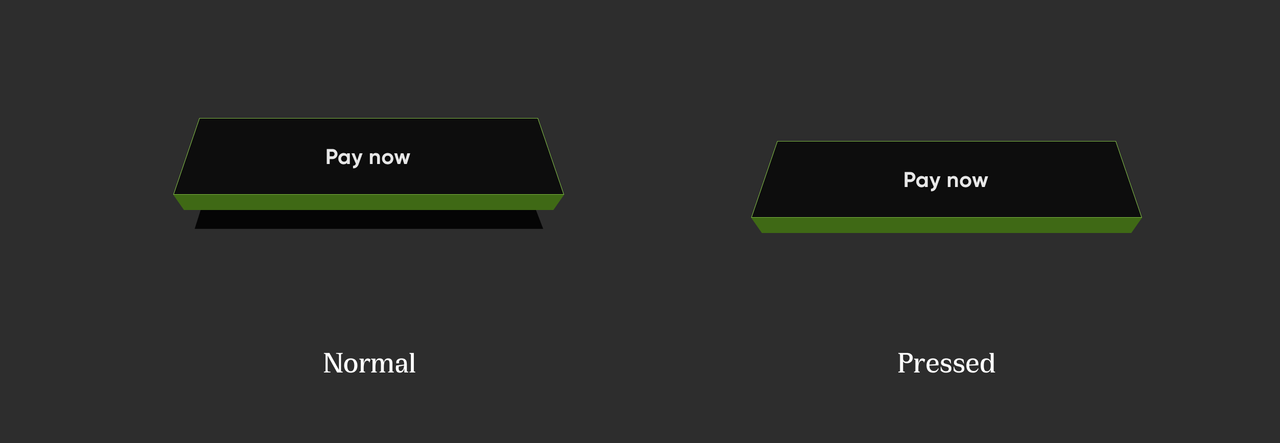
Popular Styles of PopButton
- ELEVATED BUTTON

let elevatedButton = PopButton()
let model = PopButton.Model(
    position: .bottomRight,
    backgroundColor: UIColor.white
)
elevatedButton.configurePopButton(withModel: model)
- FLAT BUTTON

let flatButton = PopButton()
let model = PopButton.Model(
    position: .bottomRight,
    backgroundColor: .white,
    superViewColor: .black
)
flatButton.configurePopButton(withModel: model)
- ELEVATED STROKE BUTTON

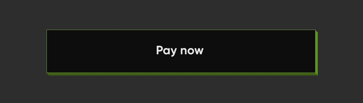
let elevatedStrokeButton = PopButton()
let model = PopButton.Model(
    position: .bottomRight,
    backgroundColor: .black,
    buttonFaceBorderColor: EdgeColors(color: UIColor.white),
    borderWidth: 0.31,
    edgeLength: 1.87,
    customEdgeColor: EdgeColors(
        left: nil,
        right: PopHelper.horizontalEdgeColor(for: UIColor.white),
        top: nil,
        bottom: PopHelper.verticalEdgeColor(for: UIColor.white)
    )
)
elevatedStrokeButton.configurePopButton(withModel: model)
- FLAT STROKE BUTTON

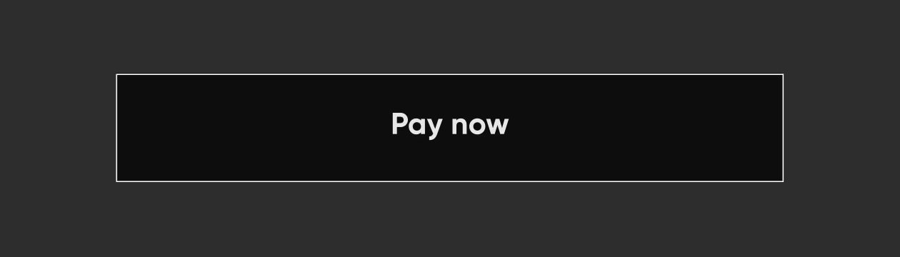
let flatStrokeButton = PopButton()
let model = PopButton.Model(
    position: .bottomRight,
    backgroundColor: UIColor.black,
    superViewColor: UIColor.black,
    buttonFaceBorderColor: EdgeColors(color: UIColor.white),
    borderWidth: 0.31,
    edgeLength: 1.87,
    customEdgeColor: EdgeColors(
        left: nil,
        right: PopHelper.horizontalEdgeColor(for: UIColor.white),
        top: nil,
        bottom: PopHelper.verticalEdgeColor(for: UIColor.white)
    )
)
flatStrokeButton.configurePopButton(withModel: model)
For more customisations make use of the properties of PopButton.Model
PopButton.Model initialiser arguments
| attribute | description | value |
|---|---|---|
direction |
Direction of the edges of the button. | EdgeDirection |
position |
Position of the button w.r.t the super PopView. |
PopButton.Position |
backgroundColor |
color of the button | UIColor |
superViewColor |
color of the neopop container color (background color of the PopView which is the super view of the button) |
UIColor? |
parentContainerBGColor |
background color of the container(background color of container view which is the super view of the PopView which is holding the PopButton). This will be necessary to draw the edges of the button in some positions. |
UIColor? |
buttonFaceBorderColor |
border colors of button's content face. | EdgeColors? |
borderColors |
border colors of the edges of the button. | PopButton.BorderModel? |
borderWidth |
width of the border | CGFloat |
adjacentButtonAvailability |
presence of the other button close the edges the current button. | AdjacentButtonAvailability |
customEdgeColor |
customise the color of the edges. | EdgeColors? |
edgeLength |
depth of the edges. | CGFloat |
showStaticBaseEdges |
decides whether to draw borders at the bottom edges of the button. | Bool |
shimmerStyle |
shimmer configurations. | ShimmerStyle? |
How to setup the Button content ?
The content of a PopButton has a
- an imageView on left
- a label
- an image view on right of the label
And you can set up a PopButton content through.
let contentModel = PopButtonContainerView.Model(
    attributedTitle: nil,
    leftImage: UIImage(named: "arrow"),
    leftImageScale: 3
)
popButton.configureButtonContent(withModel: contentModel)
more customisations on these contents are available, for which please refer the PopButtonContainerView.
We know, the content to show on a button surface differs varies with your use cases and design requirements. So, all buttons in NeoPOP framework is designed to accept a UIView confirming to the protocol PopButtonCustomContainerDrawable as its contentView. That means, you can create any number of custom views w.r.t your requirements and use it on any buttons in NeoPOP framework.
PopButtonCustomContainerDrawable protocol will be listening to state changes of the owner button, such that you can also update the button content view (confirming PopButtonCustomContainerDrawable) w.r.t state changes.
class  ContainerNew: UIView, PopButtonCustomContainerDrawable {
    public let  titleLabel: UILabel = {
        let view = UILabel()
        view.numberOfLines = 1
        view.translatesAutoresizingMaskIntoConstraints = false
        return view
    }()

    func updateOnStateChange(state: PopButton.State) {
        //Use this space to listen to button state changes
    }
}

let newContainer = ContainerNew()
newContainer.titleLabel.text = "Continue"
popButon.setCustomContainerView(container)
Non Floating

let elevatedButton = PopButton()
let model = PopButton.Model(
    position: .bottom,
    backgroundColor: UIColor.white
)
elevatedButton.configurePopButton(withModel: model)
PopFloatingButton
PopFloatingButton is a pop button with shadow, exhibiting a floating effect.

use PopFloatingButton.Model to configure the button parameters.
//Create button config model.
let model = PopFloatingButton.Model(
    backgroundColor: UIColor.yellow,
    edgeWidth: 9,
    shimmerModel: PopShimmerModel(
        spacing: 10,
        lineColor1: UIColor.white,
        lineColor2: UIColor.white,
        lineWidth1: 16,
        lineWidth2: 35,
        duration: 2,
        delay: 5
    )
)

//configure the button.
button.configureFloatingButton(withModel: model)

//Setup custom container model
let contentModel = PopButtonContainerView.Model(attributedTitle: nil, rightImage: UIImage(named: "play_now_text"), rightImageScale: 4.81)
button.configureButtonContent(withModel: contentModel)

//Starting shimmer animation.
button.startShimmerAnimation()
post adding shimmer effect : 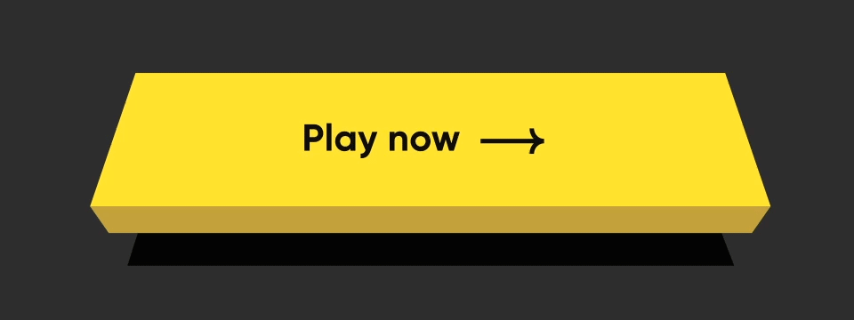
Contributing
Pull requests are welcome! We'd love help improving this library. Feel free to browse through open issues to look for things that need work. If you have a feature request or bug, please open a new issue so we can track it.
License
Copyright 2022 Dreamplug Technologies Private Limited

Licensed under the Apache License, Version 2.0 (the "License");
you may not use this file except in compliance with the License.
You may obtain a copy of the License at

http://www.apache.org/licenses/LICENSE-2.0
Unless required by applicable law or agreed to in writing, software
distributed under the License is distributed on an "AS IS" BASIS,
WITHOUT WARRANTIES OR CONDITIONS OF ANY KIND, either express or implied.
See the License for the specific language governing permissions and
limitations under the License.
 12 Jul 29, 2022
 42 Apr 19, 2022

 478 Dec 16, 2022
 20 Nov 16, 2022
 21 Dec 14, 2022
 1 Mar 16, 2022
 32 Dec 12, 2022

 0 Jan 3, 2022
 0 Feb 25, 2022


 9 Dec 15, 2022
 2k Jan 6, 2023
 239 Nov 18, 2022
 3.7k Jan 4, 2023
 0 Oct 2, 2022
 78 Oct 17, 2022
 0 Jan 1, 2022
 1 Nov 23, 2021
 2 Dec 4, 2021
 2 Oct 12, 2021