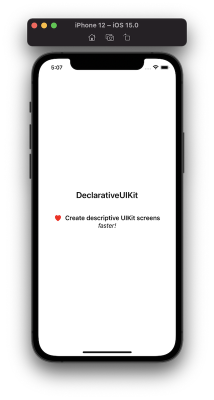
Columbina's DeclarativeUIKit
Create descriptive UIKit screens, faster!
Get rid of constraints manipulation and use declarative language to create your views, resulting in less UI code, more readable views and faster iterations.
class DeclarativeViewController: UIViewController {
    lazy var content: UIView = {
        VerticalStack()
            // UIKit's functions are extended so they return Self, allowing chaining.
            .alignment(.center)
            // Spacer will try to expand, pushing the content down
            .spacer()
            // addArranged works like addArrangedSubview, but will return Self.
            .addArranged(
                UILabel()
                    .text("DeclarativeUIKit")
                    .font(.boldSystemFont(ofSize: 24))
            )
            // Spacer with fixed height used for padding.
            .spacer(height: 40)
            .addArranged(
                HorizontalStack()
                    .addArranged(
                        UIImageView(
                            image: UIImage(systemName: "heart.fill")?
                                    .withTintColor(.red, renderingMode: .alwaysOriginal)
                        )
                    )
                    .spacer(width: 10)
                    .addArranged(
                        UILabel()
                            .text("Create descriptive UIKit screens")
                            .font(.boldSystemFont(ofSize: 18))
                    )
            )
            .addArranged(
                UILabel()
                    .text("faster!")
                    .font(.italicSystemFont(ofSize: 18))
            )
            // Spacer will try to expand, pushing the content up.
            // Because there is one spacer pushing the content down
            // and another one pushing the content up, the result
            // is a centralized content.
            .spacer()
    }()

    override func viewDidLoad() {
        super.viewDidLoad()
        view.backgroundColor = .white
        // add is a convenience method that abstracts the work of
        // setting `translatesAutoresizingMaskIntoConstraints` to false
        // and connecting the content view with the superview.
        // In other words, by calling `add` with `content`, it will expand the content to fit the view.
        view.add(content)
    }
}
Example
Let's recreate the following view:
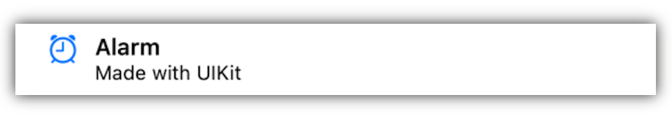
Using UIKit, that's how it might look like:
class RegularAlarmCardView: UIView {

    private let title: String
    private let subtitle: String

    init(title: String, subtitle: String) {
        self.title = title
        self.subtitle = subtitle
        super.init(frame: .zero)
        setupView()
    }

    required init?(coder: NSCoder) {
        fatalError("init(coder:) has not been implemented")
    }

    func setupView() {
        let imageView = UIImageView(image: UIImage(systemName: "alarm"))
        let titleLabel = UILabel()
        let descriptionLabel = UILabel()

        imageView.contentMode = .scaleAspectFit
        imageView.setContentHuggingPriority(.defaultHigh, for: .horizontal)

        titleLabel.text = title
        titleLabel.font = .boldSystemFont(ofSize: 14)

        descriptionLabel.text = subtitle
        descriptionLabel.font = .systemFont(ofSize: 12)

        addSubview(imageView)
        addSubview(titleLabel)
        addSubview(descriptionLabel)

        imageView.translatesAutoresizingMaskIntoConstraints = false
        titleLabel.translatesAutoresizingMaskIntoConstraints = false
        descriptionLabel.translatesAutoresizingMaskIntoConstraints = false

        NSLayoutConstraint.activate([
            imageView.topAnchor.constraint(equalTo: safeAreaLayoutGuide.topAnchor),
            imageView.leadingAnchor.constraint(equalTo: safeAreaLayoutGuide.leadingAnchor, constant: 20)
        ])

        NSLayoutConstraint.activate([
            titleLabel.topAnchor.constraint(equalTo: imageView.safeAreaLayoutGuide.topAnchor),
            titleLabel.leadingAnchor.constraint(equalTo: imageView.safeAreaLayoutGuide.trailingAnchor, constant: 10),
            titleLabel.trailingAnchor.constraint(equalTo: safeAreaLayoutGuide.trailingAnchor)
        ])

        NSLayoutConstraint.activate([
            descriptionLabel.topAnchor.constraint(equalTo: titleLabel.safeAreaLayoutGuide.bottomAnchor),
            descriptionLabel.leadingAnchor.constraint(equalTo: titleLabel.safeAreaLayoutGuide.leadingAnchor),
            descriptionLabel.trailingAnchor.constraint(equalTo: safeAreaLayoutGuide.trailingAnchor),
            descriptionLabel.bottomAnchor.constraint(equalTo: safeAreaLayoutGuide.bottomAnchor)
        ])
    }
}
By using DeclarativeUIKit, we can simplify this code:
class DeclarativeAlarmCardView: UIView {
    private lazy var content: UIView = {
        HorizontalStack()
            .spacer(width: 20)
            .addArranged(
                VerticalStack()
                    .addArranged(
                        UIImageView(image: UIImage(systemName: "alarm"))
                            .contentMode(.scaleAspectFit)
                            .set(contentHuggingPriority: .defaultHigh, for: .horizontal)
                    )
                    // Spacer will expand and push the image view up
                    .spacer()
            )
            .spacer(width: 10)
            .addArranged(
                VerticalStack()
                    .addArranged(UILabel().text(title) .font(.boldSystemFont(ofSize: 14)))
                    .addArranged(UILabel().text(subtitle).font(.systemFont(ofSize: 12)))
            )
    }()

    private let title: String
    private let subtitle: String

    init(title: String, subtitle: String) {
        self.title = title
        self.subtitle = subtitle
        super.init(frame: .zero)
        add(content)
    }

    required init?(coder: NSCoder) {
        fatalError("init(coder:) has not been implemented")
    }
}
That's roughly a 39% decrease in line size of the original code, plus we didn't have to deal with any constraints. On top of that, one of the biggest advantages of this framework, is how easy it is to manipulate the views. Repositioning the elements is as easy as swapping the "addArranged" functions around, as opposed to manually connecting the right constraints for the affected views. Also, its declarative nature makes it easy to visualize the composition of the view just by looking at the code, very similar to SwiftUI.
Why DeclarativeUIKit?
The main reasons why your team might want to use this framework are:
- It supports older iOS versions (iOS 10+).
- It's faster than using pure UIKit.
- It's more readable than pure UIKit with constraints.
- DeclarativeUIKit makes a good transitioning tool into SwiftUI, since it borrows some characteristics from it (like the declarative look and use of spacers) while being totally compatible with UIKit elements.
- It's easier to grasp than SwiftUI.
What DeclarativeUIKit is and is not
DeclarativeUIKit is an expansion on UIKit and not a SwiftUI copy. Therefore, setters found in UIKit classes will have a counterpart which returns the object itself, while keeping the same naming whenever possible, which is not the case with SwiftUI. For instance, when setting the background color of a UIKit view to green, we call view.backgroundColor = .green. This framework will provide you a function with the same name, view.backgroundColor(.green), different from SwiftUI, which would be view.background(Color.green). Although we try to keep the same names, there are some cases where this is not possible, like with addArrangedSubview and other methods in general.
DeclarativeUIKit doesn't do any magic behind the curtains, it just abstracts the use of constraints. Therefore, the autolayout rules are the same here. Despite that, we may borrow some elements and concepts from SwiftUI, like the Spacer, just because there is no equivalent in UIKit, and it makes our life easier.
Quick start
1. Import the module
import DeclarativeUIKit
2. Build the view using Stacks and addArranged()
class DeclarativeViewController: UIViewController {
    var content: UIView = {
        VerticalStack()
            .addArranged(
                UILabel()
                    .text("Hello world!")
                    .font(.boldSystemFont(ofSize: 24))
                    .textAlignment(.center)
                    .textColor(.white)
            )
    }()
}
3. Call add to insert the new view
class DeclarativeViewController: UIViewController {
    var content: UIView = {
        ...
    }()

    override func viewDidLoad() {
        super.viewDidLoad()

        // The following add is equivalent to:
        // content.translatesAutoresizingMaskIntoConstraints = false
        // view.addSubview(content)
        // content.topAnchor.constraint(equalTo: view.safeAreaLayoutGuide.topAnchor).isActive = true
        // content.leadingAnchor.constraint(equalTo: view.safeAreaLayoutGuide.leadingAnchor).isActive = true
        // content.trailingAnchor.constraint(equalTo: view.safeAreaLayoutGuide.trailingAnchor).isActive = true
        // content.bottomAnchor.constraint(equalTo: view.safeAreaLayoutGuide.bottomAnchor).isActive = true
        view.add(content)
    }
}
4. Use Spacers if needed
Spacers will try to expand, so we can use it to move content around and allow certain areas to grow, avoiding layout issues.
E.g.: to push content to the bottom:
class DeclarativeViewController: UIViewController {
    var content: UIView = {
        VerticalStack()
            .spacer()
            .addArranged(
                ...
            )
    }()
    ...
}
See more in Use Spacers to push content around.
5. Run and enjoy!
Tips
Use Spacers to push content around
Like in SwiftUI, Spacers expand and push your content around.
Examples
Push content to the right:
HorizontalStack()
    .spacer()
    .addArranged(
        ...
    )
Push content up:
VerticallStack()
    .addArranged(
        ...
    )
    .spacer()
Center content:
HorizontalStack() //or VerticalStack()
    .spacer()
    .addArranged(
        ...
    )
    .spacer()
Don't forget Autolayout rules
Just like when using Autolayout, your views might have layout issues if not properly configured. For instance, if you have a stack which connects to all corners of the screen, and then you insert two labels in it, xcode will complain of height ambiguity.
"image here"
This is because xcode will have to expand one of the views to fit in the screen, and you haven't define which of the views should "break" to make this happen.
Using DeclarativeUIKit, there are some solutions for this issue:
- Set the content hugging priority, just like you would do with a regular stack:
class DeclarativeViewController: UIViewController {
    lazy var content: UIView = {
        VerticalStack()
            .addArranged(
                UILabel().text("Title")
                    .set(huggingPriority: .defaultHigh, for: .vertical)
            )
            .addArranged(
                UILabel().text("Subtitle")
            )
    }()

    override func viewDidLoad() {
        super.viewDidLoad()
        view.add(content).backgroundColor(.white)
    }
}
- Use a Spacer, so it can be expanded accordingly.
class DeclarativeViewController: UIViewController {
    lazy var content: UIView = {
        VerticalStack()
            .addArranged(
                UILabel().text("Title")
            )
            .addArranged(
                UILabel().text("Subtitle")
            )
            .spacer()
    }()

    override func viewDidLoad() {
        super.viewDidLoad()
        view.add(content).backgroundColor(.white)
    }
}
- Allow the stack to expand as needed, just like you would do normally:
class DeclarativeViewController: UIViewController {
    lazy var content: UIView = {
        VerticalStack()
            ...
    }()

    override func viewDidLoad() {
        super.viewDidLoad()

        content.translatesAutoresizingMaskIntoConstraints = false
        view.backgroundColor(.white).addSubview(content)

        NSLayoutConstraint.activate([
            content.topAnchor.constraint(equalTo: view.safeAreaLayoutGuide.topAnchor),
            content.leadingAnchor.constraint(equalTo: view.safeAreaLayoutGuide.leadingAnchor),
            content.trailingAnchor.constraint(equalTo: view.safeAreaLayoutGuide.trailingAnchor),
            content.bottomAnchor.constraint(lessThanOrEqualTo: view.safeAreaLayoutGuide.bottomAnchor)
        ])
    }
}
Use lazy var to reference other views
class DeclarativeViewController: UIViewController {
    lazy var content: UIView = {
        VerticalStack()
            .addArranged(
                titleLabel
            )
            .addArranged(
                subtitleLabel
            )
    }()

    var titleLabel = UILabel().text("Title")
    var subtitleLabel = UILabel().text("Subtitle")

    ...
}
Use connect when manually setting the constraints
class DeclarativeViewController: UIViewController {
    lazy var content: UIView = {
        ...
    }()

    override func viewDidLoad() {
        super.viewDidLoad()
        view.addSubview(content)

        content
            .backgroundColor(.white)
            .connect(\.topAnchor, to: view.safeAreaLayoutGuide.topAnchor)
            .connect(\.leadingAnchor, to: view.safeAreaLayoutGuide.leadingAnchor)
            .connect(\.trailingAnchor, to: view.safeAreaLayoutGuide.trailingAnchor)
            .connect(\.bottomAnchor, to: view.safeAreaLayoutGuide.bottomAnchor)
    }
}
Use set for fixing sizes
import UIKit
import DeclarativeUIKit

class DeclarativeViewController: UIViewController {
    lazy var content: UIView = {
        VerticalStack()
            .addArranged(
                UILabel().text("Title")
                    .set(\.heightAnchor, to: 50)
                    .set(\.widthAnchor, to: 100)
            )
            .addArranged(
                UILabel().text("Subtitle")
                    .set(\.heightAnchor, to: 50)
            )
            .spacer()
    }()

    override func viewDidLoad() {
        super.viewDidLoad()
        view.add(content).backgroundColor(.white)
    }
}
 0 Nov 28, 2021

 30 Oct 2, 2022

 14 Dec 20, 2022

 402 Oct 3, 2022
 34 Sep 26, 2022
 20 Jun 27, 2022
 182 Dec 25, 2022
 234 Nov 22, 2022

 88 Oct 2, 2022

 682 Dec 29, 2022
 42 Dec 13, 2022
 11 Nov 5, 2022
 1.3k Jan 1, 2023
 0 Oct 22, 2021
 1 Nov 5, 2021
 423 Jan 4, 2023
 9 Sep 8, 2022
 0 Dec 14, 2021
 11 Dec 1, 2022