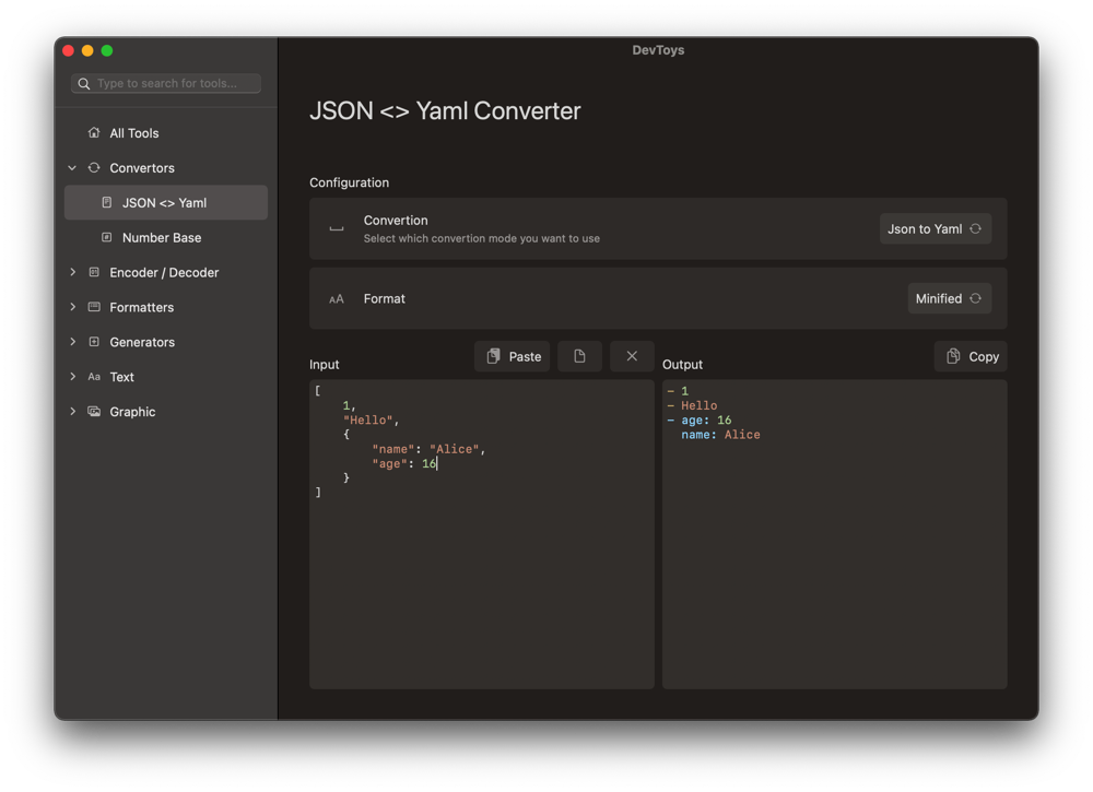
I am noticing several UI inconsistencies as follows.
The sidebar spacing is a bit off. I've corrected it and this is the result. I am showing it alongside Finder to show how it should look.

We may even consider replacing categories with collapsable list section headings instead of using an outline view (similar to the FInder sidebar - "Favorites", "iCloud", "Locations", "Tags"). This would save space and flatten up our navigation.
Changing ToolmenuCell to this should fix this. Then resize all the icon image files from 16x16 to 20x20 (or just download the resized files here).
import CoreUtil

final class ToolmenuCell: NSLoadView {

    static let height: CGFloat = 28

    var title: String {
        get { titleLabel.stringValue } set { titleLabel.stringValue = newValue }
    }
    var icon: NSImage? {
        get { iconView.image } set { iconView.image = newValue }
    }

    private let titleLabel = NSTextField(labelWithString: "Title")
    private let iconView = NSImageView()

    override func onAwake() {
        self.snp.makeConstraints{ make in
            make.height.equalTo(Self.height)
        }
        self.addSubview(iconView)
        self.iconView.snp.makeConstraints{ make in
            make.size.equalTo(20)
            make.left.equalTo(0)
            make.centerY.equalToSuperview()
        }
        self.addSubview(titleLabel)

        self.titleLabel.lineBreakMode = .byTruncatingTail
        self.titleLabel.font = .systemFont(ofSize: R.Size.controlTitleFontSize)
        self.titleLabel.snp.makeConstraints{ make in
            make.left.equalTo(self.iconView.snp.right).offset(4)
            make.right.equalToSuperview().inset(4)
            make.centerY.equalToSuperview()
        }
    }
}
The search bar is too small. See the search bar in Music, Finder, App Store or any other app and see that it should be a bit taller.

The search bar should also scroll with the overflow and when scrolled, a subtle line should appear dividing the window controls from the sidebar content.
 (You get most of this for free by the way with SwiftUI, so we may consider using it instead.)
I am also noticing that there is unnecessary overflow on some of the screens where the text inputs are sized to fit the window height.


 (You get most of this for free by the way with SwiftUI, so we may consider using it instead.)


 If user set the length that is too long when using the 'Lorem Ipsum Generator', the length is stored in 'Userdefaults' and causing stuck to generate that huge amount of samples even if the app is restarted.