SwiftTheming
Demo
📱
You can see the demo project in Example folder.
Motivation
🎉
Imagine that you want to achieve injecting multiple themes and managing them depending on the current system appearance or your preferred appearance. As SwiftUI does not come with the mechanism to manage different themes, you have to come up with it on your own. To me, I want to focus on other time-consuming stuff and don't want to spend on it. So, the idea to implement the handy mechanism for developers came to me and I eventually started crafting it. That was the becoming of SwiftTheming.
Requirements
⚠️
- iOS 14+, macOS 11+, watchOS 7+, tvOS 14+
SwiftTheming is developed using Xcode 13.0. Make sure you are using Xcode 13 and above.
Installation
🛠
Using Swift Package Manager
📦
Add it as a dependency within your Package.swift.
dependencies: [
    .package(url: "https://github.com/dscyrescotti/SwiftTheming.git", from: "1.0.0")
]
Currently, SwiftTheming can be installed only via Swift Package Manager.
Usage
📋
Defining multiple themes
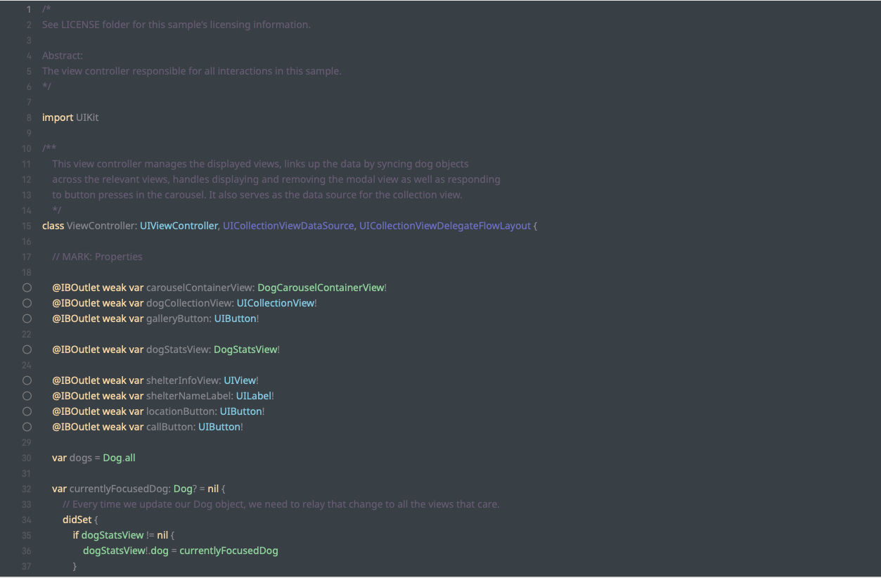
To get started, you need to declare the abstraction layer of asset that may contain a group of colors, images, gradients and/or fonts. It will be injected into different themes that you create later.
struct Asset: Assetable {
    enum ColorAsset {
        case backgroundColor
        // more...
    }
    enum ImageAsset { // more... }
    enum FontAsset { // more... }
    enum GradientAsset { // more... }
}
Now, we can start designating different themes based on the above asset.
class SampleTheme: Themed<Asset> {
    override func colorSet(for asset: Asset.ColorAsset) -> ColorSet {
        switch asset {
        case .backgroundColor:
            return ColorSet(light: Color.red, dark: Color.pink)
        }
    }
    override func imageSet(for asset: Asset.ImageAsset) -> ImageSet { // some stuff... }
    override func fontSet(for asset: Asset.FontAsset) -> FontSet { // some stuff... }
    override func gradientSet(for asset: Asset.GradientAsset) -> GradientSet { // some stuff... }
}
Make sure you override the above methods before you call. If not , you will end up with fatal error.
After you create multiple themes, it is time to list down all themes that you are going to use in app.
enum Theme: Themeable {
    case sampleTheme
    // more...

    func theme() -> Themed<Asset> {
        switch self {
        case .sampleTheme: return SampleTheme()
        // more...
        }
    }
}
Accessing theme provider across views
Yay! you are ready to use themes in your views. Let's get started to pass ThemeProvider across view hierarchy. Here you can set default theme and default appearance for first time running.
WindowGroup {
    ContentView()
        .themeProviding(defaultTheme: Theme.sampleTheme, defaultAppearance: .system)
}
Now, you can access ThemeProvider via @ThemeProviding property wrapper inside any view so that you can easily use assets prepopulated by passing it.
struct ContentView: View {
    @ThemeProviding<Theme> var themeProvider

    var body: some View {
        Color(on: themeProvider, for: .backgroundColor)
    }
}
Switching theme and appearance
You can change theme and appearance by callingsetTheme(with:)and setPreferredAppearance(with:)respectively.
Author
🖋
Dscyre Scotti (@dscyrescotti)
Contributions
👨💻
🧑💻
👩💻
SwiftTheming
License
📃
SwiftTheming


