AGCircularPicker is helpful component for creating a controller aimed to manage any calculated parameter

Overview

AGCircularPicker

Made by Agilie CI Status Version License Platform

We are pleased to offer you our new free lightweight plugin named AGCircularPicker.

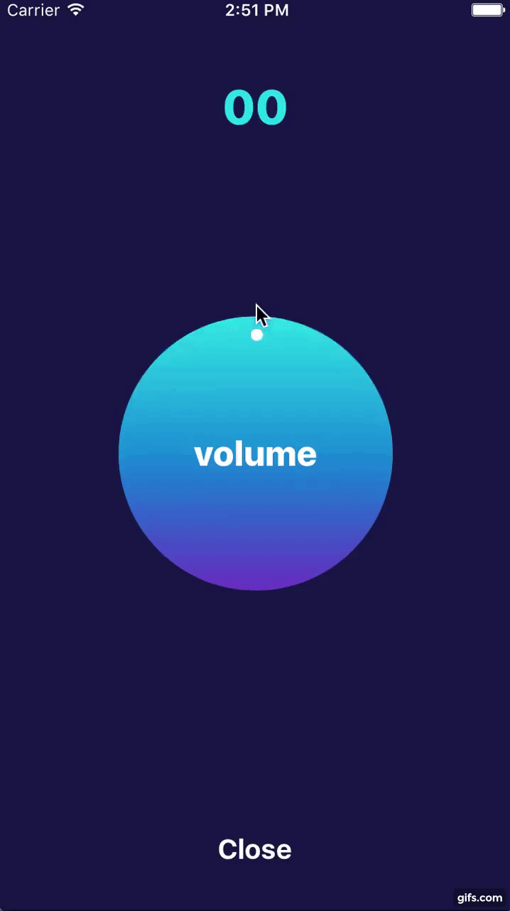
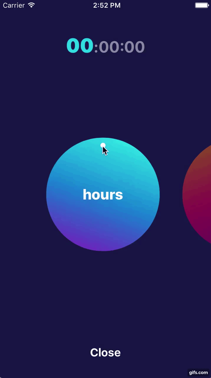
AGCircularPicker is helpful for creating a controller aimed to manage any calculated parameter. For example, it can be used as a countdown timer or for keeping the score in the game interface.

AGCircularPicker can be customized to meet your individual requirements. The developer can set the number of the controllers and their design by selecting a color, gradient and other similar parameters. In addition, it’s possible to specify the transition type for showing controllers on the screen.

Link to Android repo

Check out our Android CircularPicker

Installation

AGCircularPicker is available through CocoaPods. To install it, simply add the following line to your Podfile:

pod "AGCircularPicker"

Demo

Volume Picker Sreenshot Volume Picker Demo Time Picker Demo

Example

To run the example project, clone the repo, and run pod install from the Example directory first.

Usage

import AGCircularPicker

AGCircularPickerView could be used either from Interface Builder by linking outlet or from the code.

The main requirement to let it work is to setup AGCircularPickerOption. Once it is set picker will automatically setup all required data.

public struct AGCircularPickerOption {

    var titleOption: AGCircularPickerTitleOption? = nil
    var valueOption: AGCircularPickerValueOption!
    var colorOption: AGCircularPickerColorOption = AGCircularPickerColorOption()

}

It consists of three option groups: AGCircularPickerTitleOption (defines title, it's color and font), AGCircularPickerValueOption (defines min and max values and number of rounds) and AGCircularPickerColorOption (defines gradient colors, gradient locations and angle)

AGCircularPickerValueOption is required whereas two others are optionals.

If AGCircularPickerTitleOption is empty control will have no title.

If AGCircularPickerColorOption is not set control will use default colors.

AGCircularPickerView has a delegate to notify about any changes

public protocol AGCircularPickerViewDelegate {

    func circularPickerViewDidChangeValue(_ value: Int, color: UIColor, index: Int)
    func circularPickerViewDidEndSetupWith(_ value: Int, color: UIColor, index: Int)
    func didBeginTracking(timePickerView: AGCircularPickerView)
    func didEndTracking(timePickerView: AGCircularPickerView)

}

Let's see how we can use it in practice. First we should link it in the Interface Builder

@IBOutlet weak var circularPickerView: AGCircularPickerView!

Then we should define required options and setup control with it and delegate if needed

override func viewDidLoad() {
    super.viewDidLoad()
    let valueOption = AGCircularPickerValueOption(minValue: 0, maxValue: 100)
    let titleOption = AGCircularPickerTitleOption(title: "volume")
    let option = AGCircularPickerOption(valueOption: valueOption, titleOption: titleOption)
    pickerView.setupPicker(delegate: self, option: option)
}

For more details please see our example

Troubleshooting

Problems? Check the Issues block to find the solution or create an new issue that we will fix asap. Feel free to contribute.

Author

This iOS visual component is open-sourced by Agilie Team [email protected]

Contributors

Contact us

If you have any questions, suggestions or just need a help with web or mobile development, please email us at [email protected]. You can ask us anything from basic to complex questions.

License

AGCircularPicker is available under The MIT License (MIT) Copyright © 2017 Agilie Team

You might also like...
An easy to use UI component to help display a signal bar with an added customizable fill animation

TZSignalStrengthView for iOS Introduction TZSignalStrengthView is an easy to use UI component to help display a signal bar with an added customizable

UIPheonix is a super easy, flexible, dynamic and highly scalable UI framework + concept for building reusable component/control-driven apps for macOS, iOS and tvOS

UIPheonix is a super easy, flexible, dynamic and highly scalable UI framework + concept for building reusable component/control-driven apps for macOS, iOS and tvOS

Zeplin component preview for your SwiftUI views

A Zeplin component preview for your SwiftUI views. You can use Zeplin components instead of real views within your app until you implement them.

A panel component similar to the iOS Airpod battery panel or the Share Wi-Fi password panel.

A SwiftUI panel component similar to the iOS Airpod battery panel or the Share Wi-Fi password panel.

⬆️ A SwiftUI view component sliding in from bottom

⬆️ A SwiftUI view component sliding in from bottom

Customizable CheckBox / RadioButton component for iOS

GDCheckbox An easy to use CheckBox/Radio button component for iOS, with Attributes inspector support. Requirements Xcode 10+ Swift 5 iOS 9+ Installati

A multi-platform SwiftUI component for tabular data

SwiftTabler A multi-platform SwiftUI component for tabular data. NOTE this component is BRAND NEW and under active development. If you need stability,

TSnackBarView is a simple and flexible UI component fully written in Swift

TSnackBarView is a simple and flexible UI component fully written in Swift. TSnackBarView helps you to show snackbar easily with 3 styles: normal, successful and error

TDetailBoxView is a simple and flexible UI component fully written in Swift

TDetailBoxView is a simple and flexible UI component fully written in Swift. TDetailBoxView is developed to help users quickly display the detail screen without having to develop from scratch.

Comments
  • what kind of view that i can connect with

    what kind of view that i can connect with "@IBOutlet weak var circularPicker: AGCircularPicker!"

    hello . this source is very awesome i shout when i found this library

    but i have some problem when i use it can you help me?

    what kind of view that i can connect with "@IBOutlet weak var circularPicker: AGCircularPicker!" i never know please help me i need the this library

    thank you

    opened by justin3527 6
  • Start at specific value

    Start at specific value

    Hi. I have the picker working great with decimals by just diving the end value by 10 as you suggested. When I return to the picker I would like to set the control to the last used value. I initialize it starting at zero and going to 100 for example but would like it to be selected at an interim value, say 40 ie: remembers the last value since each time the picker is used it is to adjust the previous recorded value.

    Is this possible?

    opened by alexjordaan 5
  • AGCircularPickerView move issue when i use the multi mode

    AGCircularPickerView move issue when i use the multi mode

    when i move the view using swipe in the multi mode, it is move to the previous view (when move using touch, it is normal)

    is it AGCircularPicker issue ? or my mistake? when you have some time, i hope that you check this issue thank you very much

    ps. it is reproduce video AGCircularPicker_multi_move_issue.mov.zip

    opened by justin3527 1
  • changes made for Swift 4.1

    changes made for Swift 4.1

    All the new changes have been made for the Pod to be compatible and to be used in the new and upcoming projects also. I have personally tried and tested before making all the changes.

    opened by GodsEye-07 0
Owner
Agilie Team
Design and development of iOS and Android mobile apps, mobile friendly websites and cloud apps (RoR).
Agilie Team
A controller that uses a UIStackView and view controller composition to display content in a list

StackViewController Overview StackViewController is a Swift framework that simplifies the process of building forms and other static content using UIS

Seed 867 Dec 27, 2022
A way to quickly add a notification badge icon to any view. Make any view of a full-fledged animated notification center.

BadgeHub A way to quickly add a notification badge icon to any view. Demo/Example For demo: $ pod try BadgeHub To run the example project, clone the r

Jogendra 772 Dec 28, 2022
A drop-in universal library helps you to manage the navigation bar styles and makes transition animations smooth between different navigation bar styles

A drop-in universal library helps you to manage the navigation bar styles and makes transition animations smooth between different navigation bar styles while pushing or popping a view controller for all orientations. And you don't need to write any line of code for it, it all happens automatically.

Zhouqi Mo 3.3k Dec 21, 2022
Wallet is a library to manage cards and passes.

Wallet Wallet is a replica of the Apple's Wallet interface. Add, delete or present your cards and passes. Feel free to use this pod in your project an

Russ St Amant 360 Feb 4, 2022
Material, a UI/UX framework for creating beautiful iOS applications

Material Welcome to Material, a UI/UX framework for creating beautiful applications. Material's animation system has been completely reworked to take

Cosmicmind 12k Jan 2, 2023
A SwiftUI Library for creating resizable partitions for View Content.

Partition Kit Recently Featured In Top 10 Trending Android and iOS Libraries in October and in 5 iOS libraries to enhance your app! What is PartitionK

Kieran Brown 230 Oct 27, 2022
Creating a blurred window background in Mac Catalyst

TransparentChrome In response to a developer question, I looked for the easiest way to provide a translucent full-window chrome with a blurred backgro

Steven Troughton-Smith 37 Dec 2, 2022
Creating a simple selectable tag view in SwiftUI is quite a challenge. here is a simple & elegant example of it.

SwiftUI TagView Creating a simple selectable tag view in SwiftUI is quite a challenge. here is a simple & elegant example of it. Usage: Just copy the

Ahmadreza 16 Dec 28, 2022
DesafioMobile2You - This project consists of creating a replica of a TodoMovies screen

DesafioMobile2You Swift IOS Este projeto consiste na criação da réplica de uma t

Leonardo P M 0 Feb 3, 2022
UI Component. This is a copy swipe-panel from app: Apple Maps, Stocks. Swift version

ContainerController UI Component. This is a copy swipe-panel from app: https://www.apple.com/ios/maps/ Preview Requirements Installation CocoaPods Swi

Rustam 419 Dec 12, 2022