


CardParts - made with
- Example
- Requirements
- Installation
- Communication & Contribution
- Overview
- Quick Start
- Architecture
- CardsViewController
- Card Traits
- CardPartsViewController
- CardPartsFullScreenViewController
- CardParts
- CardPartTextView
- CardPartAttributedTextView
- CardPartImageView
- CardPartButtonView
- CardPartTitleView
- CardPartTitleDescriptionView
- CardPartPillLabel
- CardPartIconLabel
- CardPartSeparatorView
- CardPartVerticalSeparatorView
- CardPartTableView
- CardPartTableViewCell
- CardPartTableViewCardPartsCell
- CardPartCollectionView
- CardPartCollectionViewCardPartsCell
- CardPartBarView
- CardPartPagedView
- CardPartSliderView
- CardPartMultiSliderView
- CardPartSpacerView
- CardPartTextField
- CardPartCenteredView
- CardPartOrientedView
- CardPartConfettiView
- CardPartProgressBarView
- CardPartMapView
- CardPartRadioButton
- CardPartSwitchView
- CardPartHistogramView
- CardPartsBottomSheetViewController
- CardPartVideoView
- Card States
- Data Binding
- Themes
- Clickable Cards
- Listeners
- Apps That Love CardParts
- Publications
- License
Example
To run the example project, clone the repo, and run pod install from the Example directory first.
In ViewController.swift you will be able to change the cards displayed and/or their order by commenting out one of the loadCards(cards: ) functions. If you want to change the content of any of these cards, you can look into each of the CardPartsViewController you pass into the function such as: TestCardController, Thing1CardController, Thing2CardController, etc.
Requirements
- iOS 10.0+
- Xcode 10.2+
- Swift 5.0+
- CocoaPods 1.6.1+
Installation
CardParts is available through CocoaPods. You can install it with the following command:
$ gem install cocoapods
To add CardParts to your project, simply add the following line to your Podfile:
source 'https://github.com/CocoaPods/Specs.git'
platform :ios, '10.0'
use_frameworks!

target '<Your Target Name>' do
    pod 'CardParts'
end
Then, run the following command:
$ pod install
Communication and Contribution
- If you need help, open an issue and tag as
help wanted. - If you found a bug, open an issue and tag as
bug. - If you have a feature request, open an issue and tag as
feature. - If you want to contribute, submit a pull request.
- In order to submit a pull request, please fork this repo and submit a PR from your forked repo.
- Have a detailed message as to what your PR fixes/enhances/adds.
- Each PR must get two approvals from our team before we will merge.
Overview
CardParts is the second generation Card UI framework for the iOS Mint application. This version includes many updates to the original card part framework, including improved MVVM, data binding (via RxSwift), use of stack views and self sizing collection views instead sizing cells, 100% swift and much more. The result is a much simpler, easier to use, more powerful, and easier to maintain framework. This framework is currently used by the iOS Mint application and the iOS Turbo application.

Quick Start
See how quickly you can get a card displayed on the screen while adhering to the MVVM design pattern:
import RxCocoa

class MyCardsViewController: CardsViewController {

    let cards: [CardController] = [TestCardController()]

    override func viewDidLoad() {
        super.viewDidLoad()

        loadCards(cards: cards)
    }
}

class TestCardController: CardPartsViewController  {

    var viewModel = TestViewModel()
    var titlePart = CardPartTitleView(type: .titleOnly)
    var textPart = CardPartTextView(type: .normal)

    override func viewDidLoad() {
        super.viewDidLoad()

        viewModel.title.asObservable().bind(to: titlePart.rx.title).disposed(by: bag)
        viewModel.text.asObservable().bind(to: textPart.rx.text).disposed(by: bag)

        setupCardParts([titlePart, textPart])
    }
}

class TestViewModel {

    var title = BehaviorRelay(value: "")
    var text = BehaviorRelay(value: "")

    init() {

        // When these values change, the UI in the TestCardController
        // will automatically update
        title.accept("Hello, world!")
        text.accept("CardParts is awesome!")
    }
}
Note: RxCocoa is required for BehaviorRelay, thus you must import it wherever you may find yourself using it.
Architecture
There are two major parts to the card parts framework. The first is the CardsViewController which will display the cards. It is responsible for displaying cards in the proper order and managing the lifetime of the cards. The second major component is the cards themselves which are typically instances of CardPartsViewController. Each instance of CardPartsViewController displays the content of a single card, using one or more card parts (more details later).
CardsViewController
The CardsViewController uses a collection view where each cell is a single card. The cells will render the frames for the cards, but are designed to have a child ViewController that will display the contents of the card. Thus CardsViewController is essentially a list of child view controllers that are rendered in special cells that draw the card frames.
To use a CardsViewController, you first need to subclass it. Then in the viewDidLoad method call the super class loadCards method passing an array of CardControllers. Each instance of a CardController will be rendered as a single card. The loadCards method does this by getting the view controller for each CardController and adding them as child view controllers to the card cells. Here is an example:
class TestCardsViewController: CardsViewController {

    let cards: [CardController] = [TestCardController(), AnotherTestCardController()]

    override func viewDidLoad() {
        super.viewDidLoad()

        loadCards(cards: cards)
    }
}
Each card must implement the CardController protocol (note that CardPartsViewController discussed later implements this protocol already). The CardController protocol has a single method:
protocol CardController : NSObjectProtocol {

    func viewController() -> UIViewController

}
The viewController() method must return the viewController that will be added as a child controller to the card cell. If the CardController is a UIViewController it can simply return self for this method.
Load specific cards
While normally you may call loadCards(cards:) to load an array of CardControllers, you may want the ability to load reload a specific set of cards. We offer the ability via the loadSpecificCards(cards: [CardController] , indexPaths: [IndexPath]) API. Simply pass in the full array of new cards as well as the indexPaths that you would like reloaded.
Custom Card Margins
By default, the margins of your CardsViewController will match the theme's cardCellMargins property. You can change the margins for all CardsViewControllers in your application by applying a new theme or setting CardParts.theme.cardCellMargins = UIEdgeInsets(...). Alternatively, if you want to change the margins for just one CardsViewController, you can set the cardCellMargins property of that CardsViewController. To change the margin for an individual card see CustomMarginCardTrait. This property will default to use the theme's margins if you do not specify a new value for it. Changing this value should be done in the init of your custom CardsViewController, but must occur after super.init because it is changing a property of the super class. For example:
class MyCardsViewController: CardsViewController {

	init() {
		// set up properties
		super.init(nibName: nil, bundle: nil)
		self.cardCellMargins = UIEdgeInsets(/* custom card margins */)
	}

	...
}
If you use storyboards with CardsViewController subclasses in your storyboard, the cardCellMargins property will take the value of the CardParts.theme.cardCellMargins when the required init(coder:) initializer is called. If you are trying to change the theme for your whole application, you will need to do so in this initializer of the first view controller in your storyboard to be initialized, and changes will take effect in all other view controllers. For example:
required init?(coder: NSCoder) {
	YourCardPartTheme().apply()
	super.init(coder: coder)
}
Card Traits
The Card Parts framework defines a set of traits that can be used to modify the appearance and behavior of cards. These traits are implemented as protocols and protocol extensions. To add a trait to a card simply add the trait protocol to the CardController definition. For example:
class MyCard: UIViewController, CardController, TransparentCardTrait {

}
MyCard will now render itself with a transparent card background and frame. No extra code is needed, just adding the TransparentCardTrait as a protocol is all that is necessary.
Most traits require no extra code. The default protocol extensions implemented by the framework implement all the code required for the trait to modify the card. A few traits do require implementing a function or property. See the documentation for each trait below for more information.
NoTopBottomMarginsCardTrait
By default each card has margin at the top and bottom of the card frame. Adding the NoTopBottomMarginsCardTrait trait will remove that margin allowing the card to render to use the entire space inside the card frame.
TransparentCardTrait
Each card is rendered with a frame that draws the border around the card. Adding TransparentCardTrait will not display that border allowing the card to render without a frame.
EditableCardTrait
If the EditableCardTrait trait is added, the card will be rendered with an edit button in upper right of the card. When user taps in the edit button, the framework will call the cards onEditButtonTap() method. The EditableCardTrait protocol requires the CardController to implement the onEditButtonTap() method.
HiddenCardTrait
The HiddenCardTrait trait requires the CardController to implement an isHidden variable:
var isHidden: BehaviorRelay<Bool> { get }
The framework will then observe the isHidden variable so that whenever its value is changed the card will be hidden or shown based upon the new value. This allows the CardController to control its visibility by simply modifying the value of its isHidden variable.
ShadowCardTrait
The ShadowCardTrait protocol requires CardController to implement shadowColor(), shadowRadius(), shadowOpacity() and shadowOffset() methods.
    func shadowColor() -> CGColor {
        return UIColor.lightGray.cgColor
    }

    func shadowRadius() -> CGFloat {
        return 10.0
    }

    // The value can be from 0.0 to 1.0.
    // 0.0 => lighter shadow
    // 1.0 => darker shadow
    func shadowOpacity() -> Float {
        return 1.0
    }

    func shadowOffset() -> CGSize {
    	return CGSize(width: 0, height: 5)
    }
shadowColor: lightGray, shadowRadius: 5.0, shadowOpacity: 0.5
shadowColor: lightGray, shadowRadius: 10.0, shadowOpacity: 0.5
RoundedCardTrait
Use this protocol to define the roundness for the card by implementing the method cornerRadius().
    func cornerRadius() -> CGFloat {
        return 10.0
    }
cornerRadius: 10.0
GradientCardTrait
Use this protocol to add a gradient background for the card. The gradients will be added vertically from top to bottom. Optionally you can apply an angle to the gradient. Angles are defined in degrees, any negative or positive degree value is valid.
    func gradientColors() -> [UIColor] {
        return [UIColor.lavender, UIColor.aqua]
    }

    func gradientAngle() -> Float {
        return 45.0
    }

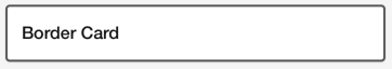
BorderCardTrait
Use this protocol to add border color and border width for the card, implement borderWidth(), and borderColor() methods.
    func borderWidth() -> CGFloat {
        return 2.0
    }

    func borderColor() -> CGColor {
        return UIColor.darkGray.cgColor
    }
CustomMarginCardTrait
Use this protocol to specifiy a custom margin for the card, implement customMargin() method. Value returned will be used for left and right margins thus centering the card in the superview.
    func customMargin() -> CGFloat {
        return 42.0
    }
CardPartsViewController
CardPartsViewController implements the CardController protocol and builds its card UI by displaying one or more card part views using an MVVM pattern that includes automatic data binding. Each CardPartsViewController displays a list of CardPartView as its subviews. Each CardPartView renders as a row in the card. The CardParts framework implements several different types of CardPartView that display basic views, such as title, text, image, button, separator, etc. All CardPartView implemented by the framework are already styled to correctly match the applied s UI guidelines.
In addition to the card parts, a CardPartsViewController also uses a view model to expose data properties that are bound to the card parts. The view model should contain all the business logic for the card, thus keeping the role of the CardPartsViewController to just creating its view parts and setting up bindings from the view model to the card parts. A simple implementation of a CardPartsViewController based card might look like the following:
class TestCardController: CardPartsViewController  {

    var viewModel = TestViewModel()
    var titlePart = CardPartTitleView(type: .titleOnly)
    var textPart = CardPartTextView(type: .normal)

    override func viewDidLoad() {
        super.viewDidLoad()

        viewModel.title.asObservable().bind(to: titlePart.rx.title).disposed(by: bag)
        viewModel.text.asObservable().bind(to: textPart.rx.text).disposed(by: bag)

        setupCardParts([titlePart, textPart])
    }
}

class TestViewModel {

    var title = BehaviorRelay(value: "")
    var text = BehaviorRelay(value: "")

    init() {

        // When these values change, the UI in the TestCardController
        // will automatically update
        title.accept("Hello, world!")
        text.accept("CardParts is awesome!")
    }
}
The above example creates a card that displays two card parts, a title card part and a text part. The bind calls setup automatic data binding between view model properties and the card part view properties so that whenever the view model properties change, the card part views will automatically update with the correct data.
The call to setupCardParts adds the card part views to the card. It takes an array of CardPartView that specifies which card parts to display, and in what order to display them.
CardPartsFullScreenViewController
This will make the card a full screen view controller. So if you do not want to build with an array of Cards, instead you can make a singular card full-screen.
class TestCardController: CardPartsFullScreenViewController  {
    ...
}
CardParts
The framework includes several predefined card parts that are ready to use. It is also possible to create custom card parts. The following sections list all the predefined card parts and their reactive properties that can be bound to view models.
CardPartTextView
CardPartTextView displays a single text string. The string can wrap to multiple lines. The initializer for CardPartTextView takes a type parameter which can be set to: normal, title, or detail. The type is used to set the default font and textColor for the text.
CardPartTextView exposes the following reactive properties that can be bound to view model properties:
var text: String?
var attributedText: NSAttributedString?
var font: UIFont!
var textColor: UIColor!
var textAlignment: NSTextAlignment
var lineSpacing: CGFloat
var lineHeightMultiple: CGFloat
var alpha: CGFloat
var backgroundColor: UIColor?
var isHidden: Bool
var isUserInteractionEnabled: Bool
var tintColor: UIColor?
CardPartAttributedTextView
CardPartAttributedTextView is comparable to CardPartTextView, but it is built upon UITextView rather than UILabel. This allows for CardPartImageViews to be nested within the CardPartAttrbutedTextView and for text to be wrapped around these nested images. In addition, CardPartAttributedTextView allows for links to be set and opened. CartPartAttributedTextView exposes the following reactive properties that can be bound to view model properties:
var text: String?
var attributedText: NSAttributedString?
var font: UIFont!
var textColor: UIColor!
var textAlignment: NSTextAlignment
var lineSpacing: CGFloat
var lineHeightMultiple: CGFloat
var isEditable: Bool
var dataDetectorTypes: UIDataDetectorTypes
var exclusionPath: [UIBezierPath]?
var linkTextAttributes: [NSAttributedString.Key : Any]
var textViewImage: CardPartImageView?
var isUserInteractionEnabled: Bool
var tintColor: UIColor?
CardPartImageView
CardPartImageView displays a single image. CardPartImageView exposes the following reactive properties that can be bound to view model properties:
var image: UIImage?
var imageName: String?
var alpha: CGFloat
var backgroundColor: UIColor?
var isHidden: Bool
var isUserInteractionEnabled: Bool
var tintColor: UIColor?
CardPartButtonView
CardPartButtonView displays a single button.
CardPartButtonView exposes the following reactive properties that can be bound to view model properties:
var buttonTitle: String?
var isSelected: Bool?
var isHighlighted: Bool?
var contentHorizontalAlignment: UIControlContentHorizontalAlignment
var alpha: CGFloat
var backgroundColor: UIColor?
var isHidden: Bool
var isUserInteractionEnabled: Bool
var tintColor: UIColor?
CardPartTitleView
CardPartTitleView displays a view with a title, and an optional options menu. The initializer requires a type parameter which can be set to either titleOnly or titleWithMenu. If the type is set to titleWithMenu the card part will display a menu icon, that when tapped will display a menu containing the options specified in the menuOptions array. The menuOptionObserver property can be set to a block that will be called when the user selects an item from the menu.
As an example for a title with menu buttons:
let titlePart = CardPartTitleView(type: .titleWithMenu)
titlePart.menuTitle = "Hide this offer"
titlePart.menuOptions = ["Hide"]
titlePart.menuOptionObserver  = {[weak self] (title, index) in
    // Logic to determine which menu option was clicked
    // and how to respond
    if index == 0 {
        self?.hideOfferClicked()
    }
}
CardPartButtonView exposes the following reactive properties that can be bound to view model properties:
var title: String?
var titleFont: UIFont
var titleColor: UIColor
var menuTitle: String?
var menuOptions: [String]?
var menuButtonImageName: String
var alpha: CGFloat
var backgroundColor: UIColor?
var isHidden: Bool
var isUserInteractionEnabled: Bool
var tintColor: UIColor?
CardPartTitleDescriptionView
CardPartTitleDescriptionView allows you to have a left and right title and description label, however, you are able to also choose the alignment of the right title/description labels. See below:
let rightAligned = CardPartTitleDescriptionView(titlePosition: .top, secondaryPosition: .right) // This will be right aligned
let centerAligned = CardPartTitleDescriptionView(titlePosition: .top, secondaryPosition: .center(amount: 0)) // This will be center aligned with an offset of 0.  You may increase that amount param to shift right your desired amount
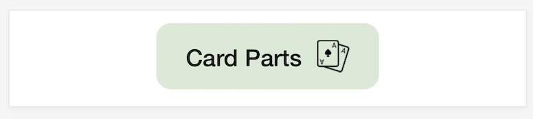
CardPartPillLabel
CardPartPillLabel provides you the rounded corners, text aligned being at the center along with vertical and horizontal padding capability.
var verticalPadding:CGFloat
var horizontalPadding:CGFloat
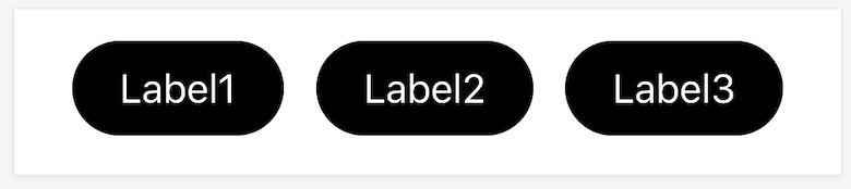
See the example app for a working example.
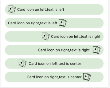
CardPartIconLabel
CardPartIconLabel provides the capability to add images in eithet directions supporting left , right and center text alignments along with icon binding capability.
    let iconLabel = CardPartIconLabel()
    iconLabel.verticalPadding = 10
    iconLabel.horizontalPadding = 10
    iconLabel.backgroundColor = UIColor.blue
    iconLabel.font = UIFont.systemFont(ofSize: 12)
    iconLabel.textColor = UIColor.black
    iconLabel.numberOfLines = 0
    iconLabel.iconPadding = 5
    iconLabel.icon = UIImage(named: "cardIcon")
CardPartSeparatorView
CardPartSeparatorView displays a separator line. There are no reactive properties define for CardPartSeparatorView.
CardPartVerticalSeparatorView
As the name describes, it shows a vertical separator view opposed to a horizontal one
CardPartStackView
CardPartStackView displays a UIStackView that can contain other card parts, and even other CardPartStackViews. Using CardPartStackView allows for creating custom layouts of card parts. By nesting CardPartStackViews you can create almost any layout.
To add a card part to the stack view call its addArrangedSubview method, specifying the card part's view property as the view to be added to the stack view. For example:
horizStackPart.addArrangedSubview(imagePart)
Also,provides an option to round the corners of the stackview
let roundedStackView = CardPartStackView()
roundedStackView.cornerRadius = 10.0
roundedStackView.pinBackground(roundedStackView.backgroundView, to: roundedStackView)
There are no reactive properties defined for CardPartStackView. However you can use the default UIStackView properties (distribution, alignment, spacing, and axis) to configure the stack view.
CardPartTableView
CardPartTableView displays a table view as a card part such that all items in the table view are displayed in the card part (i.e. the table view does not scroll). CardPartTableView leverages Bond's reactive data source support allowing a MutableObservableArray to be bound to the table view.
To setup the data source binding the view model class should expose MutableObservableArray property that contains the table view's data. For example:
var listData = MutableObservableArray(["item 1", "item 2", "item 3", "item 4"])
Then in the view controller the data source binding can be setup as follows:
viewModel.listData.bind(to: tableViewPart.tableView) { listData, indexPath, tableView in

    guard let cell = tableView.dequeueReusableCell(withIdentifier: tableViewPart.kDefaultCellId, for: indexPath) as? CardPartTableViewCell else { return UITableViewCell() }

    cell.leftTitleLabel.text = listData[indexPath.row]

    return cell
}
The last parameter to the bind call is block that will be called when the tableview's cellForRowAt data source method is called. The first parameter to the block is the MutableObservableArray being bound to.
CardPartTableView registers a default cell class (CardPartTableViewCell) that can be used with no additional work. CardPartTableViewCell contains 4 labels, a left justified title, left justified description, right justified title, and a right justified description. Each label can be optionally used, if no text is specified in a label the cell's layout code will correctly layout the remaining labels.
It is also possible to register your own custom cells by calling the register method on tableViewPart.tableView.
You also have access to two delegate methods being called by the tableView as follows:
@objc public protocol CardPartTableViewDelegate {
	func tableView(_ tableView: UITableView, didSelectRowAt indexPath: IndexPath)
	@objc optional func tableView(_ tableView: UITableView, heightForRowAt indexPath: IndexPath) -> CGFloat
}
CardPartTableViewCell
CardPartTableViewCell is the default cell registered for CardPartTableView. The cell contains the following properties:
var leftTitleLabel: UILabel
var leftDescriptionLabel: UILabel
var rightTitleLabel: UILabel
var rightDescriptionLabel: UILabel
var rightTopButton: UIButton
var shouldCenterRightLabel = false
var leftTitleFont: UIFont
var leftDescriptionFont: UIFont
var rightTitleFont: UIFont
var rightDescriptionFont: UIFont
var leftTitleColor: UIColor
var leftDescriptionColor: UIColor
var rightTitleColor: UIColor
var rightDescriptionColor: UIColor
CardPartTableViewCardPartsCell
This will give you the ability to create custom tableView cells out of CardParts. The following code allows you to create a cell:
class MyCustomTableViewCell: CardPartTableViewCardPartsCell {

    let bag = DisposeBag()

    let attrHeader1 = CardPartTextView(type: .normal)
    let attrHeader2 = CardPartTextView(type: .normal)
    let attrHeader3 = CardPartTextView(type: .normal)

    override public init(style: UITableViewCellStyle, reuseIdentifier: String?) {
        super.init(style: style, reuseIdentifier: reuseIdentifier)

        selectionStyle = .none

        setupCardParts([attrHeader1, attrHeader2, attrHeader3])
    }

    required init?(coder aDecoder: NSCoder) {
        fatalError("init(coder:) has not been implemented")
    }

    func setData(_ data: MyCustomStruct) {
        // Do something in here
    }
}
If you do create a custom cell, you must register it to the CardPartTableView:
tableViewCardPart.tableView.register(MyCustomTableViewCell.self, forCellReuseIdentifier: "MyCustomTableViewCell")
And then as normal, you would bind to your viewModel's data:
viewModel.listData.bind(to: tableViewPart.tableView) { tableView, indexPath, data in

    guard let cell = tableView.dequeueReusableCell(withIdentifier: "MyCustomTableViewCell", for: indexPath) as? MyCustomTableViewCell else { return UITableViewCell() }

    cell.setData(data)

    return cell
}
CardPartCollectionView
CardPartCollectionView underlying engine is RxDataSource. You can look at their documentation for a deeper look but here is an overall approach to how it works:
Start by initializing a CardPartCollectionView with a custom UICollectionViewFlowLayout:
lazy var collectionViewCardPart = CardPartCollectionView(collectionViewLayout: collectionViewLayout)
var collectionViewLayout: UICollectionViewFlowLayout = {
    let layout = UICollectionViewFlowLayout()
    layout.minimumInteritemSpacing = 12
    layout.minimumLineSpacing = 12
    layout.scrollDirection = .horizontal
    layout.itemSize = CGSize(width: 96, height: 128)
    return layout
}()
Now say you have a custom struct you want to pass into your CollectionViewCell:
struct MyStruct {
    var title: String
    var description: String
}
You will need to create a new struct to conform to SectionModelType:
struct SectionOfCustomStruct {
    var header: String
    var items: [Item]
}

extension SectionOfCustomStruct: SectionModelType {

    typealias Item = MyStruct

    init(original: SectionOfCustomStruct, items: [Item]) {
        self = original
        self.items = items
    }
}
Next, create a data source that you will bind to you data: Note: You can create a custom CardPartCollectionViewCell as well - see below.
let dataSource = RxCollectionViewSectionedReloadDataSource<SectionOfCustomStruct>(configureCell: {[weak self] (_, collectionView, indexPath, data) -> UICollectionViewCell in

    let cell = collectionView.dequeueReusableCell(withReuseIdentifier: "Cell", for: indexPath)

    return cell
})
Finally, bind your viewModel data to the collectionView and its newly created data source:
viewModel.data.asObservable().bind(to: collectionViewCardPart.collectionView.rx.items(dataSource: dataSource)).disposed(by: bag)
Note: viewModel.data will be a reactive array of SectionOfCustomStruct:
typealias ReactiveSection = BehaviorRelay<[SectionOfCustomStruct]>
var data = ReactiveSection(value: [])
CardPartCollectionViewCardPartsCell
Just how CardPartTableViewCell has the ability to create tableView cells out of CardParts - so do CollectionViews. Below is an example of how you may create a custom CardPartCollectionViewCardPartsCell:
class MyCustomCollectionViewCell: CardPartCollectionViewCardPartsCell {
    let bag = DisposeBag()

    let mainSV = CardPartStackView()
    let titleCP = CardPartTextView(type: .title)
    let descriptionCP = CardPartTextView(type: .normal)

    override init(frame: CGRect) {

        super.init(frame: frame)

        mainSV.axis = .vertical
        mainSV.alignment = .center
        mainSV.spacing = 10

        mainSV.addArrangedSubview(titleCP)
        mainSV.addArrangedSubview(descriptionCP)

        setupCardParts([mainSV])
    }

    required init?(coder aDecoder: NSCoder) {
        fatalError("init(coder:) has not been implemented")
    }

    func setData(_ data: MyStruct) {

        titleCP.text = data.title
        descriptionCP.text = data.description
    }
}
To use this, you must register it to the CollectionView during viewDidLoad as follows:
collectionViewCardPart.collectionView.register(MyCustomCollectionViewCell.self, forCellWithReuseIdentifier: "MyCustomCollectionViewCell")
Then, inside your data source, simply dequeue this cell:
let dataSource = RxCollectionViewSectionedReloadDataSource<SectionOfSuggestedAccounts>(configureCell: {[weak self] (_, collectionView, indexPath, data) -> UICollectionViewCell in

    guard let cell = collectionView.dequeueReusableCell(withReuseIdentifier: "MyCustomCollectionViewCell", for: indexPath) as? MyCustomCollectionViewCell else { return UICollectionViewCell() }

    cell.setData(data)

    return cell
})
CardPartBarView
CardPartBarView present a horizontal bar graph that can be filled to a certain percentage of your choice. Both the color of the fill and the percent is reactive
let barView = CardPartBarView()
viewModel.percent.asObservable().bind(to: barView.rx.percent).disposed(by:bag)
viewModel.barColor.asObservable().bind(to: barView.rx.barColor).disposed(by: bag)
CardPartPagedView
This CardPart allows you to create a horizontal paged carousel with page controls. Simply feed it with your desired height and an array of CardPartStackView:
let cardPartPages = CardPartPagedView(withPages: initialPages, andHeight: desiredHeight)
cardPartPages.delegate = self
This CardPart also has a delegate:
func didMoveToPage(page: Int)
Which will fire whenever the user swipes to another page
You also have the abililty to automatically move to a specific page by calling the following function on CardPartPagedView
func moveToPage(_ page: Int)
CardPartSliderView
You can set min and max value as well as bind to the current set amount:
let slider = CardPartSliderView()
slider.minimumValue = sliderViewModel.min
slider.maximumValue = sliderViewModel.max
slider.value = sliderViewModel.defaultAmount
slider.rx.value.asObservable().bind(to: sliderViewModel.amount).disposed(by: bag)
CardPartMultiSliderView
You can set min and max value as well as tint color and outer track color:
let slider = CardPartMultiSliderView()
slider.minimumValue = sliderViewModel.min
slider.maximumValue = sliderViewModel.max
slider.orientation = .horizontal
slider.value = [10, 40]
slider.trackWidth = 8
slider.tintColor = .purple
slider.outerTrackColor = .gray
CardPartSpacerView
Allows you to add a space between card parts in case you need a space larger than the default margin. Initialize it with a specific height:
CardPartSpacerView(height: 30)
CardPartTextField
CardPartTextField can take a parameter of type CardPartTextFieldFormat which determines formatting for the UITextField. You may also set properties such as keyboardType, placeholder, font, text, etc.
let amount = CardPartTextField(format: .phone)
amount.keyboardType = .numberPad
amount.placeholder = textViewModel.placeholder
amount.font = dataFont
amount.textColor = UIColor.colorFromHex(0x3a3f47)
amount.text = textViewModel.text.value
amount.rx.text.orEmpty.bind(to: textViewModel.text).disposed(by: bag)
The different formats are as follows:
public enum CardPartTextFieldFormat {
    case none
    case currency(maxLength: Int)
    case zipcode
    case phone
    case ssn
}
CardPartOrientedView
CardPartOrientedView allows you to create an oriented list view of card part elements. This is similar to the CardPartStackView except that this view can orient elements to the top or bottom of the view. This is advantageous when you are using horizontal stack views and need elements to be oriented differently (top arranged or bottom arranged) relative to the other views in the horizontal stack view. To see a good example of this element please take a look at the example application.
The supported orientations are as follows:
public enum Orientation {
    case top
    case bottom
}
To create an oriented view you can use the following code:
let orientedView = CardPartOrientedView(cardParts: [<elements to list vertically>], orientation: .top)
Add the above orientedView to any list of card parts or an existing stack view to orient your elements to the top or bottom of the enclosing view.
CardPartCenteredView
CardPartCenteredView is a CardPart that fits a centered card part proportionally on the phone screen while allowing a left and right side card part to scale appropriately. To create a centered card part please use the following example:
class TestCardController : CardPartsViewController {
    override func viewDidLoad() {
        super.viewDidLoad()

        let rightTextCardPart = CardPartTextView(type: .normal)
        rightTextCardPart.text = "Right text in a label"

        let centeredSeparator = CardPartVerticalSeparator()

        let leftTextCardPart = CardPartTextView(type: .normal)
        leftTextCardPart.text = "Left text in a label"

        let centeredCardPart = CardPartCenteredView(leftView: leftTextCardPart, centeredView: centeredSeparator, rightView: rightTextCardPart)

        setupCardParts([centeredCardPart])
    }
}
A CardPartCenteredView can take in any card part that conforms to CardPartView as the left, center, and right components. To see a graphical example of the centered card part please look at the example application packaged with this cocoapod.
CardPartConfettiView
Provides the capability to add confetti with various types ( diamonds, star, mixed ) and colors, along with different level of intensity
    let confettiView = CardPartConfettiView()
    confettiView.type  = .diamond
    confettiView.shape = CAEmitterLayerEmitterShape.line
    confettiView.startConfetti()
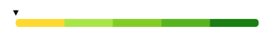
CardPartProgressBarView
Provides the capability to configure different colors and custom marker , it's position to indicate the progress based on the value provided.
    let progressBarView = CardPartProgressBarView(barValues: barValues, barColors: barColors, marker: nil, markerLabelTitle: "", currentValue: Double(720), showShowBarValues: false)
    progressBarView.barCornerRadius = 4.0
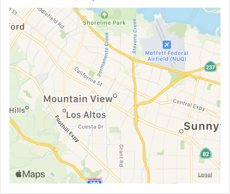
CardPartMapView
Provides the capability to display a MapView and reactively configure location, map type, and coordinate span (zoom). You also have direct access to the MKMapView instance so that you can add annotations, hook into it's MKMapViewDelegate, or whatever else you'd normally do with Maps.
By default the card part will be rendered at a height of 300 points but you can set a custom height just be resetting the CardPartMapView.intrensicHeight property.
Here's a small example of how to reactively set the location from a changing address field (See the Example project for a working example):
    let initialLocation = CLLocation(latitude: 37.430489, longitude: -122.096260)
    let cardPartMapView = CardPartMapView(type: .standard, location: initialLocation, span: MKCoordinateSpan(latitudeDelta: 1, longitudeDelta: 1))

    cardPartTextField.rx.text
            .flatMap { self.viewModel.getLocation(from: $0) }
            .bind(to: cardPartMapView.rx.location)
            .disposed(by: bag)
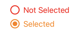
CardPartRadioButton
Provides the capability to add radio buttons with configurable inner/outer circle line width , colors along with tap etc..
    let radioButton = CardPartRadioButton()
    radioButton.outerCircleColor = UIColor.orange
    radioButton.outerCircleLineWidth = 2.0

    radioButton2.rx.tap.subscribe(onNext: {
        print("Radio Button Tapped")
    }).disposed(by: bag)
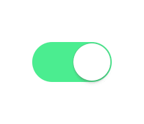
CardPartSwitchView
Provides the capability to add a switch with configurable colors.
    let switchComponent = CardPartSwitchView()
    switchComponent.onTintColor = .blue
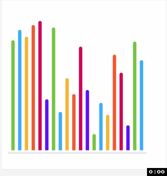
CardPartHistogramView
Provides the caoability to generate the bar graph based on the data ranges with customizable bars , lines, colors etc..
    let dataEntries = self.generateRandomDataEntries()
    barHistogram.width = 8
    barHistogram.spacing = 8
    barHistogram.histogramLines = HistogramLine.lines(bottom: true, middle: false, top: false)
    self.barHistogram.updateDataEntries(dataEntries: dataEntries, animated: true)
CardPartsBottomSheetViewController
CardPartsBottomSheetViewController provides the capability to show a highly-customizable modal bottom sheet. At its simplest, all you need to do is set the contentVC property to a view controller that you create to control the content of the bottom sheet:
    let bottomSheetViewController = CardPartsBottomSheetViewController()
    bottomSheetViewController.contentVC = MyViewController()
    bottomSheetViewController.presentBottomSheet()
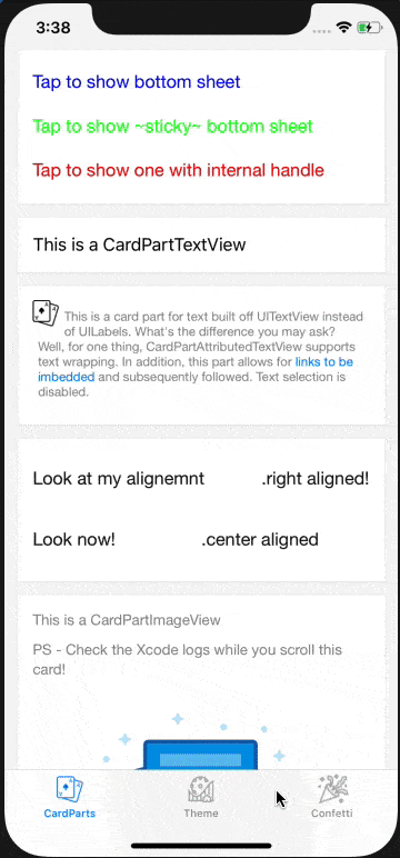
CardPartsBottomSheetViewController also supports being used as a sticky view at the bottom of the screen, and can be presented on any view (default is keyWindow). For example, the following code creates a sticky view that still permits scrolling behind it and can only be dismissed programmatically.
    let bottomSheetViewController = CardPartsBottomSheetViewController()
    bottomSheetViewController.contentVC = MyStickyViewController()
    bottomSheetViewController.configureForStickyMode()
    bottomSheetViewController.addShadow()
    bottomSheetViewController.presentBottomSheet(on: self.view)
There are also over two dozen other properties that you can set to further customize the bottom sheet for your needs. You can configure the colors, height, gesture recognizers, handle appearance, animation times, and callback functions with the following properties.
var contentVC: UIViewController?: View controller for the content of the bottom sheet. Should set this parameter before presenting bottom sheet.var contentHeight: CGFloat?: Manually set a content height. If not set, height will try to be inferred fromcontentVC.var bottomSheetBackgroundColor: UIColor: Background color of bottom sheet. Default is white.var bottomSheetCornerRadius: CGFloat: Corner radius of bottom sheet. Default is 16.var handleVC: CardPartsBottomSheetHandleViewController: Pill-shaped handle at the top of the bottom sheet. Can configurehandleVC.handleHeight,handleVC.handleWidth, andhandleVC.handleColor.var handlePosition: BottomSheetHandlePosition: Positioning of handle relative to bottom sheet. Options are.above(bottomPadding),.inside(topPadding),.none. Default is above with padding 8.var overlayColor: UIColor: Color of the background overlay. Default is black.var shouldIncludeOverlay: Bool: Whether or not to include a background overlay. Default is true.var overlayMaxAlpha: CGFloat: Maximum alpha value of background overlay. Will fade to 0 proportionally with height as bottom sheet is dragged down. Default is 0.5.var dragHeightRatioToDismiss: CGFloat: Ratio of how how far down user must have dragged bottom sheet before releasing it in order to trigger a dismissal. Default is 0.4.var dragVelocityToDismiss: CGFloat: Velocity that must be exceeded in order to dismiss bottom sheet if height ratio is greater thandragHeightRatioToDismiss. Default is 250.var pullUpResistance: CGFloat: Amount that the bottom sheet resists being dragged up. Default 5 means that for every 5 pixels the user drags up, the bottom sheet goes up 1 pixel.var appearAnimationDuration: TimeInterval: Animation time for bottom sheet to appear. Default is 0.5.var dismissAnimationDuration: TimeInterval: Animation time for bottom sheet to dismiss. Default is 0.5.var snapBackAnimationDuration: TimeInterval: Animation time for bottom sheet to snap back to its height. Default is 0.25.var animationOptions: UIView.AnimationOptions: Animation options for bottom sheet animations. Default is UIView.AnimationOptions.curveEaseIn.var changeHeightAnimationDuration: TimeInterval: Animation time for bottom sheet to adjust to a new height when height is changed. Default is 0.25.var shouldListenToOverlayTap: Bool: Whether or not to dismiss if a user taps in the overlay. Default is true.var shouldListenToHandleDrag: Bool: Whether or not to respond to dragging on the handle. Default is true.var shouldListenToContentDrag: Bool: Whether or not to respond to dragging in the content. Default is true.var shouldListenToContainerDrag: Bool: Whether or not to respond to dragging in the container. Default is true.var shouldRequireVerticalDrag: Bool: Whether or not to require a drag to start in the vertical direction. Default is true.var adjustsForSafeAreaBottomInset: Bool: Boolean value for whether or not bottom sheet should automatically add to its height to account for bottom safe area inset. Default is true.var didShow: (() -> Void)?: Callback function to be called when bottom sheet is done preseting.var didDismiss: ((_ dismissalType: BottomSheetDismissalType) -> Void)?: Callback function to be called when bottom sheet is done dismissing itself. ParameterdismissalType: information about how the bottom sheet was dismissed -.tapInOverlay,.swipeDown,.programmatic(info).var didChangeHeight: ((_ newHeight: CGFloat) -> Void)?: Callback function to be called when bottom sheet height changes from dragging or a call toupdateHeight.var preferredGestureRecognizers: [UIGestureRecognizer]?: Gesture recognizers that should block the vertical dragging of bottom sheet. Will automatically find and use all gesture recognizers if nil, otherwise will use recognizers in the array. Default is empty array.var shouldListenToKeyboardNotifications: Bool: If there is a text field in the bottom sheet we may want to automatically have the bottom sheet adjust for the keyboard. Default is false.var isModalAccessibilityElement: Bool: Whether or not to treat the bottom sheet as a modal accessibility element, which will block interaction with views underneath. Default is true. It is not recommended that you override this unless you are using the bottom sheet in sticky mode or otherwise without the overlay.var allowsAccessibilityGestureToDismiss: Bool: Whether or not users can use the accessibility escape gesture to dismiss the bottom sheet. Default is true. It is not recommended that you override this unless you are using the bottom sheet in sticky mode or otherwise disabling dismissal or providing another way for VoiceOver users to dismiss.
If you change the contentVC or contentHeight properties, the bottom sheet will automatically update its height. You can also call updateHeight() to trigger an update of the height (this is mainly for if the content of the contentVC has changed and you want the bottom sheet to update to match the new content size).
Because it is uncommon to have access to the bottom sheet view controller from the contentVC,we define a CardPartsBottomSheetDelegate with default implementations for updating to a new contentVC or contentHeight, updating the height, or dismissing the bottom sheet programmatically. In order to use this delegate and its default function implementations, simply have your class conform to CardPartsBottomSheetDelegate and define a var bottomSheetViewController: CardPartsBottomSheetViewController. Then, set that class to be a delegate for your content view controller and you can interface with the bottom sheet through the delegate.
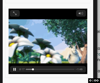
CardPartVideoView
Provides the capability to embed AVPlayer inside a cardpart view.
guard let videoUrl = URL(string: "https://www.learningcontainer.com/wp-content/uploads/2020/05/sample-mp4-file.mp4")  else  { return }
let cardPartVideoView = CardPartVideoView(videoUrl: videoUrl)
If you need to access the underlying AVPlayerViewController to further customize it or set its delegate, you can do so through the CardPartVideoView's viewController property. For example:
guard let controller = cardPartVideoView.viewController as? AVPlayerViewController else { return }
controller.delegate = self
controller.entersFullScreenWhenPlaybackBegins = true
Card States
CardPartsViewController can optionally support the notion of card states, where a card can be in 3 different states: loading, empty, and hasData. For each state you can specify a unique set of card parts to display. Then when the CardPartsViewController state property is changed, the framework will automatically switch the card parts to display the card parts for that state. Typically you would bind the state property to a state property in your view model so that when the view model changes state the card parts are changed. A simple example:
public enum CardState {
    case none
    case loading
    case empty
    case hasData
    case custom(String)
}

class TestCardController : CardPartsViewController  {

    var viewModel = TestViewModel()
    var titlePart = CardPartTitleView(type: .titleOnly)
    var textPart = CardPartTextView(type: .normal)
    var loadingText = CardPartTextView(type: .normal)
    var emptyText = CardPartTextView(type: .normal)
    var customText = CardPartTextView(type: .normal)

    override func viewDidLoad() {
        super.viewDidLoad()

        viewModel.title.asObservable().bind(to: titlePart.rx.title).disposed(by: bag)
        viewModel.text.asObservable().bind(to: textPart.rx.text).disposed(by: bag)

        loadingText.text = "Loading..."
        emptyText.text = "No data found."
        customText.text = "I am some custom state"

        viewModel.state.asObservable().bind(to: self.rx.state).disposed(by: bag)

        setupCardParts([titlePart, textPart], forState: .hasData)
        setupCardParts([titlePart, loadingText], forState: .loading)
        setupCardParts([titlePart, emptyText], forState: .empty)
        setupCardParts([titlePart, customText], forState: .custom("myCustomState"))
    }
}
Note: There is a custom(String) state which allows you to use more than our predefined set of states:
.custom("myCustomState")
Data Binding
Data binding is implemented using the RxSwift library (https://github.com/ReactiveX/RxSwift). View models should expose their data as bindable properties using the Variable class. In the example above the view model might look like this:
class TestViewModel {

    var title = BehaviorRelay(value: "Testing")
    var text = BehaviorRelay(value: "Card Part Text")
}
Later when the view model's data has changed it can update its property by setting the value attribute of the property:
title.accept(“Hello”)
The view controller can bind the view model property to a view:
viewModel.title.asObservable().bind(to: titlePart.rx.title).disposed(by: bag)
Now, whenever the view model's title property value is changed it will automatically update the titlePart's title.
RxSwift use the concept of "Disposable" and "DisposeBag" to remove bindings. Each call to bind returns a Disposable that can be added to a DisposeBag. CardPartsViewController defines an instance of DisposeBag called "bag" that you can use to automatically remove all your bindings when your CardPartsViewController is deallocated. See the RxSwift documentation for more information on disposables and DisposeBags.
Themes
Out of the box we support 2 themes: Mint and Turbo. These are the 2 Intuit app's that are currently built on top of CardParts. As you can find in the file CardPartsTheme.swift we have a protocol called CardPartsTheme. You may create a class that conforms to CardPartsTheme and set all properties in order to theme CardParts however you may like. Below is an example of some of the themeable properties:
// CardPartTextView
var smallTextFont: UIFont { get set }
var smallTextColor: UIColor { get set }
var normalTextFont: UIFont { get set }
var normalTextColor: UIColor { get set }
var titleTextFont: UIFont { get set }
var titleTextColor: UIColor { get set }
var headerTextFont: UIFont { get set }
var headerTextColor: UIColor { get set }
var detailTextFont: UIFont { get set }
var detailTextColor: UIColor { get set }

// CardPartTitleView
var titleFont: UIFont { get set }
var titleColor: UIColor { get set }

// CardPartButtonView
var buttonTitleFont: UIFont { get set }
var buttonTitleColor: UIColor { get set }
var buttonCornerRadius: CGFloat { get set }
Applying a theme
Generate a class as follows:
public class YourCardPartTheme: CardPartsTheme {
    ...
}
And then in your AppDelegete call YourCardPartTheme().apply() it apply your theme. If you use storyboards with CardsViewControllers in your storyboard, the required init(coder:) initializer gets called prior to AppDelegate. In this case, you will need to apply the theme in this initializer of the first view controller in your storyboard to be initialized, and changes will take effect in all other view controllers. For example:
required init?(coder: NSCoder) {
	YourCardPartTheme().apply()
	super.init(coder: coder)
}
Clickable Cards
You have the ability to add a tap action for each state of any given card. If a part of the card is clicked, the given action will be fired:
self.cardTapped(forState: .empty) {
    print("Card was tapped in .empty state!")
}

self.cardTapped(forState: .hasData) {
    print("Card was tapped in .hasData state!")
}

// The default state for setupCardParts([]) is .none
self.cardTapped {
    print("Card was tapped in .none state")
}
Note: It is always a good idea to weakify self in a closure:
{[weak self] in

}
Listeners
CardParts also supports a listener that allows you to listen to visibility changes in the cards that you have created. In your CardPartsViewController you may implement the CardVisibilityDelegate to gain insight into the visibility of your card within the CardsViewController you have created. This optional delegate can be implemented as follows:
public class YourCardPartsViewController: CardPartsViewController, CardVisibilityDelegate {
    ...

    /**
    Notifies your card parts view controller of the ratio that the card is visible in its container
    and the ratio of its container that the card takes up.
    */
     func cardVisibility(cardVisibilityRatio: CGFloat, containerCoverageRatio: CGFloat) {
        // Any logic you would like to perform based on these ratios
    }
}
Delegates
Any view controller which is a subclass of CardPartsViewController supports gesture delegate for long press on the view. Just need to conform your controller to CardPartsLongPressGestureRecognizerDelegate protocol.
When the view is long pressed didLongPress(_:) will be called where you can custom handle the gesture. Example: Zoom in and Zoom out on gesture state begin/ended.
func didLongPress(_ gesture: UILongPressGestureRecognizer) -> Void
You can set the minimumPressDuration for your press to register as gesture began. The value is in seconds. default is set to 1 second.
var minimumPressDuration: CFTimeInterval { get } // In seconds
Example:
extension MYOwnCardPartController: CardPartsLongPressGestureRecognizerDelegate {
	func didLongPress(_ gesture: UILongPressGestureRecognizer) {
		guard let v = gesture.view else { return }

		switch gesture.state {
		case .began:
			// Zoom in
		case .ended, .cancelled:
			// Zoom out
		default: break
		}
	}
	// Gesture starts registering after pressing for more than 0.5 seconds.
	var minimumPressDuration: CFTimeInterval { return 0.5 }
}
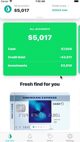
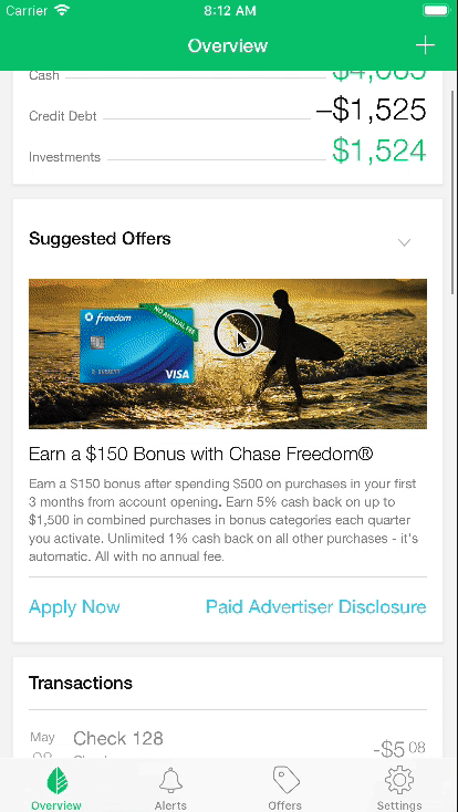
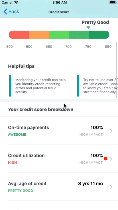
Apps That Love CardParts
- Mint - Personal Finance & Money
- Turbo: Scores-Income & Credit
- More to come.. hopefully!
Publications
- Rebuilding Mint’s UI From the Ground Up Using CardParts (iOS)
- Top 10 Swift Open Source of the Month
- 23 Amazing iOS UI Libraries
License
CardParts is available under the Apache 2.0 license. See the LICENSE file for more info.


 1 Mar 25, 2022
 4 Mar 28, 2022
 6 Oct 15, 2022
 5 Jan 14, 2022
 716 Dec 29, 2022
 96 Dec 18, 2022
 1.2k Dec 14, 2022
 23 Feb 1, 2021
 250 Nov 15, 2022
 556 Dec 5, 2022
 798 Dec 28, 2022
 754 Dec 28, 2022
 3 May 19, 2022
 84 Dec 5, 2022
 1.2k Dec 28, 2022
 285 Jan 3, 2023
 5.2k Jan 2, 2023
 4.1k Dec 14, 2022
 57 Jul 22, 2022
 1.4k Dec 15, 2022