Update July 2020 - latest SwiftUI now has built-in components to do this, which should be used instead.
FlowStack
FlowStack is a SwiftUI component for laying out content in a grid.
Requirements
Xcode 11 beta on MacOS 10.14 or 10.15
Installation
In Xcode, choose File -> Swift Packages -> Add Package Dependency and enter this repo's URL.
Usage
FlowStack(columns, numItems, alignment) { index, colWidth in }
- columns (Int)
- The number of columns to display.
- numItems (Int)
- The total count of items you will be displaying.
- alignment (HorizontalAlignment?)
-
Default: .leading
The alignment of any trailing columns in the last row.
Callback parameters
- index (Int)
- The index of the item currently being processed.
- colWidth (CGFloat)
- The computed width of the column currently being processed.
Examples
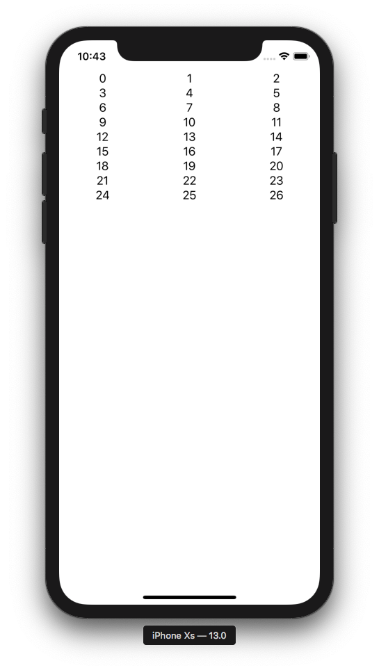
1) Simple
The simplest possible example:
FlowStack(columns: 3, numItems: 27, alignment: .leading) { index, colWidth in
  Text(" \(index) ").frame(width: colWidth)
}
You should always add .frame(width: colWidth) to the immediate child of FlowStack.
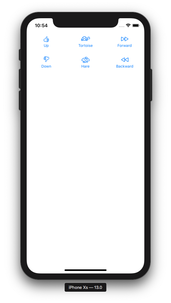
2) Displaying Data
struct Item {
  var image: String
  var label: String
}

let items = [
  Item(image: "hand.thumbsup", label: "Up"),
  Item(image: "tortoise", label: "Tortoise"),
  Item(image: "forward", label: "Forward"),
  Item(image: "hand.thumbsdown", label: "Down"),
  Item(image: "hare", label: "Hare"),
  Item(image: "backward", label: "Backward")
]

FlowStack(columns: 3, numItems: items.count, alignment: .leading) { index, colWidth in
  Button(action: { print("Tap \(index)!") }) {
    Image(systemName: items[index].image)
    Text(items[index].label).font(Font.caption)
  }
  .padding()
  .frame(width: colWidth)
}
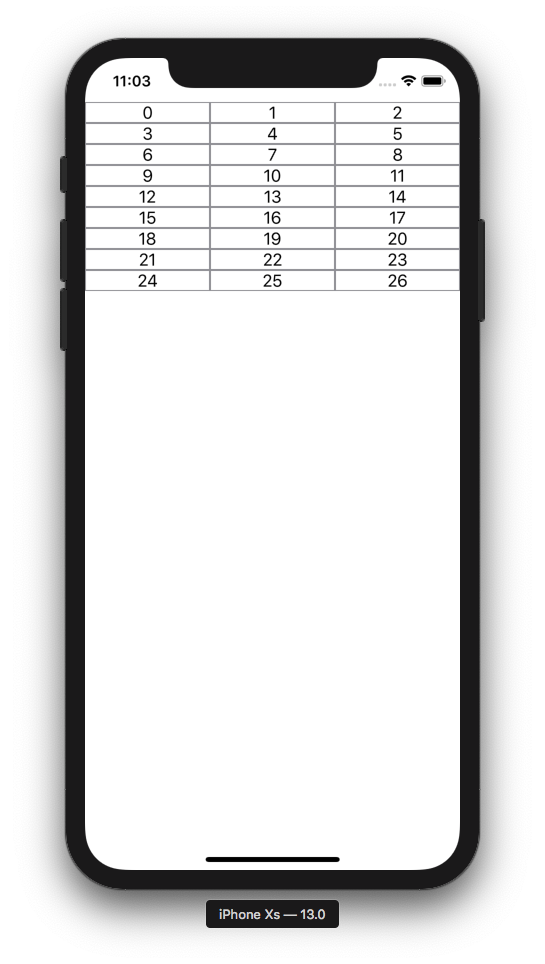
Padding/Borders/Actions
Let's draw a border on our cells to visualize some concepts:
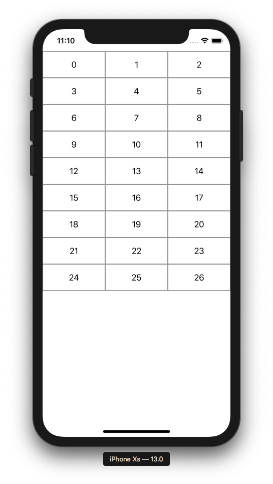
FlowStack(columns: 3, numItems: 27, alignment: .leading) { index, colWidth in
  Text(" \(index) ").frame(width: colWidth).border(Color.gray)
}
Now let's swap the .frame and .border order and note what happens. This demonstrates the order of operations is important when chaining layout modifiers.
FlowStack(columns: 3, numItems: 27, alignment: .leading) { index, colWidth in
  Text(" \(index) ").border(Color.gray).frame(width: colWidth)
}
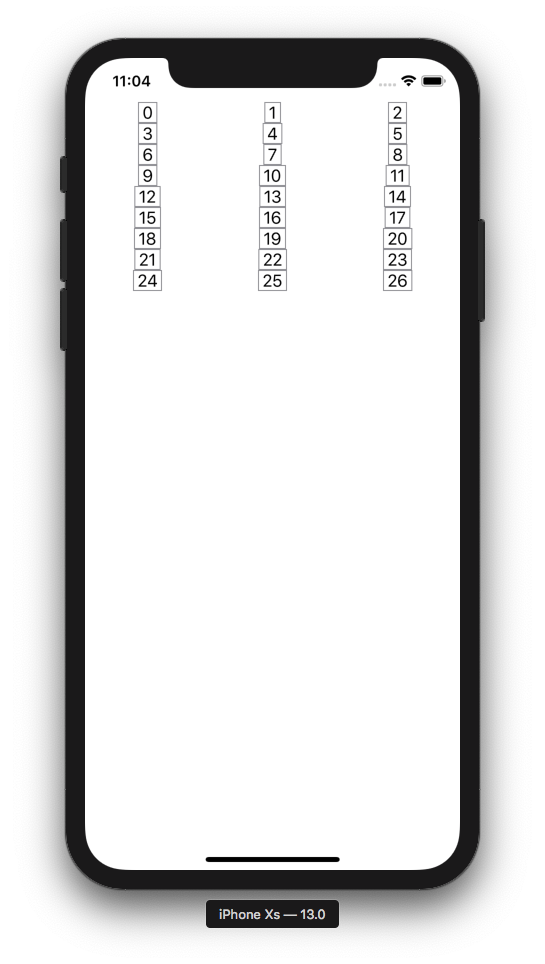
Now let's swap the order back and add some padding:
FlowStack(columns: 3, numItems: 27, alignment: .leading) { index, colWidth in
  Text(" \(index) ").padding().frame(width: colWidth).border(Color.gray)
}
To add actions, you can of course just put buttons in your cells like example #2. But there is also a way to detect a tap on the entire cell. Note we add a background to detect taps in the empty areas outside the text.
FlowStack(columns: 3, numItems: 27, alignment: .leading) { index, colWidth in
  Text(" \(index) ")
    .padding()
    .frame(width: colWidth)
    .border(Color.gray)
    .background(Color.white)
    .tapAction {
      print("Tap!")
    }
}
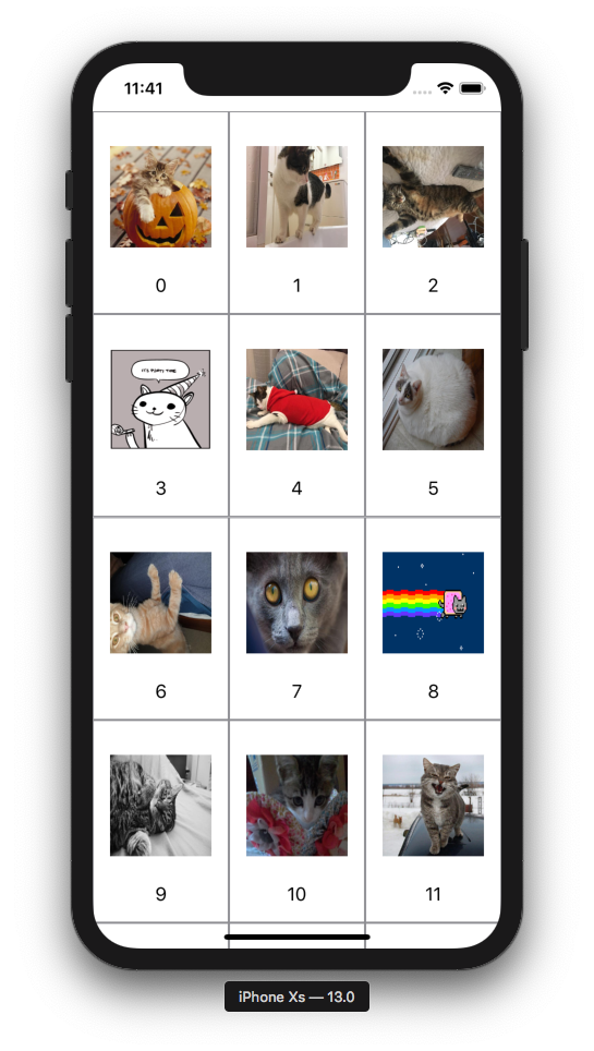
Example with images
Here's an example with images. LoadableImageView is from here.
FlowStack(columns: 3, numItems: 27, alignment: .leading) { index, colWidth in
  VStack {
    LoadableImageView(with: "https://cataas.com/cat?type=sq?foo")
      .padding()
      .frame(width: colWidth, height: colWidth)
      .tapAction { print("Meow!") }
    Text(" \(index) ")
  }
  .padding()
  .frame(width: colWidth)
  .border(Color.gray)
  .background(Color.white)
  .tapAction {
    print("Tap!")
  }
}
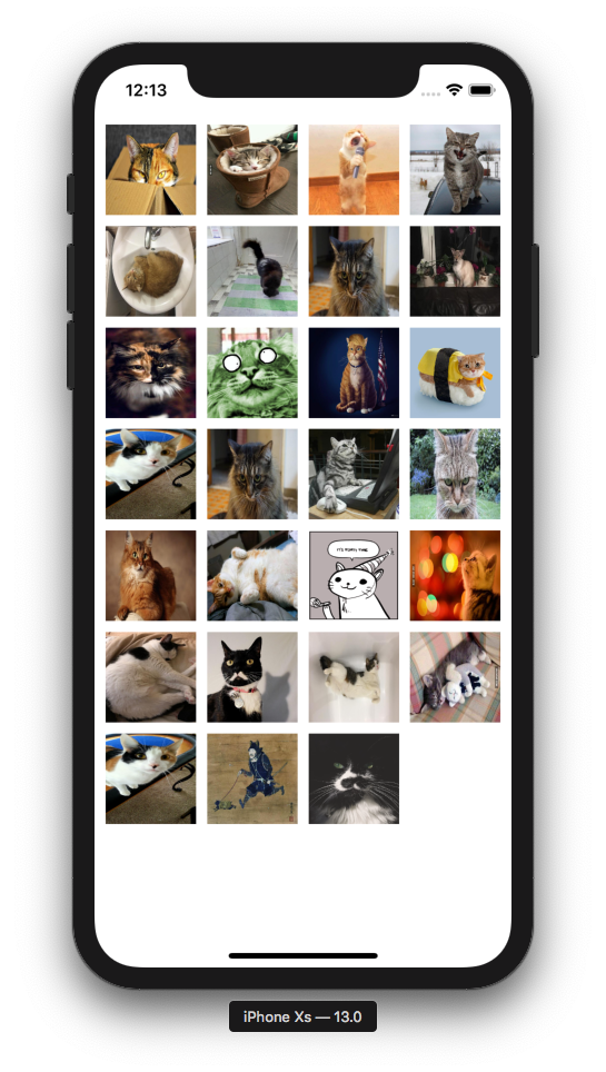
Evenly spaced grid
FlowStack(columns: 4, numItems: 27, alignment: .leading) { index, colWidth in
  LoadableImageView(with: "https://cataas.com/cat?type=sq?rando")
    .padding(5)
    .frame(width: colWidth, height: colWidth)
}.padding(5)
Feedback
Please file a github issue if you're having trouble or spot a bug.

 4.2k Dec 30, 2022
 0 Dec 13, 2021

 1 Dec 29, 2021
 26 Dec 23, 2022

 114 Jan 5, 2023


 84 Dec 16, 2022
 0 Jun 9, 2022


 56 Nov 14, 2022
 1.2k Jan 2, 2023
 6 Sep 27, 2022
 74 Oct 19, 2022
 1 Jan 16, 2022
 8 Dec 28, 2022
 115 Dec 28, 2022
 3.2k Dec 27, 2022
 696 Aug 3, 2022