An open-source colour picker app for macOS

Overview

Pika icon, an eye against a multicoloured background

Pika

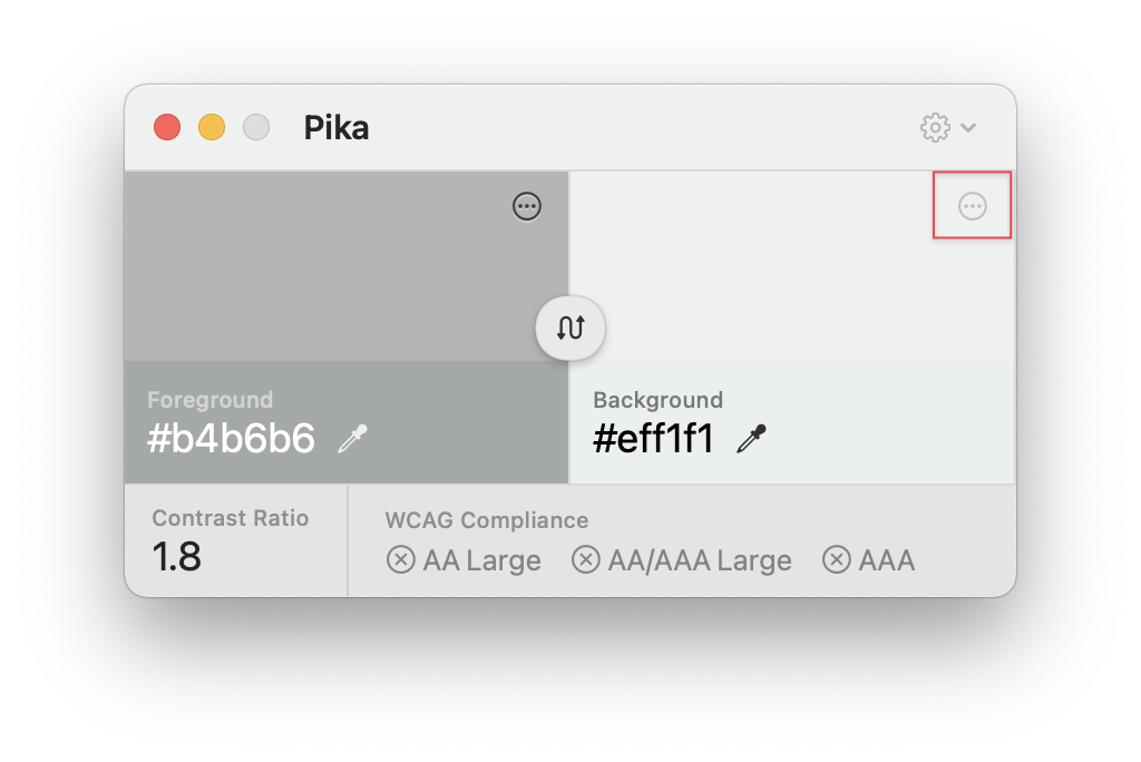
Pika (pronounced pi·kuh, like picker) is an easy to use, open-source, native colour picker for macOS. Pika makes it easy to quickly find colours onscreen, in the format you need, so you can get on with being a speedy, successful designer.

Download the latest version of the app at superhighfives.com/pika.

Learn more about the motivations behind the project, and the product vision.

Screenshots of the dark and light Pika interface

Requirements

OS

  • macOS Catalina (Version 10.15+) and newer

Development

Getting started with contributing

Make sure you have mint installed, and bootstrap the toolchain dependencies:

brew install mint
mint bootstrap

Open Pika.xcodeproj and you should be good to go. If you run into any problems, please detail them in an issue.

Contributions

Any and all contributions are welcomed. Check for open issues, look through the project roadmap, and submit a PR.

Dependencies and thanks

And a huge thank you to Stormnoid for the incredible 2D vector field visualisation on Shadertoy.

Comments
  • Automatically open in color-picking mode; probably foreground

    Automatically open in color-picking mode; probably foreground

    Is your feature request related to a problem? Please describe. When I open Pika it's usually because I immediately want to select a color (to check accessibility). It would save me a click (or keypress) if it opened in color-picking mode.

    Describe the solution you'd like If Pika is not "open", I'd like Pika to open and be in color-picking mode, probably foreground. When checking the accessibility of two colors, I usually start with foreground so that's my preference; not sure if everyone would agree. 🤔

    I really can't think of a scenario where I'd open Pika and NOT want to immediately select a color. And since Esc exits that mode, it's pretty easy to cancel if one doesn't want that. Seems like making this default behavior would be cleaner than adding yet another setting.

    Describe alternatives you've considered I could use the new shortcut (thanks! 🙏) which is faster than clicking the eyedropper, but it's still an extra step.

    Additional context I may be biased from having used MacOS's Digital Color Picker, which is always in color-picking mode.

    enhancement 
    opened by bikrrr 20
  • Add colour naming (for us colourblind types)

    Add colour naming (for us colourblind types)

    I'm pretty colourblind. When I'm implementing a front-end I often have to create a variable name for a particular colour, and it's very hard to know where to start. Should this be $nice-yellow or $warm-green or $cool-orange?

    I generally use https://www.color-blindness.com/color-name-hue/ to give me prompts on this. I don't need exact names - I'm not going to have 200 different colours in an app - but some little suggestions are very helpful.

    I'd love it if Pika could also help me with this, by allowing me to see a name along with the colour value.

    And of course if you need a real-life proper colourblind person to test with, you know where to find me!

    enhancement 
    opened by daveslutzkin 13
  • Colors don’t match expected webpage output

    Colors don’t match expected webpage output

    Describe the bug I’ve been checking the colours that Pika grabs from webpages against their CSS values, and the results don’t always match up.

    To Reproduce Steps to reproduce the behavior:

    1. Here’s a quick site to check against: https://rileyjshaw.com/palette-test-tool
    2. I tried each RGB colour space in Pika, but couldn’t get its outputs to match up.

    Tested in Firefox Developer Edition and Chrome latest.

    Expected behavior The results on screen at https://rileyjshaw.com/palette-test-tool, and in the CSS devtools of other websites, would match Pika’s colour values.

    Screenshots Screen Shot 2021-02-28 at 10 45 59 PM

    Environment

    • OS: macOS Big Sur
    • App Version: 11.1 (20C69)
    • Architecture: MacBook Pro (13-inch, 2016, Four Thunderbolt 3 Ports) | 3.3 GHz Dual-Core Intel Core i7 | 16 GB 2133 MHz LPDDR3 | Intel Iris Graphics 550 1536 MB

    Additional context I’ve never messed with the colour profiles on my machine (default MacBook “Color LCD” profile), nor in my browser. I know very little about this world. Apologies if this is a daft minunderstanding on my part, but I definitely expected my browser (with default settings) to match this tool (with default settings).

    bug 
    opened by rileyjshaw 10
  • Pika's drop-shadow affects the sampling

    Pika's drop-shadow affects the sampling

    When you place Pika close to the area that you are sampling, the window's drop-shadow adds to the underlying area's luminosity, potentially causing an incorrect reading

    To Reproduce With Pika running, place over an area known to have a white background Sample the background colour just below the bottom of Pika's window

    Expected behavior The colour of the area undeath should be correctly identified as #ffffff, but will be darker than that as it icludes whatever window drop-shadow shade is over the top

    Environment (please complete the following information):

    • OS: macOS Big Sur

    Additional context This may be an OS-level thing that cannot be avoided (short of moving the Pika app further away from where you are sampling). Can the drop-shadow effect be removed for just this app?

    bug 
    opened by lloydi 10
  • Pass/Fail status in 'Copy all as text' is not completely correct

    Pass/Fail status in 'Copy all as text' is not completely correct

    This is regarding the 0.0.11-beta1 you just put out.

    When choosing to 'Copy all as text', some of the data is incorrect. Attached image shows the issue (WCAG AA is marked as a pass when it is a fail. The key on the app UI is correctly showing pass/fail status.

    pika_copy_all_as_text

    Also, having seen the output as text, I think it could be made less ambiguous by not combining AA and AAA large as you do in the app UI. I would suggest that the format should be as follows (and using the example colors above to show pass/fails):

    Foreground: #ececec / rgb(236, 236, 236) / hsb(360, 0, 93) / hsl(0, 0, 93) Background: #7a7a7a / rgb(122, 122, 122) / hsb(120, 0, 48) / hsl(120, 0, 48) Contrast Ratio: 3.63:1 WCAG Text contrast:

    • AA: Fail
    • AA Large: Pass
    • AAA: Fail
    • AAA Large: Fail

    Note that I am emphasizing that this is for Text Contrast. There is also an SC for Non-text items contrast. This could also potentially be included in this text output (as you do not have the limitations of a small space on the app Window for that.

    SC 1.4.3 Contrast (Minimum) SC 1.4.11 Non-text Contrast

    bug 
    opened by lloydi 9
  • Reconsider the swatch design

    Reconsider the swatch design

    From https://github.com/superhighfives/pika/issues/3#issuecomment-759846470

    One thing I would love to look at in future is making the text editable as well, so you can paste in your own value on either side. I want that to be really seamless, so it's a little further down the track, but I know I'll need to slightly rethink the layout of the swatches. This could be a good opportunity to consider that now.

    One thought is centralising the copy to a single icon, with left and right click. Here's a quick sketch:

    image

    I think my only concern would be doing it in a way that makes it clear it has a right click, but that could be a part of the onboarding, potentially. Also, you have the ability to change the colour format in preferences, so it's never 100% hidden. 🤔

    enhancement 
    opened by superhighfives 9
  • WCAG levels easy to misunderstand

    WCAG levels easy to misunderstand

    Thanks for the app, it is very useful.

    The app uses the following symbols to signal if WCAG 2 is met:

    • AA = 4.5 contrast ratio, meets WCAG AA for normal text
    • AA+ = 3 contrast ratio, meets WCAG AA for large or bold text
    • AAA = 7 contrast ratio, meets WCAG AAA for normal text
    • AAA+ = 4.5 contrast ratio, meets WCAG AAA for large or bold text

    I think this is easy to misunderstand as AA+ meaning to exceed WCAG 2 AA when in fact it is not.

    I suggest the following instead:

    • AA = 4.5 contrast ratio, meets WCAG AA for normal text
    • 18.6+/24+ = 3 contrast ratio, meets WCAG AA for large or bold text
    • AA = 4.5 contrast ratio, meets WCAG AA for normal text
    • 18.6+/24+ = 3 contrast ratio, meets WCAG AA for large or bold text

    (Because it is not very pronounced on Github, 18.6+ above is bold to signal at least 14 point/18.6px font size.)

    bug 
    opened by yatil 9
  • Feature request: Easier and faster way to copy the colour code.

    Feature request: Easier and faster way to copy the colour code.

    Firstly thank you for making this - it's already proving invaluable.

    Is your feature request related to a problem? Please describe. I was wondering whether it's utility as a colour picker could be improved by making getting the colour code onto the clipboard faster - currently, it takes two clicks (right click and click again).

    image

    Describe the solution you'd like Ideally, this could be achieved using both mouse and keyboard. You could include an extra icon to copy the preferred display format to the clipboard from both foreground and background like so: image

    and maybe assign keyboard shortcuts for either as an additional step or allow Cmd+C if your mouse is over the Foreground or the Background and Pika app is in focus. I guess the code that would be copied using this shortcut method would be the one displayed on the screen and set in preferences.

    Thanks for the consideration, and thanks for making such a useful app!

    enhancement 
    opened by alpower 8
  • No eyedropper displayed

    No eyedropper displayed

    First of all, I just want to say thank you so much for this. Pika is an amazing tool that does EXACTLY what I need!

    I seem to be unable to select a colour. I'm not sure when this started, but the eye dropper doesn't appear, clicking the swatch doesn't trigger it, neither does the keyboard shortcut nor selecting pick foreground or pick background in the menu.

    To Reproduce Unsure how to reproduce. It appears this way from launch

    Expected behavior The eye dropper icon should appear in each swatch. Clicking this, pressing the keyboard shortcut or selecting pick foreground or pick background should trigger the loop to select a colour.

    Screenshots

    No eyedropper

    Environment (please complete the following information):

    • OS: Mac OS 12.0.1 (21A559)
    • App Version: 0.0.12 (Build 23)
    • Architecture: Intel

    Additional context I have tried uninstalling and reinstalling and wiping my app preferences. I've also tried granting screen recording privileges in the system preferences.

    bug 
    opened by knagurski 7
  • Copy hex code without

    Copy hex code without "#"

    Can we have an option where it doesn't copy the "#" in front of the hex code. Some Adobe apps don't like that and I have to keep going to the beginning and deleting the # to get it to read the value. This would save a ton of time.

    enhancement 
    opened by kjbotka 7
  • Icon contrast too low

    Icon contrast too low

    The contrast on the icons (settings, background color) is too low for accessibility reasons.

    Core-2021-0220 121822@2x

    Also happens with lighter background color: Core-2021-0220 122131@2x

    Edit: I saw this behaviour after first time usage. Now I get a dark cog for the settings, although the icon for background color remains nearly invisible.

    bug 
    opened by ovanbiervliet 7
  • the color picker is picking up differing colors to the actual ones

    the color picker is picking up differing colors to the actual ones

    Describe the bug It looks like that the colors the color picker is picking up differ significantly from the actual values in the css

    To Reproduce Steps to reproduce the behavior:

    1. I've tested on https://www.savethechildren.de
    2. Scrolled down to the bottom
    3. picked the white from the text as foreground color and the grey from the footer as background color (the grey is solid with no nuances like with the fonts)
    4. i've checked the colors with the bookmarklet from tota11y alongside. the only fail in there is the color of the green button
    5. picked the background color hex value and added it to https://webaim.org/resources/contrastchecker/ => the color contrasts differs between the 4,74 seen in the tot11y overlay as well as webaim compared to the result pika returns.

    *the color is set to hex

    Expected behavior i would expect that a solid color is picked up 1:1

    Screenshots If applicable, add screenshots to help explain your problem. Screen Shot 2022-11-16 at 21 20 21

    Environment (please complete the following information):

    • OS: MacOS 12.6.1
    • App Version: 0.0.13 (build 29)
    • Architecture: Apple Silicon
    bug 
    opened by rpkoller 3
  • Preferences display in French is getting cut off / isn't fitting correctly

    Preferences display in French is getting cut off / isn't fitting correctly

    Describe the bug Preferences are getting cut off when the language is set to French.

    To Reproduce Steps to reproduce the behavior:

    1. Run the app with the language set to French
    2. Open Preferences

    Expected behavior The settings / content should fit without being truncated or cut off.

    Screenshots

    image

    Environment (please complete the following information):

    • OS: macOS Big Sur
    • App Version: 0.0.13-beta1
    • Architecture: Intel

    Additional context It's related to how the window is being created and populated, which happens in AppDelegate.swift: https://github.com/superhighfives/pika/blob/907a678ae2fb66a23c8051709ca555e51228ebe4/Pika/AppDelegate.swift#L172

    bug 
    opened by superhighfives 0
  • Colours formatted for CSS

    Colours formatted for CSS

    It'd be really nice if we were able to have an option to allow pre-formatted colours, specifically for HSL

    MDN Docs on the topic

    Currently, HSL is copied in the format hsl(0, 0, 0), it would be ideal to have an option in the preferences that would preformat it as hsl(0, 0%, 0%) as this would improve workflow for developers.

    General Settings

    • [X] Launch at login
    • [ ] Hide menu bar icon
    • [ ] Hide color names
    • [X] Subscribe to beta releases
    • [X] Format for CSS

    It's a pretty minor change, but I've been loving Pika and this would make it even more enjoyable to use!

    enhancement 
    opened by MMMikeM 7
  • For copy as Text/JSON, allow some configuration

    For copy as Text/JSON, allow some configuration

    OK, fairly simple one to explain. When using 'Copy all as Test', the output is like this:

    Foreground: #3f281e · rgb(63, 40, 30) · hsb(17, 52, 25) · hsl(17, 35, 18) Background: #dcdcdc · rgb(220, 220, 220) · hsb(0, 0, 86) · hsl(0, 0, 86) Contrast Ratio: 9.97:1 WCAG Compliance: AA Large (Pass) · AA / AAA Large (Pass) · AAA (Pass) · Non-text (Pass)

    It would be great if some of these could be trimmed down. So I'm thinking a preference for Copy all like this (with the settings below matching the current default):


    Color values:

    [✅] Copy all values [☑️] Copy rgb only [☑️] Copy hex only [☑️] Copy hsb only [☑️] copy hsl only

    [✅] Copy WCAG output

    Almost always, for me, the key thing to know is the hex value and the contrast, so if I chose:


    Color values:

    [] Copy all values [] Copy rgb only [✅] Copy hex only [] Copy hsb only [] copy hsl only

    [] Copy WCAG output

    I'd get :

    Foreground: #3f281e Background: #dcdcdc Contrast Ratio: 9.97:1

    Which is much cleaner and nearly always all that I need.

    What do you think?

    enhancement 
    opened by lloydi 2
  • Failed WCAG contrast? Suggest values to fix

    Failed WCAG contrast? Suggest values to fix

    Alrighty, another thing to mull over :)

    If the two colours fail WCAG contrast levels, provide a fix/adjust icon which, when activated, provides options to fix the contrast be either darkening the darker of the two colours until it passes, or lightening the lighter of the two until contrast ratio is good. Where one of the colours cannot be made any darker or lighter, then it'd have to be an adjustment to both.

    What do you think?

    enhancement 
    opened by lloydi 1
Releases(0.0.14)
Owner
Charlie Gleason
Designer, developer and creative code enthusiast.
Charlie Gleason
Colour blindness simulation and testing for iOS

Color Deficiency Snapshot Tests This package makes it easier for you to understand the implications of your app's design on users with various types o

James Sherlock 69 Sep 29, 2022
ChromaColorPicker - An intuitive HSB color picker built in Swift

An intuitive HSB color picker built in Swift. Supports multiple selection handles and is customizable to your needs.

Jonathan Cardasis 536 Dec 29, 2022
SheetyColors is an action sheet styled color picker for iOS

?? Based on UIAlertController: The SheetyColors API is based on UIKit's UIAlertController. Simply add buttons to it as you would for any other Action Sheet by defining UIAlertAction instances. Therefore, it nicely integrates with the look & feel of all other native system dialogs. However, you can also chose to use the color picker it self without an action sheet.

Christoph Wendt 102 Nov 10, 2022
iOS app for Technex, IIT(BHU) Varanasi. This project is closed before completion. You can use this app for learning purpose. You can use this app as a templet of any event related app.

technex-ios iOS app for Technex, IIT(BHU) Varanasi. This project is closed before completion for some reasons. You can use this app for learning purpo

Jogendra 12 May 9, 2022
Overrides macOS external display EDIDs to force RGB color

edidiotic edidiotic creates EDID overrides for external displays on macOS that set the display type to RGB color and removes all extension blocks. Thi

William Alexander 1 Dec 21, 2021
An Adobe .ase (Adobe Swatch Exchange File), .aco (Photoshop swatch file) reader/writer package for Swift (macOS, iOS, tvOS, macCatalyst)

ColorPaletteCodable A palette reader/editor/writer package for iOS, macOS, watchOS and tvOS, supporting the following formats Adobe Swatch Exchange (.

Darren Ford 11 Nov 29, 2022
Base types for theming an app.

CostumeKit ?? Base types for theming an app. CostumeKit is made of up a set of Swift protocols. They are meant to be implemented by you in your app. F

Jake Marsh 301 Nov 21, 2022
An unintrusive & light-weight iOS app-theming library with support for animated theme switching.

Gestalt Gestalt is an unintrusive and light-weight framework for application theming with support for animated theme switching. Usage Let's say you wa

Vincent Esche 327 Nov 8, 2022
A Swift package to convert a colour to a name using Wikipedia's colour list

ColorName Usage import ColorName SwiftUI let myColorName = getName(for: Color.red) print(myColorName) UIKit let myColorName = getName(for: UIColor.red

Jia Chen 3 Aug 9, 2022
System Color Picker - The macOS color picker as an app with more features

System Color Picker The macOS color picker as an app with more features Download Requires macOS 11 or later. Features Quickly copy, paste, and convert

Sindre Sorhus 758 Dec 24, 2022
Colour blindness simulation and testing for iOS

Color Deficiency Snapshot Tests This package makes it easier for you to understand the implications of your app's design on users with various types o

James Sherlock 69 Sep 29, 2022
it's simple kids game to find different colour.

SWift_FindColourGame it's simple swift find different colour game. This is a sample project students or kids can use to learn how to find difference c

Vnnovate Solutions Pvt Ltd 0 Oct 20, 2021
it's simple swift find different colour game.

SWift_FindColourGame it's simple swift find different colour game. This is a sample project students or kids can use to learn how to find difference c

Jiten Engineer 0 Oct 20, 2021
A SwiftUI List Picker to replace system Picker in List

BetterListPicker An alternative customizable list picker in order to replace built-in non customizable Picker when we write settings view codes. Demo

Jinya 1 Apr 11, 2022
Swift-picker-views - inline single and multi picker views for UIKit. Without tableview! Easy and simple

swift-picker-views Inline single and multiple picker views for UIKit. No tablevi

IBRAHIM YILMAZ 2 Jan 31, 2022
A better SwiftUI Picker Use _Picker instead of Picker

BetterPicker A better SwiftUI Picker. Use _Picker instead of Picker. Create styles with _PickerStyle. The is a WIP This library is currently a work-in

Eric Lewis 17 Dec 14, 2022
CodeEdit App for macOS – Elevate your code editing experience. Open source, free forever.

CodeEdit for macOS CodeEdit is a code editor built by the community, for the community, written entirely and unapologetically for macOS. Features incl

CodeEdit 15.8k Dec 31, 2022
A very useful and unique iOS library to open image picker in just few lines of code.

ImagePickerEasy A very simple solution to implement UIImagePickerController() in your application. Requirements Swift 4.2 and above Installation Image

wajeehulhassan 6 May 13, 2022
Team Kodi 15k Jan 8, 2023
Joplin - an open source note taking and to-do application with synchronization capabilities for Windows, macOS, Linux, Android and iOS. Forum: https://discourse.joplinapp.org/

Joplin® is a free, open source note taking and to-do application, which can handle a large number of notes organised into notebooks. The notes are sea

Laurent 33.7k Dec 30, 2022