


UICollectionViewSplitLayout makes collection view more responsive.
What's this?
UICollectionViewSplitLayout is a subclass of UICollectionViewLayout. It can divide sections into two columns.
Collection view has "Section" which organizes item collection. UICollectionViewFlowLayout places them from top to bottom.
On the other hands, UICollectionViewSplitLayout divides sections into two columns. You can dynamically update the width of them and which column each section is on.
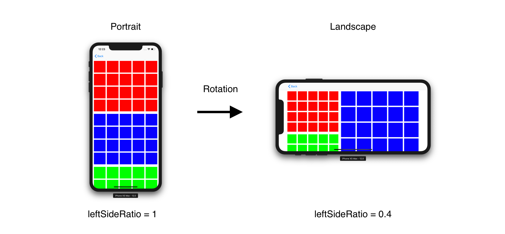
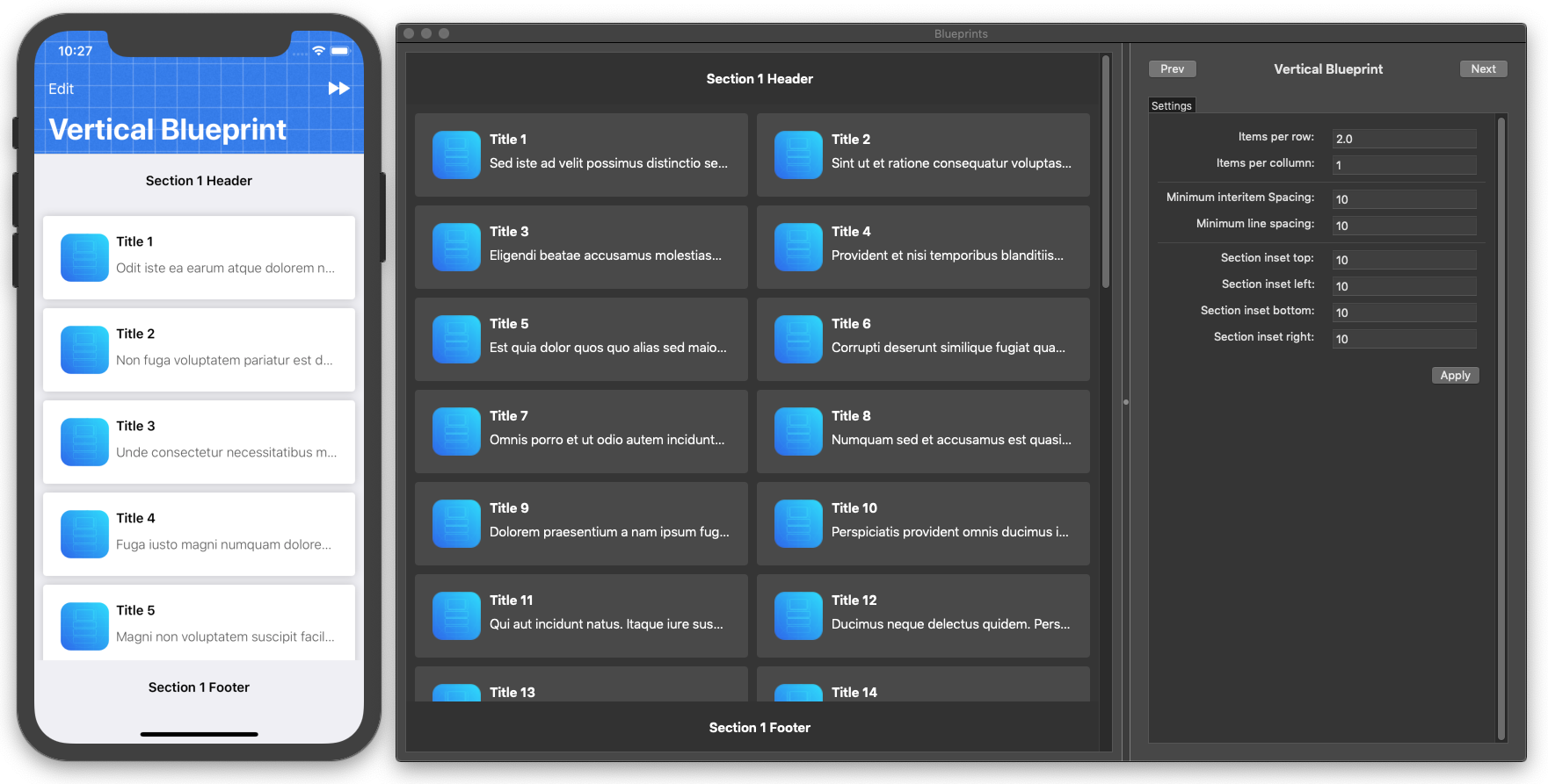
For example, UICollectionViewSplitLayout can change the number of column according to device orientation. All you need is assigning value to leftSideRatio when changing screen size. This figure describes that a collection view has three sections (red, blue and green) and UICollectionViewSplitLayout aligns them side by side.
UICollectionViewSplitLayout looks like UIStackView. But it has a more memory efficient architecture. So you can align a lot of cells with it.
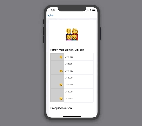
It may be hard to imagine how it works, please run EmojiCollectionViewController.
Requirement
- iOS 9.0+
- Swift 4.2
Installation
Carthage
1. create Cartfile
github "https://github.com/yahoojapan/UICollectionViewSplitLayout"
2. install
> carthage update
CocoaPods
1. create Podfile
platform :ios, '8.0'
use_frameworks!

pod "UICollectionViewSplitLayout", :git => 'https://github.com/yahoojapan/UICollectionViewSplitLayout.git'
2. install
> pod install
Getting Started
It’s good to start from replacing UICollectionViewFlowLayout with UICollectionViewSplitLayout.
1. Create UICollectionViewController
Set UICollectionViewController on Storyboard.
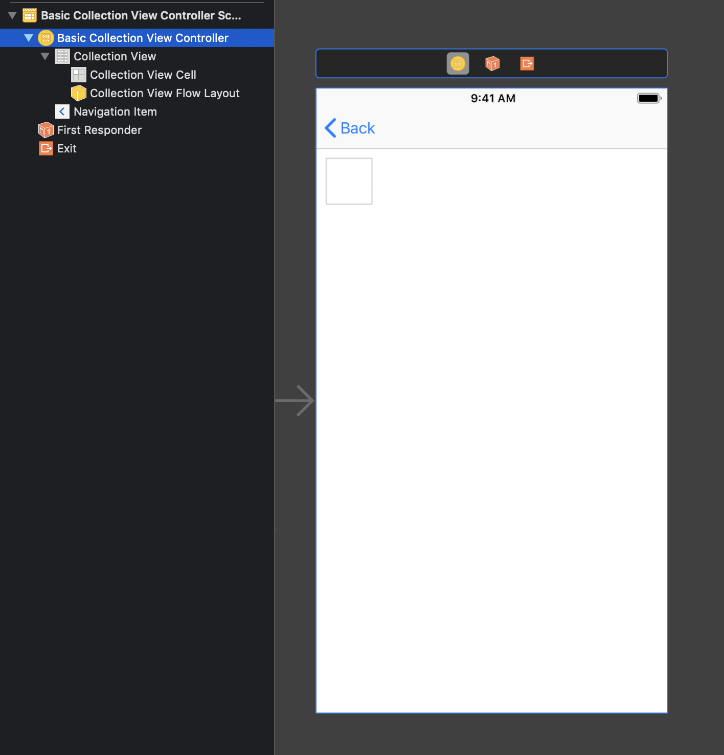
Add implementation to construct a collection view.
import UIKit

private let reuseIdentifier = "Cell"

class BasicCollectionViewController: UICollectionViewController {

    var dataSource: [[UIColor]] = [
        (0..<20).map { _ in .red },
        (0..<20).map {  _ in .blue },
        (0..<20).map {  _ in .green }
    ]

    override func viewDidLoad() {
        super.viewDidLoad()
        self.collectionView!.register(UICollectionViewCell.self, forCellWithReuseIdentifier: reuseIdentifier)
    }
    // MARK: UICollectionViewDataSource

    override func numberOfSections(in collectionView: UICollectionView) -> Int {
        return dataSource.count
    }


    override func collectionView(_ collectionView: UICollectionView, numberOfItemsInSection section: Int) -> Int {
        return dataSource[section].count
    }

    override func collectionView(_ collectionView: UICollectionView, cellForItemAt indexPath: IndexPath) -> UICollectionViewCell {
        let cell = collectionView.dequeueReusableCell(withReuseIdentifier: reuseIdentifier, for: indexPath)
        cell.backgroundColor = dataSource[indexPath.section][indexPath.row]
        return cell
    }
}
Build the code.
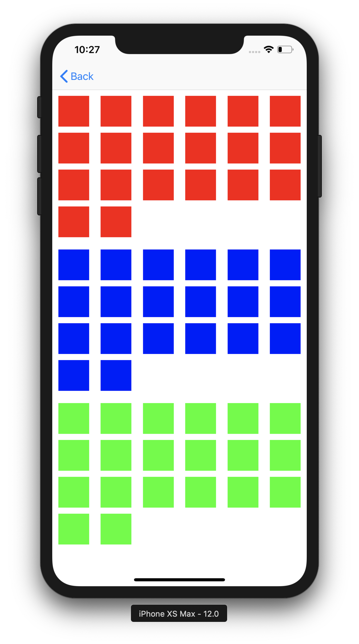
It shows three sections whose items have different colors.
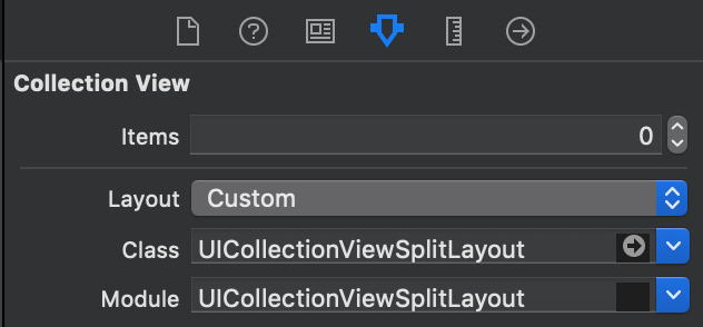
2. Input "UICollectionViewSplitLayout" as Custom Layout Class
Switch "Flow" to "Custom" in Layout attribute and input "UICollectionViewSplitLayout" into Class and Module attributes.
3. Assign parameters to UICollectionViewSplitLayout object
Connect the layout class to source code. Assign the parameters on viewDidLoad()
    @IBOutlet weak var layout: UICollectionViewSplitLayout!

    override func viewDidLoad() {
        super.viewDidLoad()
        //...
        //...

        // margins for each section
        layout.minimumItemLineSpacing = 8
        layout.minimumInterItemSpacing = 8
        layout.sectionInset = UIEdgeInsets(top: 8, left: 8, bottom: 8, right: 8)

        // Column Setting
        layout.leftSideRatio = 0.4
        layout.splitSpacing = 8

        //...
        //...
    }
4. Implement the layout delegate for UICollectionViewSplitLayout
Implement UICollectionViewDelegateTwoColumnLayout. The following methods is required.
extension BasicCollectionViewController: UICollectionViewDelegateSectionSplitLayout {
    // Fix the size of each item as UICollectionViewDelegateFlowLayout does. calculateFixedWidthRaughly() is utility method UICollectionViewSplitLayout has.
    func collectionView(_ collectionView: UICollectionView, layout collectionViewLayout: UICollectionViewLayout, sizeForItemAtIndexPath indexPath: IndexPath, width: CGFloat, side: UICollectionViewSplitLayoutSide) -> CGSize {
        let width = layout.calculateFixedWidthRaughly(
                               to: 3,
                               of: side,
                               minimumInterItemSpacing: layout.minimumInterItemSpacing,
                               sectionInset: layout.sectionInset)
        return CGSize(width: width, height: width)
    }

    func collectionView(_ collectionView: UICollectionView, layout collectionViewLayout: UICollectionViewLayout, sideForSection section: Int) -> UICollectionViewSplitLayoutSide {
        // when a section number is odd, the items are placed into left side.
        return section % 2 == 0 ? .left : .right
    }
}
It arranges the sections side by side.

See BasicCollectionViewController to run the above example.
Architecture
It is one of the UICollectionViewLayout. So you can change a layout without updating code in UICollectionViewDelegate and UICollectionViewDataSource. It is reasonable to apply a new layout. All you have to do is studying layout class and the delegate.
Usage
How to Split
UICollectionViewSplitLayout calculates width of the left and right side with the following parameter.
leftSideRatio = 0.4
It has a Float value which is the ration of left side to the entire width. In addition, left and right sides have spacing between them.
splitSpacing = 10
If a collection view has 110pt width, the above setting requires 40pt width to the left side and 60pt width to the right side. When leftSideRatio has 0.0, splitSpacing is ignored as an exception.
You can choose which side each section is in. UICollectionViewDeleagteSectionSplitLayout provides a method to do that.
func collectionView(_ collectionView: UICollectionView, layout collectionViewLayout: UICollectionViewLayout, sideForSection section: Int) -> UICollectionViewSplitLayoutSide
UICollectionViewSplitLayout hooks the delegate every time a collection view calls invalidateLayout().
Margins
UICollectionViewSplitLayout has these parameters to determine margins.
/// The minimum spacing to use between items in the same row.
open var minimumInterItemSpacing: CGFloat
/// The minimum spacing to use between lines of items in the grid.
open var minimumItemLineSpacing: CGFloat
/// The margins used to lay out content in a section
open var sectionInset: UIEdgeInsets
They have the corresponding delegate methods by section (optional).
// section inset to each section
@objc optional func collectionView(_ collectionView: UICollectionView, layout collectionViewLayout: UICollectionViewLayout, insetForSectionAtIndex section: Int, side: UICollectionViewSplitLayoutSide) -> UIEdgeInsets

// minimumInterItemSpacing to each section
@objc optional func collectionView(_ collectionView: UICollectionView, layout collectionViewLayout: UICollectionViewLayout, minimumInterItemSpacingForSectionAtIndex section: Int, side: UICollectionViewSplitLayoutSide) -> CGFloat

// minimumItemLineSpacing to each section
@objc optional func collectionView(_ collectionView: UICollectionView, layout collectionViewLayout: UICollectionViewLayout, minimumItemLineSpacingForSectionAtIndex section: Int, side: UICollectionViewSplitLayoutSide) -> CGFloat
Pinning (iOS 11~)
UICollectionViewSplitLayout pins seciton header like UICollectionViewFlowLayout. This feature is supported from iOS 11. sectionPinToVisibleBounds enables to work it.
Setting Attriutes
UICollectionViewSplitLayout uses three kinds of attribute, item, supplementary view and decoration view.
Item
You need to implement cell sizing. UICollectionViewSplitLayout provides a delegate to implement it.
func collectionView(
    _ collectionView: UICollectionView,
    layout collectionViewLayout: UICollectionViewLayout,
    sizeForItemAtIndexPath indexPath: IndexPath,
    width: CGFloat,
    side: UICollectionViewSplitLayoutSide) -> CGSize
You can divide the sizes evenly with a utility method.
open func calculateFixedWidthRaughly(
    to num: Int,
    of side: UICollectionViewSplitLayoutSide,
    minimumInterItemSpacing: CGFloat,
    sectionInset: UIEdgeInsets) -> CGFloat
Supplementary view for header and footer
You can implement header and footer sizing. UICollectionViewSplitLayout provides delegate to implement it. If the sizes are zero, header and footer are ignoured.
// header
@objc optional func collectionView(_ collectionView: UICollectionView, layout collectionViewLayout: UICollectionViewLayout, referenceSizeForHeaderInSection section: Int, width: CGFloat, side: UICollectionViewSplitLayoutSide) -> CGSize

// footer size
@objc optional func collectionView(_ collectionView: UICollectionView, layout collectionViewLayout: UICollectionViewLayout, referenceSizeForFooterInSection section: Int, width: CGFloat, side: UICollectionViewSplitLayoutSide) -> CGSize
decoration view for backgroundColor
UICollectionSplitLayout has a special decoration view. It has the same size as the section. You can determine backgroundColor to each section with the following delegate.
@objc optional func collectionView(
    _ collectionView: UICollectionView,
    layout collectionViewLayout: UICollectionViewLayout,
    itemsBackgroundColorFor section: Int,
    side: UICollectionViewSplitLayoutSide) -> UIColor?
Line Height Normalization
If isNormalizingLineHeight is true, item height is adjusted to outline height of the line (defalut: false).
open var isNormalizingLineHeight: Bool
License
The MIT License (MIT)
Copyright (c) 2018 Yahoo Japan Corporation
Permission is hereby granted, free of charge, to any person obtaining a copy of this software and associated documentation files (the "Software"), to deal in the Software without restriction, including without limitation the rights to use, copy, modify, merge, publish, distribute, sublicense, and/or sell copies of the Software, and to permit persons to whom the Software is furnished to do so, subject to the following conditions:
The above copyright notice and this permission notice shall be included in all copies or substantial portions of the Software.
THE SOFTWARE IS PROVIDED "AS IS", WITHOUT WARRANTY OF ANY KIND, EXPRESS OR IMPLIED, INCLUDING BUT NOT LIMITED TO THE WARRANTIES OF MERCHANTABILITY, FITNESS FOR A PARTICULAR PURPOSE AND NONINFRINGEMENT. IN NO EVENT SHALL THE AUTHORS OR COPYRIGHT HOLDERS BE LIABLE FOR ANY CLAIM, DAMAGES OR OTHER LIABILITY, WHETHER IN AN ACTION OF CONTRACT, TORT OR OTHERWISE, ARISING FROM, OUT OF OR IN CONNECTION WITH THE SOFTWARE OR THE USE OR OTHER DEALINGS IN THE SOFTWARE.

 4.2k Jan 3, 2023

 1.3k Dec 24, 2022
 982 Dec 7, 2022
 1.3k Jan 6, 2023

 1.6k Dec 30, 2022
 1.1k Jan 1, 2023
 12k Jan 7, 2023
 4 Dec 29, 2022

 6.8k Dec 27, 2022


 940 Dec 22, 2022

 79 Apr 18, 2022

 106 Dec 19, 2022
 69 Sep 21, 2022
 2.6k Nov 29, 2022
 96 Dec 22, 2022

 775 Dec 7, 2022

 591 Dec 14, 2022
 252 Nov 23, 2022
 982 Dec 7, 2022
 224 Dec 19, 2022
 239 Dec 6, 2022
 300 Oct 10, 2022
 5 Sep 15, 2022
 0 Jan 9, 2022
 1 Jan 24, 2022
 4.2k Jan 5, 2023