An animated popover that pops out a given frame, great for subtle UI tips and onboarding.

Overview

Test suite CocoaPods Docs Carthage compatible Swift 5.0 Join the chat at https://gitter.im/andreamazz/AMPopTip

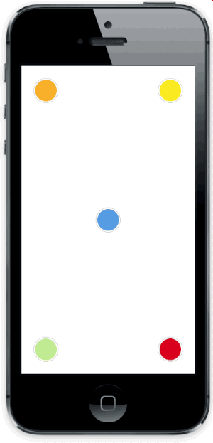
Animated popover that pops out of a frame. You can specify the direction of the popover and the arrow that points to its origin. Color, border radius and font can be easily customized. This popover can be used to leave subtle hints about your UI and provide fun looking onboarding popups.

Screenshot

AMPopTip

Versioning notes

With version 2.0.0 the library was re-written in Swift, and the API was slightly updated. Checkout version 1.5.x for the previous Objective-C implementation.

Version 3.0.0 introduces Swift 4 support, 3.5.0 Swift 4.2.

Setup with CocoaPods

  • Add pod 'AMPopTip' to your Podfile
  • Run pod install
  • Run open App.xcworkspace

Setup with Carthage

  • Add github "andreamazz/AMPopTip"
  • Run carthage update
  • Add AMPopTip.framework in your project

You can then import the framework in your project

import AMPopTip

Usage

The API is fairly straight forward, you can show and hide the popover at any time.

Showing the popover

You must specify the text that you want to display alongside the popover direction, its max width, the view that will contain it and the frame of the view that the popover's arrow will point to.

let popTip = PopTip()
popTip.show(text: "Hey! Listen!", direction: .up, maxWidth: 200, in: view, from: someView.frame)

You can also display the popover in the center, with no arrow, in this case the from can be the whole view:

popTip.show(text: "Hey! Listen!", direction: .none, maxWidth: 200, in: view, from: view.frame)

Coordinate system

Please note that the frame you are intended to provide needs to refer to the absolute coordinate system of the view you are presenting the popover in. This means that if you are presenting the popover in a view, pointing to a nested subview, you'll need to convert its frame using UIKit's convertRect(_:toView:). Read the reference here.

Direction

You can specify the direction that the tip will occupy, or you can let the library decide by using auto (all axis), autoHorizontal (only left or right) or autoVertical (only up or down). Once the popup is visible, the direction property will hold the direction that was decided.

Showing a custom view

You can provide a custom view that will be wrapped in the PopTip and presented.

let customView = UIView(frame: CGRect(x: 0, y: 0, width: 100, height: 100))
// Configure your view
popTip.show(customView: customView, direction: .down, in: view, from: someView.frame)

Showing a custom SwiftUI view

You can provide a custom SwiftUI view that will be embed in a UIHostingController, added to a parent controller and then wrapped in the PopTip and presented.

let customSwiftUIView = MySwiftUIView()
// Configure your view
popTip.show(rootView: customSwiftUIView, direction: .down, in: view, from: someView.frame, parent: someParentViewController)

Dismissing the popover

You can hide the popover by calling:

popTip.hide()

Or you can specify the duration of the popover:

popTip.show(text: "Hey! Listen!", direction: .up, maxWidth: 200, in: view, from: someView.frame, duration: 3)

You can also let the user dismiss the popover by tapping on it:

popTip.shouldDismissOnTap = true

You can add a block that will be fired when the user taps the PopTip...

popTip.tapHandler = { popTip in
  print("\(popTip) tapped")
}

... when the popover is shown...

popTip.appearHandler = { popTip in
  print("\(popTip) appeared")
};

... or when the popover is dismissed:

popTip.dismissHandler = { popTip in
  print("\(popTip) dismissed")
}

popTip.tapOutsideHandler = { _ in
  print("tap outside")
}

popTip.swipeOutsideHandler = { _ in
  print("swipe outside")
}

Updating the PopTip

You can update the text, attributed text, or custom view to a PopTip already visible:

popTip.update(text: "New string")
popTip.update(attributedText: someAttributedString)
popTip.update(customView: someView)

The position can also be changed by updating the from property:

let here = CGRect(x: 100, 100, 10, 10)
let there = CGRect(x: 400, 400, 10, 10)

popTip.show(text: "Hey! Listen!", direction: .up, maxWidth: 200, in: view, from: here)
DispatchQueue.main.asyncAfter(deadline: .now() + 2) {
  popTip.from = there
}

Custom entrance animation

You can choose which animation should be performed when the popTip is displayed:

popTip.entranceAnimation = .scale;

Available animations:

PopTipEntranceAnimation.scale,
PopTipEntranceAnimation.transition,
PopTipEntranceAnimation.none,
PopTipEntranceAnimation.custom

PopTipEntranceAnimation.custom

You can provide your own animation block when using PopTipEntranceAnimation.custom:

popTip.entranceAnimationHandler = { [weak self] completion in
  guard let `self` = self else { return }
  self.popTip.transform = CGAffineTransform(rotationAngle: 0.3)
  UIView.animate(withDuration: 0.5, animations: {
    self.popTip.transform = .identity
  }, completion: { (_) in
    completion()
  })
}

This sample makes the PopTip rotate on entrance. Make sure to call the completion block when the animation is done. Also note that the animation is fired as soon as the PopTip is added as subview.

Action animations

Action animations are subtle animations that can be performed to get the user's attention. Set your preferred animation:

popTip.actionAnimation = .bounce()

Available animations:

PopTipActionAnimation.bounce,
PopTipActionAnimation.float,
PopTipActionAnimation.pulse,
PopTipActionAnimation.none

The animation is fired as soon as the popover enters the scene and completes its entrance animation, if startActionAnimationOnShow is set to true.

Customize the animations

You can pass a custom value as an associated value to customize the action animation:

popTip.actionAnimation = .bounce(16) // This will bounce for 16px instead of the default value

AMPopTip bounce

Customizing the arrow position

The arrow is centered by default, and moves to avoid the edge of the screen. You can manually change the offset from the center using the bubbleOffset property.

A note about subviews

The popover is presented inside the view provided in the in parameter. If this view is smaller than the resulting popover, to prevent clipping set clipsToBounds = false on the presenting view, and set constrainInContainerView = false to the pop tip instance. See #175 for more context.

Customization

Use the appearance proxy to customize the popover before creating the instance, or just use its public properties:

textColor = <#UIColor#>;
textAlignment = <#NSTextAlignment#>
bubbleColor = <#UIColor#>
borderColor = <#UIColor#>
borderWidth = <#CGFloat#>
cornerRadius = <#CGFloat#> // Popover's border radius
rounded = <#Bool#> // If set to YES the radius will equal frame.height / 2
offset = <#CGFloat#> // Offset between the popover and the origin
font = <#UIFont#>
padding = <#CGFloat#>
edgeInsets = <#UIEdgeInsets#>
arrowSize = <#CGSize#>
animationIn = <#TimeInterval#>
animationOut = <#TimeInterval#>
delayIn = <#TimeInterval#>
delayOut = <#TimeInterval#>
entranceAnimation = <#PopTipEntranceAnimation#>
actionAnimation = <#PopTipActionAnimation#>
actionAnimationIn = <#TimeInterval#>
actionAnimationOut = <#TimeInterval#>
actionDelayIn = <#TimeInterval#>
actionDelayOut = <#TimeInterval#>
edgeMargin = <#CGFloat#>
bubbleOffset = <#CGFloat#> // Offset between the bubble and the origin
arrowOffset = <#CGFloat#> // Offset between the bubble center and the arrow
arrowRadius = <#CGFloat#>
shadowOpacity = <#Float#>
shadowRadius = <#Float#>
shadowOffset = <#CGSize#>
shadowColor = <#UIColor#>

Author

Andrea Mazzini. I'm available for freelance work, feel free to contact me.

Want to support the development of these free libraries? Buy me a coffee ☕️ via Paypal.

Contributors

Thanks to everyone kind enough to submit a pull request.

MIT License

Copyright (c) 2017 Andrea Mazzini. All rights reserved.

Permission is hereby granted, free of charge, to any person obtaining a
copy of this software and associated documentation files (the "Software"),
to deal in the Software without restriction, including
without limitation the rights to use, copy, modify, merge, publish,
distribute, sublicense, and/or sell copies of the Software, and to
permit persons to whom the Software is furnished to do so, subject to
the following conditions:

The above copyright notice and this permission notice shall be included
in all copies or substantial portions of the Software.

THE SOFTWARE IS PROVIDED "AS IS", WITHOUT WARRANTY OF ANY KIND, EXPRESS
OR IMPLIED, INCLUDING BUT NOT LIMITED TO THE WARRANTIES OF
MERCHANTABILITY, FITNESS FOR A PARTICULAR PURPOSE AND NONINFRINGEMENT.
IN NO EVENT SHALL THE AUTHORS OR COPYRIGHT HOLDERS BE LIABLE FOR ANY
CLAIM, DAMAGES OR OTHER LIABILITY, WHETHER IN AN ACTION OF CONTRACT,
TORT OR OTHERWISE, ARISING FROM, OUT OF OR IN CONNECTION WITH THE
SOFTWARE OR THE USE OR OTHER DEALINGS IN THE SOFTWARE.
Comments
  • Use as callout view in `MKMapView`

    Use as callout view in `MKMapView`

    I tried presenting the poptip when a user taps on a MKAnnotationView in a MKMapView, to act as a custom callout view like so:

    func mapView(_ mapView: MKMapView, didSelect view: MKAnnotationView) {
    _callout.show(attributedText: someAttributedText),
                              direction: .up,
                              maxWidth: 233,
                              in: mapView,
                              from: view.frame)
    }
    

    but the bubble is not attached to the annotation view, and it doesn't move with it when the map is panned but just stays in one place. Is there a way to achieve this?

    opened by dimovskidamjan 29
  • Bubble Padding X position

    Bubble Padding X position

    opened by JaimeYesidLeonParada 14
  • Pop tip zero frame

    Pop tip zero frame

    Hello,

    I am trying to add a pop tip to a scroll view but nothing shows up. When I look at the subviews of the scrollview the AMPopTip is there but the frame is 0. What could be causing this?

    <AMPopTip: 0x7fbdfc8bfe00; frame = (0 0; 0 0); text = 'Tap to be...'; animations = { transform=<CASpringAnimation: 0x7fbdfa55a520>; }; layer = <CALayer: 0x7fbdfc8893b0>>

    Thanks! Michael

    opened by realsurfer 14
  • Strange flashing behavior

    Strange flashing behavior

    This is an EXCELLENT library. It's exactly what I needed. Quick issue: when rapidly adding/removing pops from my view, I'll get weird flashing above the point. Is this an animation issue? Forgive my ignorance, I'm a relatively new developer :)

    Keep up the good work!

    ezgif com-video-to-gif

    bug 
    opened by joshhaug 13
  • Rounded arrow

    Rounded arrow

    Hi @andreamazz, thank you for your super AMPopTip! :)

    What do you think of adding a property like arrowRadius to have a rounded arrow? I would like it very much! Something like this:

    screen shot 2015-05-05 at 13 49 02

    enhancement 
    opened by kevin-hirsch 12
  • Offset the arrow

    Offset the arrow

    I want to move the arrow, now that the arrow is centered by default, can you set the arrow to go a little bit to the left or a little bit to the right @andreamazz

    question 
    opened by flyOfYW 10
  • Swift version

    Swift version

    Hi everyone, I've converted the library in Swift, and took the chance to clean up part of the API.
    Since part of the code was refactored, some manual tests for some edge cases would be welcomed 😬

    For now everything is in the swift branch, the current version will live under the v1.x branch.

    help wanted 
    opened by andreamazz 10
  • AMPopTip Doesn't work with XIB created CustomView set for this PopTip, All App hangs

    AMPopTip Doesn't work with XIB created CustomView set for this PopTip, All App hangs

    Hello I am building the AMPopTip with this code as mentioned , but the UI hangs if I use the XIB created custom view.

    @property (nonatomic, strong) AMPopTip *popTip1; @property (nonatomic, strong) CLInfoPopUpView *popUpView; //My view

    //Initialised tried using local in button tape or in View did load as well : CLInfoPopUpView * popView = [[[NSBundle mainBundle] loadNibNamed:@"CLInfoPopUpView" owner:self options:nil] lastObject];

    self.popTip1 = [AMPopTip popTip];
    self.popTip1.shouldDismissOnTap = YES;
    self.popTip1.edgeMargin = 0;
    self.popTip1.offset = 2;
    self.popTip1.edgeInsets = UIEdgeInsetsMake(0, 0, 0, 0);
    [self.popTip1 setBackgroundColor:[UIColor grayColor]];
    [self.popTip1 setPopoverColor:[UIColor grayColor]];
    

    The Button function of tap show this.

    if ([self.popTip1 isVisible]) { [self.popTip1 hide];

        self.popTip1 = [AMPopTip popTip];
    
        return;
    }
        [self.popTip1 showCustomView:popView direction:AMPopTipDirectionDown inView:self.view fromFrame:cell.infoBtn.frame];
    

    Tool tip comes first time but later app hang no operations happening. Similarly if I try using the UIview alloc init method to make the custom view as u show in Demo it work , can you help why this is happening.

    awaiting feedback 
    opened by vicky1787 9
  • PopTips on Views with scroll

    PopTips on Views with scroll

    When i try to use the PopTip on a Scrollable view (most in cases of 3.5") only works when the view is in the original position, when you change, the PopTip remains on that position, doesn't change even when you try to show it again...

    opened by alph0x 9
  • Add objective-c support to swift4 master branch

    Add objective-c support to swift4 master branch

    Hi @andreamazz Thanks for the awesome library. Can you plz add objective-c support to swift4 master branch, so that the new features can be used in objective-c too

    opened by hardikamal 8
  • Did you drop iOS 9-10 support?

    Did you drop iOS 9-10 support?

    I cannot build the last release using Xcode 8.3.3 (8E3004b). The error is "Use of unresolved identifier 'NSAttributedStringKey'". According to documentation NSAttributedStringKey works under iOS 11.0+.

    opened by sample-repo 8
  • Fix unexpected behavior when dismissing a poptip during the entrance animation.

    Fix unexpected behavior when dismissing a poptip during the entrance animation.

    I was encountering an issue where I was using hide(forced: true) during the poptip entrance animation, and it would cause unexpected animations (my poptip would briefly fill the whole screen), and would cause other elements of my UI to stop responding to taps.

    This seemed to be due to the code that is run in the completion handler of performEntranceAnimation in show(duration:), which was mixing in unexpected ways with the exit animation.

    This change introduces a new piece of state tracking whether the exit animation is occurring, and uses that to block the post-entrance-animation code from running in this case, which seems to resolve the issues I was encountering.

    I have not exhaustively tested this behavior, but it is working properly in my own app. If there are tests I should run or other scenarios you'd like me to check, let me know.

    opened by chrisvasselli 0
  •  If a PopTip is visible and we hide that Poptip and click show it again, the Poptip won't show.

    If a PopTip is visible and we hide that Poptip and click show it again, the Poptip won't show.

    Describe the bug I'm having an issue: If a PopTip is visible and we hide that Poptip and click show it again, the Poptip won't show.

    From version 4.5.0 and earlier this seems to work properly. But the versions from 4.5.1 -> 4.6.1 it encounter this problem. Could there be any help that could fix it?

    Thank you. Regards.

    Screenshots https://user-images.githubusercontent.com/108263632/175911424-51ede1a9-7107-473b-b635-3016d211247a.mov

    opened by quyen1502 2
  • Crashes while launching the app

    Crashes while launching the app

    After updating to 4.6.1, The pod crashes while launching the app Error in Xcode command line: dyld[77051]: Library not loaded: @rpath/AMPopTip.framework/AMPopTip

    Below is the dyld error: Screen Shot 2022-01-12 at 3 01 55 PM

    opened by Pravalika-Donthineni 0
  • Top border gets cut-out

    Top border gets cut-out

    Describe the bug By setting a border and showing with .up direction will render half of of the top border

    To Reproduce My settings

            popTip = PopTip()
            popTip.shouldDismissOnTap = false
            popTip.shouldDismissOnTapOutside = false
            popTip.shouldDismissOnSwipeOutside = false
            popTip.bubbleOffset = 0
            popTip.edgeInsets = UIEdgeInsets(
                top: 0,
                left: 8,
                bottom: 0,
                right: 8)
            popTip.bubbleColor = .white
            popTip.borderColor = .textGrey750
            popTip.borderWidth = 2
            popTip.cornerRadius = 12
            popTip.arrowRadius = 2
    

    calling it later with .up will cut-out half of the top border.

    Expected behavior Top border should be properly rendered

    Screenshots image

    I've tracked the issue down to this piece of code in PopTip+Draw.swift (lines 83-88):

          // 7: Top left arc
          path.addArc(withCenter: CGPoint(x: baloonFrame.minX + radius + borderWidth, y: baloonFrame.minY + radius), radius:radius, startAngle: CGFloat.pi, endAngle: CGFloat.pi * 1.5, clockwise: true)
          // 8: Top line
          path.addLine(to: CGPoint(x: baloonFrame.width - radius, y: baloonFrame.minY))
          // 9: Top right arc
          path.addArc(withCenter: CGPoint(x: baloonFrame.width - radius, y: baloonFrame.minY + radius), radius:radius, startAngle: CGFloat.pi * 1.5, endAngle: 0, clockwise:true)
    

    Looks like is not accounting for the borderWidth. The stroke will be applied right in the edge of the path, so half inside of the balloon, half outside. That way, the path should account for the outer part of the border stroke. From UIBezierPath.fill() docs

    The painted region includes the pixels right up to, but not including, the path line itself. For paths with large line widths, this can result in overlap between the fill region and the stroked path (which is itself centered on the path line).

    opened by gchiacchio 1
  • shouldDismissOnSwipeOutside is not working

    shouldDismissOnSwipeOutside is not working

    Hello, first of all thanks for your work and framework! There is an issue with swipe outside tooltip. I have a screen with tableview (Not tableview controller, just view controller with tableview inside).

    I'm showing a tooltip on this screen's view. Enabling swipe directions to up and down, shouldDismissOnSwipeOutside to true as a PopTip init. Also, from a similar issue I've used fix with setting gestureDelegates to view and shouldRecognizeSimultaneouslyWith to return true. And it's working, but not as expected. PopTip disappears correctly if user will wait until animation ends, but, if user will scroll before it's end — then PopTip wouldn't be hidden.

    As a possible solution — I'm disabling the animation, or moving gestureDelegates set outside PopTip animated appearance.

    Appreciate any help!

    opened by RossonskiyParen 0
Releases(4.4.0)
Owner
Andrea Mazzini
💻 Software Engineer 🌲 Woodworker
Andrea Mazzini
Configurable animated onboarding screen written programmatically in Swift for UIKit

Configurable animated onboarding screen written programmatically in Swift for UIKit – inspired by many Apple-designed user interfaces in iOS – with Insignia as an example.

Lukman “Luke” Aščić 370 Dec 27, 2022
An iOS framework to easily create a beautiful and engaging onboarding experience with only a few lines of code.

Onboard Click Here For More Examples Important Onboard is no longer under active development, and as such if you create any issues or submit pull requ

Mike 6.5k Dec 17, 2022
SwiftUI library for a walkthrough or onboarding flow with tap actions

Concentric Onboarding iOS library for a walkthrough or onboarding flow with tap actions written with SwiftUI We are a development agency building phen

Exyte 955 Jan 4, 2023
OnboardKit - Customizable user onboarding for your UIKit app in Swift

OnboardKit Customizable user onboarding for your UIKit app in Swift Requirements Swift 5.0 Xcode 10 iOS 11.0+ Installation Carthage github "NikolaKire

Nikola Kirev 470 Dec 23, 2022
iOS library Paper Onboarding is a material design UI slider written on Swift.

iOS library Paper Onboarding is a material design UI slider written on Swift. We specialize in the designing and coding of custom UI

Ramotion 3.2k Jan 5, 2023
A swifty iOS framework that allows developers to create beautiful onboarding experiences.

SwiftyOnboard is being sponsored by the following tool; please help to support us by taking a look and signing up to a free trial SwiftyOnboard A simp

Juan Pablo Fernandez 1.2k Jan 2, 2023
DeliveryOnboardingSwiftUI - A Delivery Onboarding screen made with SwiftUI

DeliveryOnboardingSwiftUI Its a Onboarding screen made with SwiftUI

null 1 Feb 5, 2022
SwiftyWalkthrough is a library for creating great walkthrough experiences in your apps, written in Swift.

SwiftyWalkthrough is a library for creating great walkthrough experiences in your apps, written in Swift. You can use the library to allow users to navigate and explore your app, step by step, in a predefined way controlled by you.

Rui Costa 370 Nov 24, 2022
Presentation helps you to make tutorials, release notes and animated pages.

Presentation helps you to make tutorials, release notes and animated pages.

HyperRedink 3k Jan 5, 2023
An iOS framework to easily create simple animated walkthrough, written in Swift.

Intro Overview An iOS framework to easily create simple animated walkthrough, written in Swift. Requirements iOS8 Installation with CocoaPods Intro is

Nurdaulet Bolatov 33 Oct 1, 2021
Create walkthroughs and guided tours (coach marks) in a simple way, with Swift.

Add customizable coach marks into your iOS project. Available for both iPhone and iPad. ⚠️ Instructions 2.0.1 brings a couple of breaking changes, ple

Frédéric Maquin 4.9k Jan 3, 2023
A super-charged version of MYIntroductionView for building custom app introductions and tutorials.

MYBlurIntroductionView #####NOTICE: As of February 4th, Apple has begun to ban new app submissions using the common blurring method (UIToolbar hack) f

Matthew York 1.5k Dec 23, 2022
A simple and attractive AlertView to onboard your users in your amazing world.

AlertOnboarding A simple and attractive AlertView to onboard your users in your amazing world. PRESENTATION This AlertOnboarding was inspired by this

Boisney Philippe 832 Jan 8, 2023
Show overlay and info on app components

SwiftyOverlay App Intro / Instruction component to show data over app UI at run time! Easy to use, Animated and Customizable. Supported Components are

Saeid 80 Aug 29, 2022
PRGTipView is a drop-in solution for adding onboarding tips to your apps

PRGTipView PRGTipView is a drop-in solution for adding onboarding tips to your apps. It supports: Title, detail and dismissal button Give focus on a p

Iannis Spiropoulos 25 Aug 12, 2022
A Popover that mock iOS SkinTone Selection Popover.

IMessage SkinTone Popover This is a popover mock the iOS iMessage Skin Tone Selection Menu (Popover) Features Long press to invoeke the popover, and t

Vincent Liu 1 Dec 9, 2021
Finds the .dSYM for a given binary image name and replaces its internal UUID with the given UUID.

dsymrename Given a directory with several .dSYMs, finds the .dSYM for a given binary image name and replaces its internal UUID with the given UUID. Us

Stefan Schmitt 15 Jul 17, 2022
Inspired by Fabric - Answers animation. Allows to "build" given view with pieces. Allows to "destroy" given view into pieces

ADPuzzleAnimation Whats inside Custom animation for UIView inspired by Fabric - Answers animation. Easy to use To create your first animation you need

Anton 126 Dec 25, 2022
Weatherflow-local - Basic frame-out of a SwiftUI macOS app to receive & display WeatherFlow UDP broadcast messages

WeatherFlow Local A very basic/skeleton SwiftUI macOS app for receiving and disp

boB Rudis 4 Feb 6, 2022
Elimination-backoff stack is an unbounded lock-free LIFO linked list, that eliminates concurrent pairs of pushes and pops with exchanges.

Elimination-backoff stack is an unbounded lock-free LIFO linked list, that eliminates concurrent pairs of pushes and pops with exchanges. It uses compare-and-set (CAS) atomic operation to provide concurrent access with obstruction freedom. In order to support even greater concurrency, in case a push/pop fails, it tries to pair it with another pop/push to eliminate the operation through exchange of values.

Ebubechukwu Dimobi 0 Dec 26, 2021