A simple way to show toast in SwiftUI
Documentation • Example • Change Log
Overview
ToastUI provides you a simple way to present toast, head-up display (HUD), custom alert, or any SwiftUI views on top of everything in SwiftUI.
- Getting started
- Requirements
- Installation
- Documentation
- Contributing
- Author
- Acknowledgements
- License
Getting started
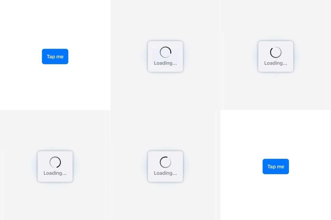
Here is an example to present an indefinite progress indicator HUD and dismiss it after 2 seconds.
struct ContentView: View {
  @State private var presentingToast: Bool = false

  var body: some View {
    Button {
      presentingToast = true
    } label: {
      Text("Tap me")
        .bold()
        .foregroundColor(.white)
        .padding()
        .background(Color.accentColor)
        .cornerRadius(8.0)
    }
    .toast(isPresented: $presentingToast, dismissAfter: 2.0) {
      print("Toast dismissed")
    } content: {
      ToastView("Loading...")
        .toastViewStyle(IndefiniteProgressToastViewStyle())
    }
  }
}
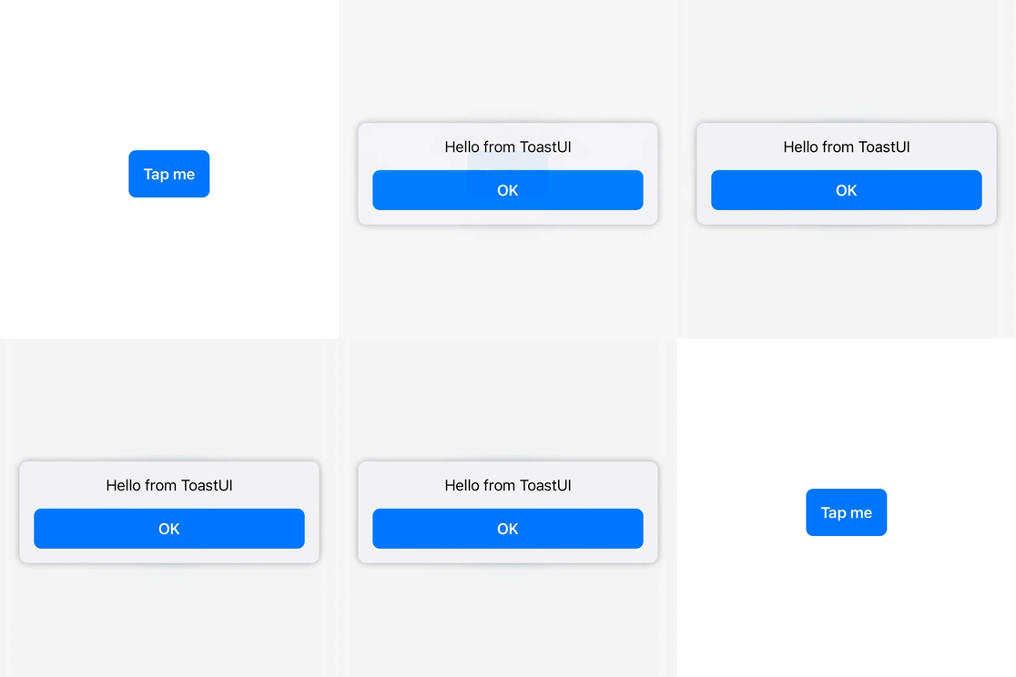
You can also present custom alerts or any SwiftUI views of your choice.
struct ContentView: View {
  @State private var presentingToast: Bool = false

  var body: some View {
    Button {
      presentingToast = true
    } label: {
      Text("Tap me")
        .bold()
        .foregroundColor(.white)
        .padding()
        .background(Color.accentColor)
        .cornerRadius(8.0)
    }
    .toast(isPresented: $presentingToast) {
      ToastView {
        VStack {
          Text("Hello from ToastUI")
            .padding(.bottom)
            .multilineTextAlignment(.center)

          Button {
            presentingToast = false
          } label: {
            Text("OK")
              .bold()
              .foregroundColor(.white)
              .padding(.horizontal)
              .padding(.vertical, 12.0)
              .background(Color.accentColor)
              .cornerRadius(8.0)
          }
        }
      }
    }
  }
}
Have a look at the ToastUISample project for more examples and also check out the Documentation below.
Requirements
- iOS 14.0+ | tvOS 14.0+ | macOS 11.0+
- Xcode 12.0+ | Swift 5.3+
Installation
Swift Package Manager
ToastUI is available through Swift Package Manager.
For app integration, add ToastUI to an existing Xcode project as a package dependency:
- From the File menu, select Swift Packages > Add Package Dependency...
- Enter https://github.com/quanshousio/ToastUI into the package repository URL text field.
- Xcode should choose updates package up to the next version option by default.
For package integration, add the following line to the dependencies parameter in your Package.swift .
dependencies: [
  .package(url: "https://github.com/quanshousio/ToastUI.git", from: "2.0.0")
]
CocoaPods
ToastUI is available through CocoaPods. To install it, add the following line to your Podfile :
pod 'ToastUI'
Documentation
For more detailed documentation, please see here.
Presenting
ToastUI supports presenting any SwiftUI views from anywhere. You just need to add toast() view modifier and provide your views, much like using alert() or sheet() .
.toast(isPresented: $presentingToast) {
  // your SwiftUI views here
}
There are two types of toast() view modifier. For more usage information, check out the examples.
toast(isPresented:dismissAfter:onDismiss:content:)– presents a toast when the given boolean binding is true.toast(item:dismissAfter:onDismiss:content:)– presents a toast using the given item as a data source for the toast's content.
ToastView
ToastUI comes with ToastView , which visually represented as a rounded rectangle shape that contains your provided views and has a default thin blurred background.
.toast(isPresented: $presentingToast) {
  ToastView("Hello from ToastUI")
}
Layout of ToastView is demonstrated in this figure below.
+-----------------------------+
|                             |
|  <Background>               |
|                             |
|        +-----------+        |
|        |           |        |
|        | <Content> |        |
|        |           |        |
|        |           |        |
|        |  <Label>  |        |
|        +-----------+        |
|                             |
|                             |
|                             |
+-----------------------------+

ToastView(<Label>) {
  <Content>
} background: {
  <Background>
}
ToastView with custom content views and custom background views.
.toast(isPresented: $presentingToast) {
  ToastView("Saved!") {
    // custom content views
    Image(systemName: "arrow.down.doc.fill")
      .font(.system(size: 48))
      .foregroundColor(.green)
      .padding()
  } background: {
    // custom background views
    Color.green.opacity(0.1)
  }
}
ToastView using built-in styles and without background.
.toast(isPresented: $presentingToast) {
  ToastView("Loading...") {
    // EmptyView()
  } background: {
    // EmptyView()
  }
  .toastViewStyle(IndefiniteProgressToastViewStyle())
}
Styling
ToastUI supports seven different ToastViewStyle s out-of-the-box. You have to use ToastView and set the style accordingly by using toastViewStyle(_:) modifier. All styles have native support for dynamic type for accessbility.
DefaultProgressToastViewStyle()– shows an empty toast if user does not provide anything.ToastViewuses this style by default.IndefiniteProgressToastViewStyle()– shows an indefinite circular progress indicator.DefiniteProgressToastViewStyle(value:total:)– shows a definite circular progress indicator from 0 to 100%.SuccessToastViewStyle()– shows a success toast.ErrorToastViewStyle()– shows an error toast.WarningToastViewStyle()- shows a warning toast.InfoToastViewStyle()– shows an information toast.
ToastUI includes a UI/NSVisualEffectView wrapper through cocoaBlur() view modifier, which is more flexible than existing blur(radius:opaque:) in SwiftUI.
cocoaBlur(blurStyle:vibrancyStyle:blurIntensity:)- for iOS.cocoaBlur(blurStyle:blurIntensity:)- for tvOS.cocoaBlur(material:blendingMode:state:)- for macOS.
Contributing
All issue reports, feature requests, pull requests and GitHub stars are welcomed and much appreciated.
Author
Quan Tran (@quanshousio)
Acknowledgements
- Fruta -
UI/NSVisualEffectViewwrapper for SwiftUI by Apple. - Label - an informative article about SwiftUI
Labeland style erasers by Five Stars. - SVProgressHUD - original design of the circular progress HUD by Sam Vermette and Tobias Tiemerding.
- SwiftUI Custom Styling - an informative article about SwiftUI custom styling by The SwiftUI Lab.
License
ToastUI is available under the MIT license. See the LICENSE file for more info.


