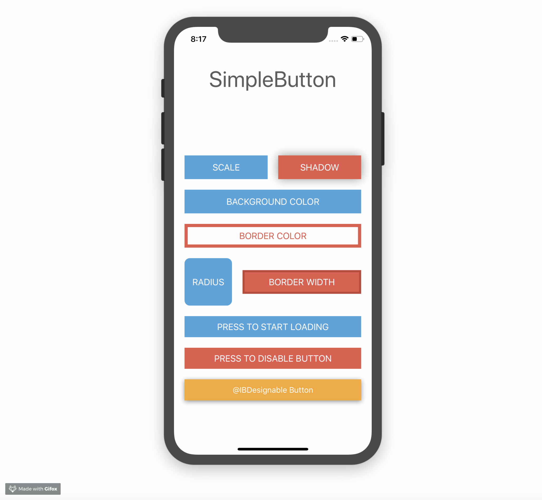
A fully customizable UIButton

Overview

NKButton

Version License Platform Swift

A fully customizable UIButton

Example

To run the example project, clone the repo, and run pod install from the Example directory first.

NKButton

Installation

NKButton is available through Swift Package Manager (Recommended) and CocoaPods:

pod 'NKButton'

Usage

Creation and basic customization:

let button = NKButton()
button.title = "Button"
button.setTitleColor(.black, for: .normal) // set title color for normal state
button.setTitleColor(.white, for: .highlighted) // set title color for highlight state
button.setTitleFont(normalFont, for: .normal)
button.setTitleFont(boldFont, for: .highlight)
button.setBackgroundColor(.blue, for: .normal) // set background color for normal state
button.setBackgroundColor(.green, for: .highlighted) // set background color for highlight state
button.spacing = 10.0 // space between icon and title
button.imageAlignment = .top // icon alignment
button.underlineTitleDisabled = true // no underline text when `Settings > Accessibility > Button Shapes` is ON
button.isRoundedButton = true
button.cornerRadius = 10.0
button.extendSize = CGSize(width: 50, height: 20) // size that will be included in sizeThatFits

Add border:

button.setBorderColor(.black, for: .normal) // set border color for normal state
button.setBorderColor(.white, for: .highlighted) // set border color for highlight state
button.setBorderSize(1.0, for: .normal) // border stroke size
button.setBorderSize(2.0, for: .highlighted)

Add shadow:

button.setShadowColor(.blue, for: .normal) // set shadow color for normal state
button.setShadowColor(.green, for: .highlighted) // set shadow color for highlight state
button.shadowOffset = CGSize(width: 0, height: 5)
button.shadowOpacity = 0.6
button.shadowRadius = 10

Add gradient color:

button.setGradientColor([UIColor(white: 1.0, alpha: 0.5), UIColor(white: 1.0, alpha: 0.0)], for: .normal) // set gradient color for normal state
button.setGradientColor([UIColor(white: 1.0, alpha: 0.0), UIColor(white: 1.0, alpha: 0.5)], for: .highlighted) // set gradient color for highlight state

Set loading state:

button.loadingIndicatorStyle = .ballBeat // loading indicator style
button.loadingIndicatorAlignment = .atImage // loading indicator alignment
button.hideImageWhileLoading = true
button.hideTitleWhileLoading = false

button.isLoading = true // show loading indicator in the button, and button will be disabled automatically until setting isLoading = false

Flashing:

button.startFlashing()
button.startFlashing(flashDuration: 0.25, intensity: 0.9, repeatCount: 10)

Subscript syntax:

button.titleColors[.normal] = .black
button.titleFonts[.normal] = normalFont
button.titleFonts[.highlight] = boldFont
button.backgroundColors[.normal] = .white
button.backgroundColors[.highlight] = .yellow
button.borderColors[.normal] = .gray
button.borderColors[[.highlight, .selected]] = .black
button.shadowColors[.normal] = .black

Dependency

NKButton uses NVActivityIndicatorView for loading indicator, so it currently has 32 animation types.

NKButton uses FrameLayoutKit for content layout so you can customize the layout easily

Author

Nam Kennic, [email protected]

License

NKButton is available under the MIT license. See the LICENSE file for more info.

You might also like...
Full-featured IBDesignable UIButton class

SpicyButton Full-featured IBDesignable UIButton class Installation Add the following to your project's Podfile: pod 'SpicyButton' Usage You can easily

A Custom UIButton with Centralised Styling and common styles available in Interface Builder

DesignableButton DesignableButton is a UIButton subclass that uses a centralised and reusable styling. In InterfaceBuilder, drag and drop a Designable

Simple UIButton subclass with additional state change animations (e.g. backgroundColor) and missing features

SimpleButton UIButton subclass with animated, state-aware attributes. Easy to subclass and configure! Full API docs Usage Just create your own SimpleB

DTPhotoViewerController - A fully customizable photo viewer ViewController to display single photo or collection of photos, inspired by Facebook photo viewer.

DTPhotoViewerController Example Demo video: https://youtu.be/aTLx4M4zsKk DTPhotoViewerController is very simple to use, if you want to display only on

Fully customizable and extensible action sheet controller written in Swift

XLActionController By XMARTLABS. XLActionController is an extensible library to quickly create any custom action sheet controller. Examples The action

Former is a fully customizable Swift library for easy creating UITableView based form.

Former is a fully customizable Swift library for easy creating UITableView based form. Submitting Issues Click HERE to get started with filing a bug r

A fully customizable popup style menu for iOS 😎

Guide Check out the documentation and guides for details on how to use. (Available languages:) English įŽ€äŊ“中文 What's a better way to know what PopMenu o

A fully customizable container view controller to display a set of ViewControllers in a horizontal scroll view. Written in Swift.

DTPagerController This is a control for iOS written in Swift. DTPagerController is simple to use and easy to customize. Screenshots Default segmented

Spreadsheet CollectionViewLayout in Swift. Fully customizable. đŸ”ļ

SwiftSpreadsheet Example To run the example project, clone the repo, and run pod install from the Example directory first. Requirements Swift 5.0 Inst

A fully customizable library to easily display Animated Toast Messages in iOS using Swift!

CustomToastView-swift A fully customizable library to easily display Animated Toast Messages in iOS using Swift! Preview - All the custom toasts you c

A fully customizable iOS Horizontal PickerView library, written in pure swift

ADDatePicker is Horizontal Date Picker Library written in Swift Requirements Communication Installation Usage Demo Customization Credits License Requi

A fully customizable container view controller to display a set of ViewControllers in a horizontal scroll view. Written in Swift.

DTPagerController This is a control for iOS written in Swift. DTPagerController is simple to use and easy to customize. Screenshots Default segmented

Fully customizable pull-to-refresh control inspired by Storehouse iOS app

CBStoreHouseRefreshControl What is it? A fully customizable pull-to-refresh control for iOS inspired by Storehouse iOS app ![screenshot1] (https://s3.

A ready for use and fully customizable location picker for your app

LocationPicker A ready for use and fully customizable location picker for your app. Features Installation Cocoapods Carthage Swift Package Manager Qui

đŸšĻ Validation library depends on SwiftUI & Combine. Reactive and fully customizable.

đŸšĻ Validation library depends on SwiftUI & Combine. Reactive and fully customizable.

SwiftUI library to create fully customizable input stepper.

SwiftUI-InputStepper Swift package for creating numerical input stepper. An example of input stepper created with this library It supports long press

A SwiftUI Partial Sheet fully customizable with dynamic height

A SwiftUI Partial Sheet fully customizable with dynamic height

Fully customizable Facebook reactions like control

Reactions is a fully customizable control to give people more ways to share their reaction in a quick and easy way. Requirements â€ĸ Usage â€ĸ Installatio

A beautiful radar view to show nearby items (users, restaurants, ...) with ripple animation, fully customizable

HGRippleRadarView Example To run the example project, clone the repo, and run pod install from the Example directory first. This project is inspired b

Comments
  • Doesn't work for buttons defined in xib/storyboard

    Doesn't work for buttons defined in xib/storyboard

    It seems to be easy to fix - xib/storyboard calls init(coder aDecoder: NSCoder), not init(). You could fix it by yourself or allow other people to access to init() inner code to call it when it is necessary.

    opened by gerchicov-bp 1
Releases(4.2.0)
Owner
Nam Kennic
Nam Kennic
High performance and lightweight UIView, UIImage, UIImageView, UIlabel, UIButton, Promise and more.

SwiftyUI High performance and lightweight UIView, UIImage, UIImageView, UIlabel, UIButton and more. Features SwiftyView GPU rendering Image and Color

Haoking 336 Nov 26, 2022
Multiple state tap-to-toggle UIButton (like old camera flash button)

Multiple State Toggle UIButton A UIButton subclass that implements tap-to-toggle button text. (Like the camera flash and timer buttons) Usage Just cre

Yonat Sharon 83 Oct 11, 2022
đŸ”Ĩ PMSuperButton is a powerful UIButton coming from the countryside, but with super powers! 😎

PMSuperButton is a powerful UIButton coming from the countryside, but with super powers! ?? An easy way to create custom and complex buttons with cust

Paolo Musolino 720 Nov 17, 2022
UIButton sublass for loading and transition animation.

TransitionButton Concept Source: Dribbble Preview Expand animation: Shake animation: Example To run the example project, clone the repo, then open the

null 1.4k Dec 25, 2022
Highlighter will magically find UI objects such as UILabel, UITextView, UITexTfield, UIButton

Highlighter Updates See CHANGELOG for details Intoduction ?? Highlight whatever you want! Highlighter will magically find UI objects such as UILabel,

Kyle Yi 932 Dec 12, 2022
Light wrapper of UIButton that allows extra customization for tvOS

FocusTvButton Light wrapper of UIButton that allows extra customization for tvOS If you would like to have the same level of customization in tablevie

David Cordero 68 Nov 12, 2022
This library allows you to make any UIView tap-able like a UIButton.

UIView-TapListnerCallback Example To run the example project, clone the repo, and run pod install from the Example directory first. Installation UIVie

wajeehulhassan 8 May 13, 2022
UIButton-based view with fade in/out animation features

JTFadingInfoView Overview JTFadingInfoView is google's material design like notification view with smooth fade in/out animation features, based on UIB

Junichi Tsurukawa 129 Mar 19, 2022
Custom UIButton effect inspired by Google Material Design

ZFRippleButton iOS Custom UIButton effect inspired by Google Material Design written in Swift Usage Set the UIButton class in Nib to ZFRippleButton or

Amornchai Kanokpullwad 1.4k Dec 1, 2022
A small and flexible (well documented) UIButton subclass with animated loading progress, and completion animation.

ButtonProgressBar-iOS Example For LIVE PREVIEW on Appetize in your browser itself, click here. To run the example project, clone the repo, and run pod

Pushkar Sharma 566 Dec 9, 2022