A badge control for iOS and tvOS written in Swift


- The badge is a subclass of UILabel view.
- It can be created and customized from the Storyboard or from the code.
Setup
There are various ways you can add BadgeSwift to your Xcode project.
Add source (iOS 7+)
Simply add BadgeSwift.swift file to your project.
Setup with Carthage (iOS 8+)
Alternatively, add github "evgenyneu/swift-badge" ~> 8.0 to your Cartfile and run carthage update.
Setup with CocoaPods (iOS 8+)
If you are using CocoaPods add this text to your Podfile and run pod install.
use_frameworks!
target 'Your target name'
pod 'BadgeSwift', '~> 8.0'
Setup with Swift Package Manager
- In Xcode 11+ select File > Packages > Add Package Dependency....
- Enter this project's URL: https://github.com/evgenyneu/swift-badge.git
Legacy Swift versions
Setup a previous version of the library if you use an older version of Swift.
Usage
Creating a badge in the Storyboard
- Drag a Label to your view.
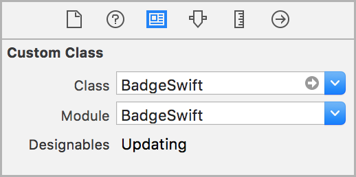
- Set its
classtoBadgeSwiftin identity inspector. - Set the
moduleproperty toBadgeSwift(unless you used the file setup method).
- Customize the badge properties in the attributes inspector (text, color and other).
- If storyboard does not show the badge correctly click Refresh All Views from the Editor menu.
Note: Carthage setup method does not allow to customize Cosmos view from the storyboard, please do it from code instead.
Creating a badge from the code
Add import BadgeSwift to your source code unless you used the file setup method.
let badge = BadgeSwift()
view.addSubview(badge)
// Position the badge ...
See example of how to create and position the badge from code in the demo app.
Customization
// Text
badge.text = "2"

// Insets
badge.insets = CGSize(width: 12, height: 12)

// Font
badge.font = UIFont.preferredFont(forTextStyle: UIFontTextStyle.body)

// Text color
badge.textColor = UIColor.yellow

// Badge color
badge.badgeColor = UIColor.black

// Shadow
badge.shadowOpacityBadge = 0.5
badge.shadowOffsetBadge = CGSize(width: 0, height: 0)
badge.shadowRadiusBadge = 1.0
badge.shadowColorBadge = UIColor.black

// No shadow
badge.shadowOpacityBadge = 0

// Border width and color
badge.borderWidth = 5.0
badge.borderColor = UIColor.magenta

// Customize the badge corner radius.
// -1 if unspecified. When unspecified, the corner is fully rounded. Default: -1.
badge.cornerRadius = 10
Demo app
This project includes a demo app.
Alternative solutions
Here are some alternative badges for iOS.
- ckteebe/CustomBadge
- JaviSoto/JSBadgeView
- mikeMTOL/UIBarButtonItem-Badge
- mustafaibrahim989/MIBadgeButton-Swift
- soffes/SAMBadgeView
- tmdvs/TDBadgedCell
- EddyBorja/MLPAccessoryBadge
Thanks to
👍
- amg1976 for adding a border and redesigning the drawing.
- gperdomor for adding ability to customize corner radius.
- acecilia for removing a warning when the badge is used in an extension.
License
BadgeSwift is released under the MIT License.
Feedback is welcome
If you found a bug or want to improve the badge feel free to create an issue.


 So instead of setting the background color on the layer to the desired color, the layer is now always clearColor and a UIBezierPath is used instead, with fill color based on the UILabel background color. This way, if the value of borderWidth is set to a value bigger than 0, it will set the stroke color and line width of the UIBezierPath.


 344 Dec 28, 2022
 11 Jan 6, 2022
 215 Dec 11, 2022
 772 Dec 28, 2022
 330 Sep 9, 2022
 124 Nov 24, 2022
 1.6k Dec 31, 2022
 608 Sep 15, 2022
 90 Sep 1, 2022
 542 Sep 24, 2022
 4 Oct 5, 2022
 367 Dec 17, 2022
 1 Oct 18, 2021