Dynamic Type • Event Kit • Quick Look • App Ideas • Keyboard Preview • Modern Collection Views
Modern Collection Views
My playground for trying stuff with compositional collection view layout and diffable data source.
The goal is to showcase different compositional layouts and how to achieve them. Feel free to use any code you can find and if you have interesting layout idea - open PR!
Please don't take these examples as the only correct way how to work with these APIs. I am still figuring them out and experimenting.
Check out my blog for posts about Compositional Layout and Diffable Data Sources or any other iOS development topics :-)
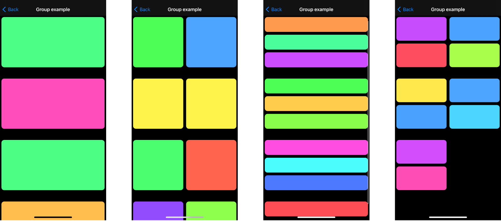
For more about NSCollectionLayoutGroup which lets you create layouts as shown below, check out this post.
Included examples
The project currently offers these example screens.
Layout examples
- List layout - list created with Compositional Layout (CL) for iOS 13+
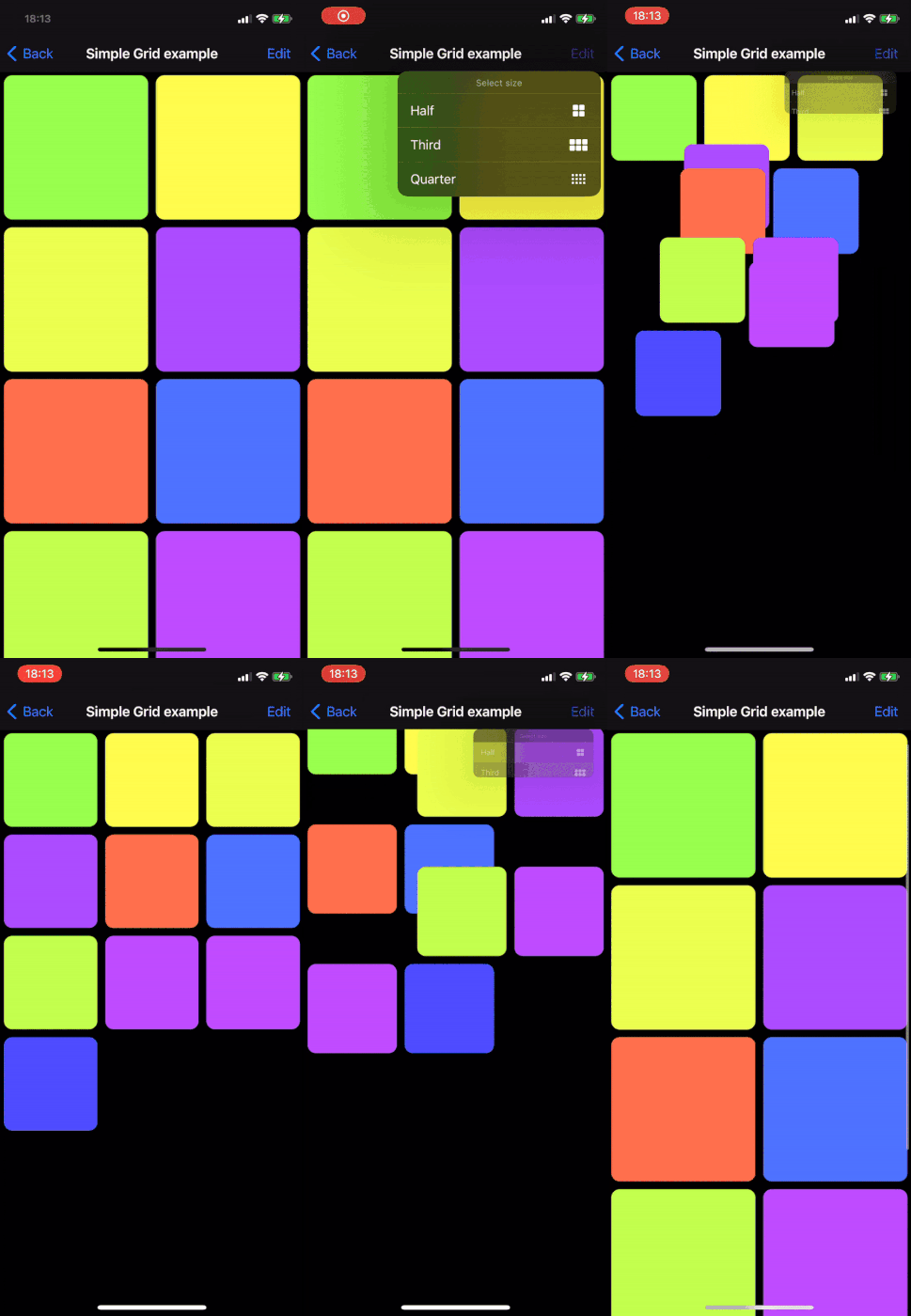
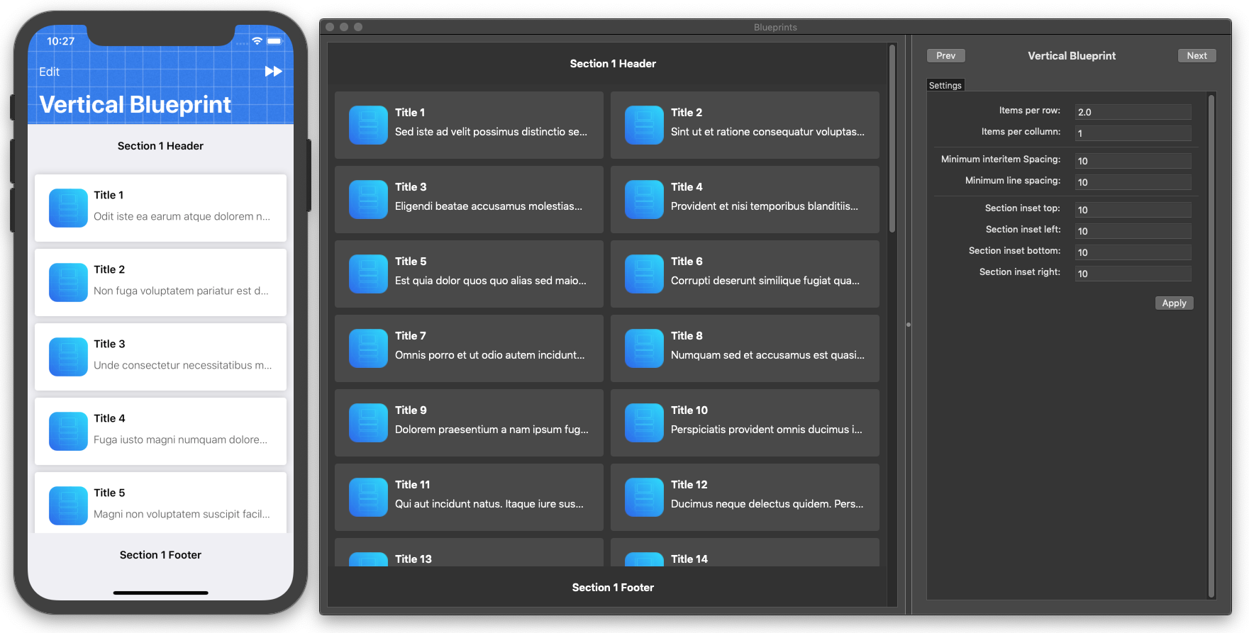
- Simple grid - grid layout with option to change sizing and see it animate the change (see GIF below)
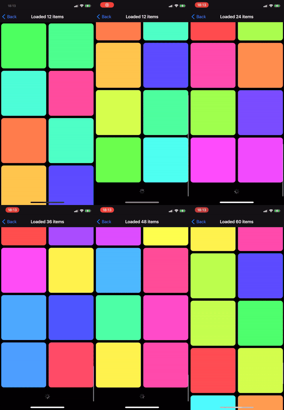
- Lazy grid example - this grid starts with 12 items and when you scroll at the end it "loads" more (see GIF below)
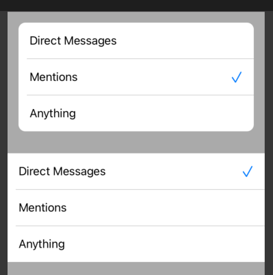
- Background decoration - this shows how to add background views to section in CL layout. For example you can use this to create layout similar to inset & grouped TableView [article]
- System list - quick example of creating list layout with the API available from iOS 14
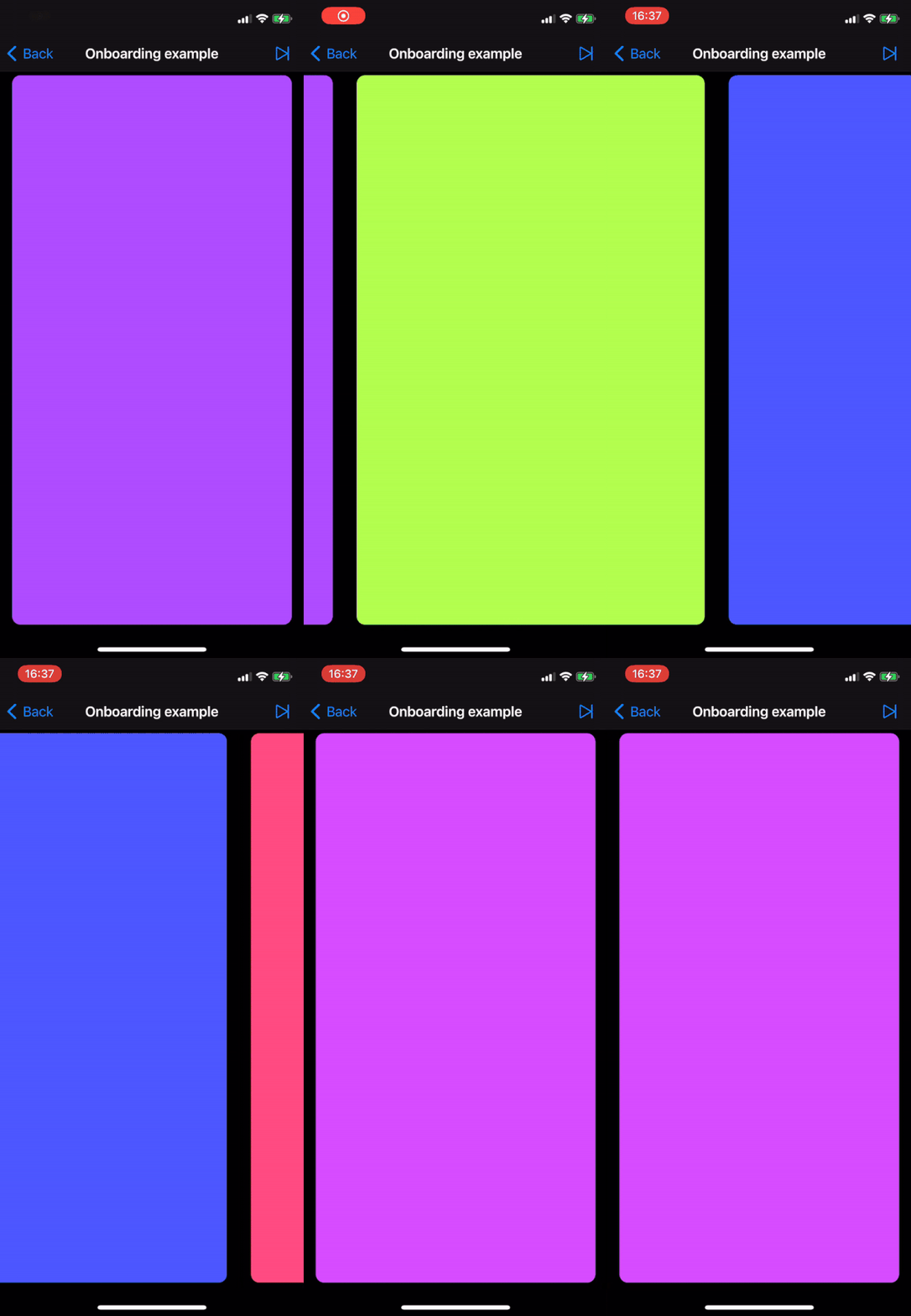
- Onboarding flow - simple example showcasing creating onboarding with Compositional Layout [article]
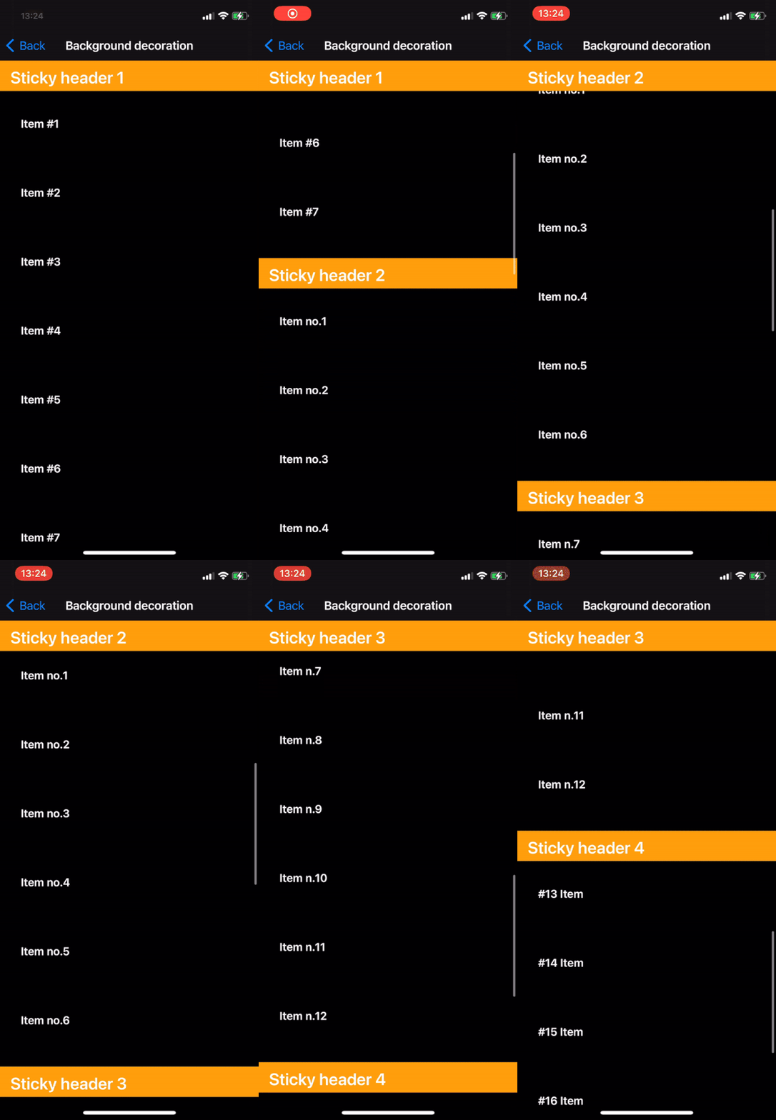
- Sticky headers - example showing how to configure headers to be pinned or sticky. Similarly what UITableView offers [article]
- Responsive layout - example how to create responsive layout such that the items will retain approximately the same size across various devices [article]
More complete examples
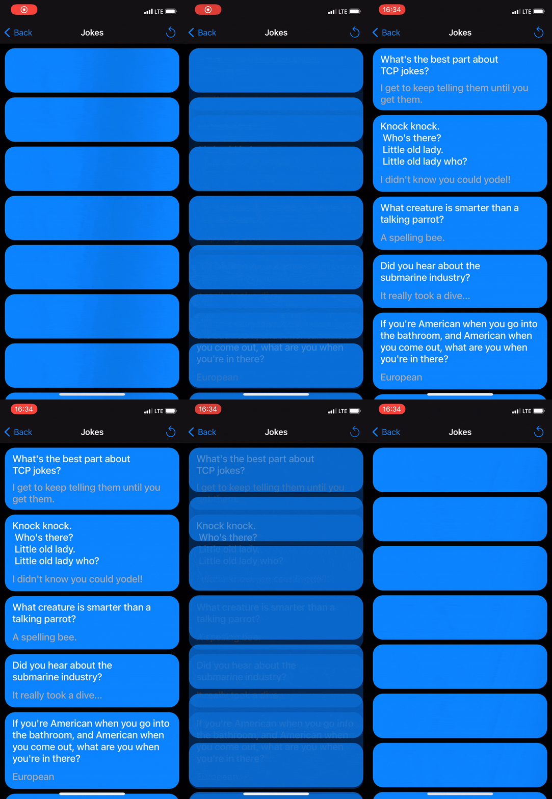
- Jokes list - this is more an example of Diffable Data Source that is used to display random jokes from an API and also favorited ones that are stored using Core Data. This also shows how to add headers to CL and loading effect. There is also context menu on the items and text-to-speech (because why not?)
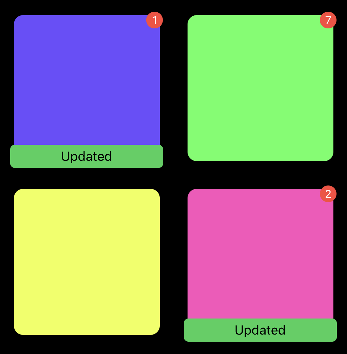
- Badges example - example showcasing adding badges to collection view cells and their positioning [article]
- Instagram profile screen - this practical example shows how to build screen similar to Instagram profile with Compositional Layout and Diffable. You can read more on my blog
Free free to reach out over at @nemecek_f with issues, questions or anything else.


