Fully customisable tooltip view in Swift for iOS.

Overview

EasyTipView: fully customisable tooltip view written in Swift

Swift3 Platform Build Status Version Carthage Compatible License

Description

EasyTipView is a fully customizable tooltip view written in Swift that can be used as a call to action or informative tip.

Contents

  1. Features
  2. Installation
  3. Supported OS & SDK versions
  4. Usage
  5. Customizing the appearance
  6. Customising the presentation and dismissal animations
  7. License
  8. Contact

Features

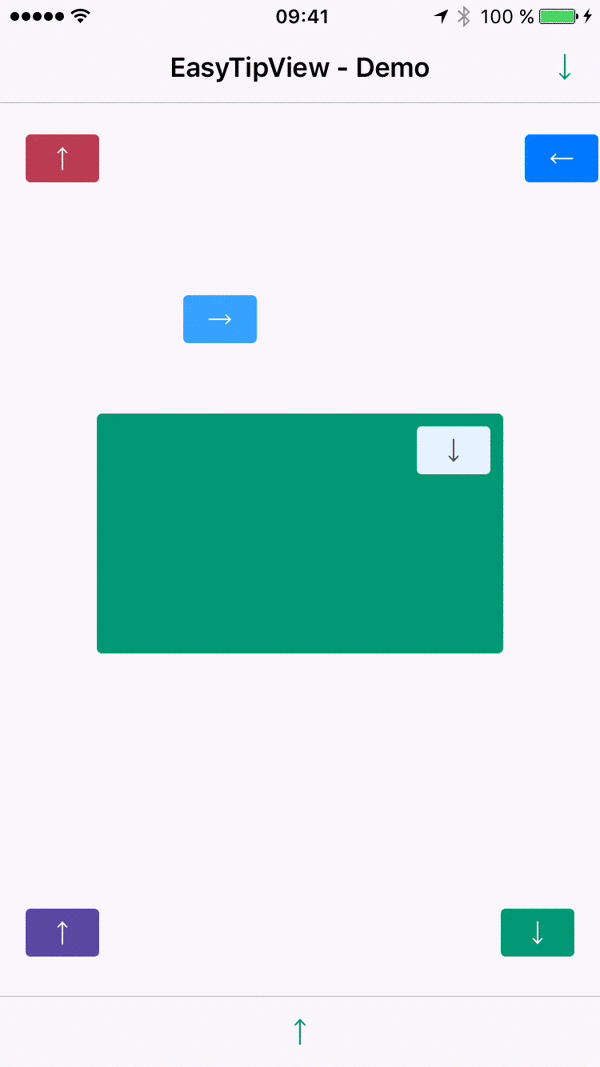
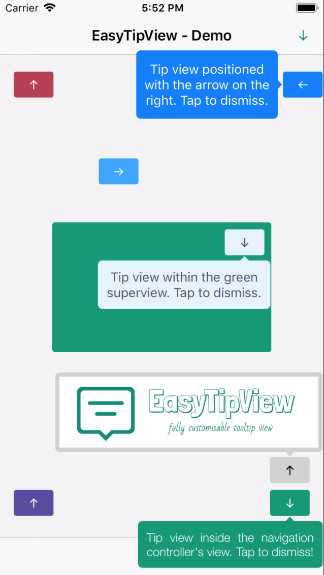
  • Can be shown pointing to any UIBarItem or UIView subclass.
  • Support for any arrow direction ←, →, ↑, ↓
  • Automatic orientation change adjustments.
  • Fully customizable appearance (custom content view or simply just text - including NSAttributedString - see the Example app).
  • Fully customizable presentation and dismissal animations.

Installation

CocoaPods

CocoaPods is a dependency manager for Cocoa projects.

CocoaPods 0.36 adds supports for Swift and embedded frameworks. You can install it with the following command:

$ gem install cocoapods

To integrate EasyTipView into your Xcode project using CocoaPods, specify it in your Podfile:

pod 'EasyTipView', '~> 2.1'

Then, run the following command:

$ pod install

In case Xcode complains ("Cannot load underlying module for EasyTipView") go to Product and choose Clean (or simply press K).

Carthage

Carthage is a decentralized dependency manager that builds your dependencies and provides you with binary frameworks.

You can install Carthage with Homebrew using the following command:

$ brew update
$ brew install carthage

To integrate EasyTipView into your Xcode project using Carthage, specify it in your Cartfile:

github "teodorpatras/EasyTipView"

Run carthage update to build the framework and drag the built EasyTipView.framework into your Xcode project.

Manually

If you prefer not to use either of the aforementioned dependency managers, you can integrate EasyTipView into your project manually.

Supported OS & SDK Versions

  • Supported build target - iOS 8+ (Xcode 8)

Usage

  1. First you should customize the preferences:
var preferences = EasyTipView.Preferences()
preferences.drawing.font = UIFont(name: "Futura-Medium", size: 13)!
preferences.drawing.foregroundColor = UIColor.whiteColor()
preferences.drawing.backgroundColor = UIColor(hue:0.46, saturation:0.99, brightness:0.6, alpha:1)
preferences.drawing.arrowPosition = EasyTipView.ArrowPosition.top

/*
 * Optionally you can make these preferences global for all future EasyTipViews
 */
EasyTipView.globalPreferences = preferences
  1. Secondly call the show(animated: forView: withinSuperview: text: preferences: delegate:) method:
EasyTipView.show(forView: self.buttonB,
withinSuperview: self.navigationController?.view,
text: "Tip view inside the navigation controller's view. Tap to dismiss!",
preferences: preferences,
delegate: self)

Note that if you set the EasyTipView.globalPreferences, you can ommit the preferences parameter in all calls. Additionally, you can also ommit the withinSuperview parameter and the EasyTipView will be shown within the main application window.

Alternatively, if you want to dismiss the EasyTipView programmatically later on, you can use one of the instance methods:

let tipView = EasyTipView(text: "Some text", preferences: preferences)
tipView.show(forView: someView, withinSuperview: someSuperview)

// later on you can dismiss it
tipView.dismiss()

Customizing the appearance

In order to customize the EasyTipView appearance and behavior, you can play with the Preferences structure which encapsulates all the customizable properties of the EasyTipView. These preferences have been split into three structures:

  • Drawing - encapsulates customizable properties specifying how EastTipView will be drawn on screen.
  • Positioning - encapsulates customizable properties specifying where EasyTipView will be drawn within its own bounds.
  • Animating - encapsulates customizable properties specifying how EasyTipView will animate on and off screen.
Drawing attribute Description
cornerRadius The corner radius of the tip view bubble.
arrowHeight The height of the arrow positioned at the top or bottom of the bubble.
arrowWidth The width of the above mentioned arrow.
foregroundColor The text color.
backgroundColor The background color of the bubble.
arrowPosition The position of the arrow. This can be:
+ .top: on top of the bubble
+ .bottom: at the bottom of the bubble.
+ .left: on the left of the bubble
+ .right: on the right of the bubble
+ .any: use this option to let the EasyTipView automatically find the best arrow position.
If the passed in arrow cannot be applied due to layout restrictions, a different arrow position will be automatically assigned.
textAlignment The alignment of the text.
borderWidth Width of the optional border to be applied on the bubble.
borderColor Color of the optional border to be applied on the bubble. In order for the border to be applied, borderColor needs to be different that UIColor.clear and borderWidth > 0
font Font to be applied on the text.
shadowColor The color of the shadow (default UIColor.clearcolor).
shadowOpacity The opacity of the shadow (default 0). For the shadow to be drawn, both shadowColor and shadowOpacity must be set to a valid value.
shadowRadius The radius of the shadow (default 0).
shadowOffset The offset of the shadow.
Positioning attribute Description
bubbleHInset Horizontal bubble inset within its container.
bubbleVInset Vertical bubble inset within its container.
contentHInset Content horizontal inset within the bubble.
contentVInset Content vertical inset within the bubble.
maxWidth Max bubble width.
Animating attribute Description
dismissTransform CGAffineTransform specifying how the bubble will be dismissed.
showInitialTransform CGAffineTransform specifying the initial transform to be applied on the bubble before it is animated on screen.
showFinalTransform CGAffineTransform specifying how the bubble will be animated on screen.
springDamping Spring animation damping.
springVelocity Spring animation velocity.
showInitialAlpha Initial alpha to be applied on the tip view before it is animated on screen.
dismissFinalAlpha The alpha to be applied on the tip view when it is animating off screen.
showDuration Show animation duration.
dismissDuration Dismiss animation duration.
dismissOnTap Prevents view from dismissing on tap if it is set to false. (Default value is true.)

Customising the presentation or dismissal animations

The default animations for showing or dismissing are scale up and down. If you want to change the default behavior, you need to change the attributes of the animating property within the preferences. An example could be:

preferences.animating.dismissTransform = CGAffineTransform(translationX: 0, y: -15)
preferences.animating.showInitialTransform = CGAffineTransform(translationX: 0, y: -15)
preferences.animating.showInitialAlpha = 0
preferences.animating.showDuration = 1.5
preferences.animating.dismissDuration = 1.5

This produces the following animations:

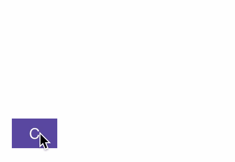
For more animations, checkout the example project. Once you configured the animations, a good idea would be to make these preferences global, for all future instances of EasyTipView by assigning it to EasyTipView.globalPreferences.

License

EasyTipView is developed by Teodor Patraş and is released under the MIT license. See the LICENSE file for details.

Logo was created using Bud Icons Launch graphic by Budi Tanrim from FlatIcon which is licensed under Creative Commons BY 3.0. Made with Logo Maker.

Contact

You can follow or drop me a line on my Twitter account. If you find any issues on the project, you can open a ticket. Pull requests are also welcome.

Comments
  • Swift 3 errors

    Swift 3 errors

    I have Xcode 8 and trying to convert my project to Swift 3.

    In my Podfile: pod 'EasyTipView', '~> 1.0.2'

    When I build the project, I get:

    “Use Legacy Swift Language Version” (SWIFT_VERSION) is required to be configured correctly for targets which use Swift. Use the [Edit > Convert > To Current Swift Syntax…] menu to choose a Swift version or use the Build Settings editor to configure the build setting directly.

    What am I doing wrong?

    opened by theolof 11
  • easyTipViewDidDismiss not called when calling dismiss()

    easyTipViewDidDismiss not called when calling dismiss()

    I expected easyTipViewDidDismiss to be called when doing self.tipView.dismiss() but it isn't.

    I do that when the user taps an overlay. easyTipViewDidDismiss is called when the user taps the tipView (so the delegate should be correct).

    Is it an issue or am I holding it wrong?

    opened by theolof 8
  • XCode 10.2 / Swift 5, Added AppStore desired 1024x1024 AppIcon

    XCode 10.2 / Swift 5, Added AppStore desired 1024x1024 AppIcon

    Updated for Xcode 10.2, Swift 5

    Added 1024x1024 Sample App AppStore AppIcon (quiets compiler warning)

    NOTE: This will fail CI, unless/until you set up your CI to use XCode 10.2

    opened by John-Wolfe-Bose 7
  • Dismiss EasyTipView when click outside

    Dismiss EasyTipView when click outside

    I have an app with navigationBar and tabBar. What I want is to dismiss EasyTipView when user clicks anywhere outside of the tip. How can it be implemented?

    opened by andrey-lisovskiy 7
  • Support for Swift Package Manager?

    Support for Swift Package Manager?

    Hi. With the recent addition of Swift Package Manager to Xcode, I was wondering if there is any chance that support for it is added to this awesome library.

    opened by boborbt 5
  • Custom contentView is always laid out with its frame origin at (0, 0)

    Custom contentView is always laid out with its frame origin at (0, 0)

    Code to reproduce this issue:

    var tipPreferences = EasyTipView.globalPreferences
    tipPreferences.drawing.arrowPosition = .bottom
    tipPreferences.positioning.bubbleVInset = 14
    let contentView = MyCustomTipContent()
    EasyTipView.show(animated: true, forView: tipViewSource, withinSuperview: view, contentView: contentView, preferences: tipPreferences)
    

    After the tip is presented, I would expect contentView.frame.origin.y to be 14 so that it's fully within the drawn bubble, but instead the y origin is 0 and the content is drawn partially outside (specifically above) the bubble.

    It appears that this is an issue of the order in which EasyTipView sets the frame of the content view and when it adds the content view as a subview. The frame is set in arrange(withinSuperview:) and then it's added as a subview in draw(_:). For some reason the addSubview(_:) call causes the frame origin to reset to (0, 0) next time the view is laid out.

    I've addressed this somewhat crudely in my own fork of this library: in draw(_:), directly after addSubview(_:) I call layoutIfNeeded to immediately force the frame origin reset. Then I manually set the frame. https://github.com/jaltreuter/EasyTipView/commit/ec165127080a39bcb770165658376bd838fb4a8f

    If my commit seems clean enough I can submit it as a pull request, but feel free to do your own investigation as it's possible there's a better solution.

    opened by jaltreuter 5
  • error: Cannot extract bundle from...

    error: Cannot extract bundle from...

    I'm having an issue where I can integrate and link EasyTipView via Carthage with no problem, but when I go to produce an ipa for enterprise deployment with bitcode enabled, I'm receiving this error message from the archive exporter:

    Failed to verify bitcode in EasyTipView.framework/EasyTipView: error: Cannot extract bundle from /var/folders/p8/hn20mcb936qgc931vmx35tj00000gn/T/XcodeDistPipeline.dHP/Root/Payload/Spoke.app/Framework…

    screen shot 2017-03-08 at 3 31 25 pm

    Does anyone have any suggestions for making the ipa tool play nice with EasyTipView and bitcode in this context?

    opened by asowers1 5
  • How to work with tableView cell

    How to work with tableView cell

    I tried to create tooltip inside tableview cell component, but... the position mess up after tableView is scrolled or reloaded..

    is there any solution for this ?

    Thank you in advance Nice Library

    opened by black-lotus 5
  • Support for Objective-C?

    Support for Objective-C?

    The EasyTipView/EasyTipView-Swift.h that is being compiled only supports:

    @property (nonatomic, strong) UIColor * _Nullable backgroundColor;

    - (void)showWithAnimated:(BOOL)animated forItem:(UIBarItem * _Nonnull)item withinSuperView:(UIView * _Nullable)superview;

    - (void)showWithAnimated:(BOOL)animated forView:(UIView * _Nonnull)view withinSuperview:(UIView * _Nullable)superview;

    - (void)dismissWithCompletion:(void (^ _Nullable)(void))completion;

    It's impossible to even set the text or description of the tooltip..

    opened by danpe 5
  • add possibility to arrange (reposition) the tooltip view after adding it

    add possibility to arrange (reposition) the tooltip view after adding it

    If you are using tooltips on cells in a table view and you add a header dynamically the tooltip will be miss placed. This PR just opens access to the arrange function so that is possible to manually rearrange the tooltip after it was created.

    opened by potmo 5
  • - add preference setting: dismissWhenTouchingOutside

    - add preference setting: dismissWhenTouchingOutside

    • if dismissWhenTouchingOutside==true display put an invisible overlay on the window that would make the tooltip dismiss touching anywhere in the screen
    opened by risalba 5
  • Doesn't work with inception table/collection/views

    Doesn't work with inception table/collection/views

    The tooltip with multiple parent lists doesn't work because the superview always need to be the global screen view. Out hierachy its

    Table [
       ACell [
          Collection [
             BCell << Element to set tip view
          ]
       ]
     ]
    

    if we add the tooltip to BCell with the global superview the library don't understand the 'Y' position because the 'Y' position of the view its 0 (The cell its positionate on the 0 'Y' axis). the solution of this its remove the precondition to set the actual ACell as a superview and this cell has the correct 'Y' position. If i remove the precondition "works" because the library takes the vertical axis with his superview but with the horizontal axis to the view.

    This library do not support multiple views inception.

    I also try::

    tooltip?.show(animated: true, forView: BCell, withinSuperview: collection)
    tooltip?.show(animated: true, forView: BCell, withinSuperview: ACell) << This works but without the precondition
    tooltip?.show(animated: true, forView: BCell, withinSuperview: Table)
    tooltip?.show(animated: true, forView: BCell)
    
    opened by EdwinAlvrdo 0
  • Arrow height is included in tooltip height when arrow is not positioned at top or bottom

    Arrow height is included in tooltip height when arrow is not positioned at top or bottom

    The tooltip is designed to include the arrow within its bounds, and the height of the arrow is included in that calculation

    The quick fix is to use the configured arrowPosition to determine which dimension should be included, but arrowPosition is optional (.any is a valid option), and the configured arrow position is not always used.

    There's no quick fix, but a workaround hack is to add content padding when using the tooltip:

    // Compensate for a bug in EasyTipView which adds the height of the "arrow" to the height of the content bubble, which adds padding below the content
    // In addition, and related to this, the arrow is included in the overall size of the tooltip, but not added to the overall size of the tooltip (unless it happens to be at the top or bottom, in which case the hard-coded addition of its height works in our favor).
    // This is still tricky because when laying out inside of a specific superview, the arrow direction can be changed when the tooltip doesn't fit. Which means our padding hacking here will result in even worse layout problems.
    let defaultPadding: CGFloat = 12
    switch position {
    case .left:
        tipPreferences.positioning.contentInsets = UIEdgeInsets(top: defaultPadding, left: defaultPadding + 4, bottom: defaultPadding - 4, right: defaultPadding)
    case .right:
        tipPreferences.positioning.contentInsets = UIEdgeInsets(top: defaultPadding, left: defaultPadding, bottom: defaultPadding - 4, right: defaultPadding + 4)
    case .top:
        tipPreferences.positioning.contentInsets = UIEdgeInsets(top: defaultPadding + 4, left: defaultPadding, bottom: defaultPadding - 4, right: defaultPadding)
    case .bottom:
        tipPreferences.positioning.contentInsets = UIEdgeInsets(top: defaultPadding, left: defaultPadding, bottom: defaultPadding - 4, right: defaultPadding + 4)
    default:
        fatalError("We can't support 'any' position until that bug is fixed")
    }
    

    This workaround is incompatible with .any position and will result in broken layout when the arrow position is changed because it doesn't fit (which seems to only be possible when a superview is specified).

    The long-term fix could be:

    • Move the layout logic such as in arrange(withinSuperview:) out to the other places that need to be aware of the actual arrow position
    • Remove the arrow dimension from the tooltip dimensions, so the size of the bubble is the same regardless of the arrow, and then place the arrow outside of those dimensions. That would also allow a tooltip to be displayed without an arrow, which seems like a useful feature.
    opened by RobinDaugherty 1
  • Tip not dismissed automatically inside prototype table view cell

    Tip not dismissed automatically inside prototype table view cell

    I have the situation that an textfield is presented via dynamic prototype cell of an table view. In this case calling the EasyTipView.dismiss() function does nothing. I have to tap the tip explicitely to dismiss it.

    In opposite, any textfields inside statical table view cells can be dismissed via dismiss() without a problem.

    opened by frameworker2019 0
  • Remove unnecessary excludes.

    Remove unnecessary excludes.

    • This PR closes #218 by removing unnecessary excludes, since the base path is already Sources, so none of those paths are being included in the first place.
    opened by hsousa 1
Owner
Teo
✈️ 🌏
Teo
iOS library Paper Onboarding is a material design UI slider written on Swift.

iOS library Paper Onboarding is a material design UI slider written on Swift. We specialize in the designing and coding of custom UI

Ramotion 3.2k Jan 5, 2023
A simple keyframe-based animation framework for iOS, written in Swift. Perfect for scrolling app intros.

RazzleDazzle is a simple AutoLayout-friendly keyframe animation framework for iOS, written in Swift. Perfect for scrolling app intros. RazzleDazzle gr

IFTTT 3.4k Jan 1, 2023
An iOS framework to easily create simple animated walkthrough, written in Swift.

Intro Overview An iOS framework to easily create simple animated walkthrough, written in Swift. Requirements iOS8 Installation with CocoaPods Intro is

Nurdaulet Bolatov 33 Oct 1, 2021
BWWalkthrough is a simple library that helps you build custom walkthroughs for your iOS App

What is BWWalkthrough? BWWalkthrough (BWWT) is a class that helps you create Walkthroughs for your iOS Apps. It differs from other similar classes in

Yari @bitwaker 2.8k Jan 4, 2023
SuggestionsKit is a framework for iOS that was created in order to provide developers with the opportunity to educate users on various features of applications.

SuggestionsKit is a framework for iOS that was created in order to provide developers with the opportunity to educate users

Ilya 63 Nov 30, 2022
A swifty iOS framework that allows developers to create beautiful onboarding experiences.

SwiftyOnboard is being sponsored by the following tool; please help to support us by taking a look and signing up to a free trial SwiftyOnboard A simp

Juan Pablo Fernandez 1.2k Jan 2, 2023
An iOS framework to easily create a beautiful and engaging onboarding experience with only a few lines of code.

Onboard Click Here For More Examples Important Onboard is no longer under active development, and as such if you create any issues or submit pull requ

Mike 6.5k Dec 17, 2022
WVWalkthroughView is an objective C based utility to highlight certain parts for iOS apps.

WVWalkthroughView A simple utility written in Objective C to help developers walk a user through their app. It allows a message to be displayed, a par

Praagya Joshi 29 Mar 25, 2021
✨ An elegant way to guide your beloved users in iOS apps - Material Showcase.

Material Showcase for iOS An elegant and beautiful tap showcase view for iOS apps based on Material Design Guidelines. Requirement iOS 10.0+ Swift 4.2

Aromajoin 349 Dec 5, 2022
Create walkthroughs and guided tours (coach marks) in a simple way, with Swift.

Add customizable coach marks into your iOS project. Available for both iPhone and iPad. ⚠️ Instructions 2.0.1 brings a couple of breaking changes, ple

Frédéric Maquin 4.9k Jan 3, 2023
OnboardKit - Customizable user onboarding for your UIKit app in Swift

OnboardKit Customizable user onboarding for your UIKit app in Swift Requirements Swift 5.0 Xcode 10 iOS 11.0+ Installation Carthage github "NikolaKire

Nikola Kirev 470 Dec 23, 2022
SwiftyWalkthrough is a library for creating great walkthrough experiences in your apps, written in Swift.

SwiftyWalkthrough is a library for creating great walkthrough experiences in your apps, written in Swift. You can use the library to allow users to navigate and explore your app, step by step, in a predefined way controlled by you.

Rui Costa 370 Nov 24, 2022
A Swift Recreation of Attach-Detach, with some configurable options

Attach-Detach-Sw A Swift Recreation of Attach-Detach, with some configurable options Usage To use, you'll need to specify if you are attaching or deta

Serena 1 Dec 24, 2021
Simple coach mark library written in Swift

Minamo Simple coach mark library written in Swift Usage Initialize let rippeleView = RippleView() rippeleView.tintColor = UIColor(red: 0.3, green: 0.7

yukiasai 248 Nov 24, 2022
Swift Actors Introduction

Swift-Actors-Introduction Swift 5.5~ 並行処理におけるデータ整合やその他の不具合を防ぐための仕組み。 https://doc

Sho Emoto 0 Jan 3, 2022
ColorMix-by-IUKit - colorMix app by Intro to app development in Swift

colorMix-by-IUKit colorMix app by "Intro to app development in Swift" In this ap

null 0 Feb 11, 2022
Configurable animated onboarding screen written programmatically in Swift for UIKit

Configurable animated onboarding screen written programmatically in Swift for UIKit – inspired by many Apple-designed user interfaces in iOS – with Insignia as an example.

Lukman “Luke” Aščić 370 Dec 27, 2022
slider view for choosing categories. add any UIView type as category item view. Fully customisable

CategorySliderView Horizontal or vertical slider view for choosing categories. Add any UIView type as category item view. Fully customisable Demo Inst

Cem Olcay 353 Nov 6, 2022
Easy Tooltip for your SwiftUI Project

SwiftUI Tooltip This package provides you with an easy way to show tooltips over any SwiftUI view, since Apple does not provide one. Getting started Y

Quassum Manus 187 Jan 1, 2023
A fully customisable and modern camera implementation for iOS made with AVFoundation.

Features Extremely simple and easy to use Controls autofocus & exposure Customizable interface Code-made UI assets that do not lose resolution quality

Gabriel Alvarado 1.3k Nov 30, 2022