BottomSheet Component 🧪🧪🧪

Overview

BCSComponent

This Source code provide a bottom sheet which allow you custom own cell,you able to show it on the bottom sheet

Get started

First thing first you have to implement frame work look like this into your project

import BottomSheetComponent

Inherit from protocol look like this

import Foundation
import BottomSheetComponent
class UserModel:PopupSectionModel {
    var isSelected: Bool = false
    var accountName:String?
    var typeAccount:String?
    static func == (lhs: UserModel, rhs: UserModel) -> Bool {
        return lhs.accountName == rhs.accountName
    }
    
    func search(with text: String) -> Bool { // in order to use search func 
        return self.accountName == text
    }
    
    init(isSelected:Bool,
         accountName:String,
         typeAccount:String?
    ) {
        
        self.isSelected = isSelected
        self.accountName = accountName 
        self.typeAccount = typeAccount
    }
    
}

Next Step you declare array with object with UserModel is delared above

        let dataSource = [UserModel.init(isSelected: false, accountName: "1010102002", typeAccount: "test"),
                            UserModel.init(isSelected: false, accountName: "1010102002", typeAccount: "test"),
                            UserModel.init(isSelected: false, accountName: "1010102002", typeAccount: "test"),
                            UserModel.init(isSelected: false, accountName: "1010102002", typeAccount: "test")]

In viewController you want to use you can call func to show BCSComponent look like this

     
        let vc = SheetViewController()
        vc.configurePopUp(title: "Account", canSearch: false, cellClass:BillSimpleCell.self , dataSource: dataSource) { [weak self] cell, model, index in
            cell.label.text = model.accountName // show items on cell 
        } onSelectItem: { model, index in
            print("test selected \(model.accountName)") // handler when you select item on the list 
        }
        
        self.present(vc, animated: true)

Checklist 🎯

  • Show cell custom
  • [] Panel to drag smoothly
  • [] Search on a list
  • [] Show recently used emoji section on top
  • [] Dark mode
  • [] Clean code
You might also like...
UI Component. This is a copy swipe-panel from app: Apple Maps, Stocks. Swift version

ContainerController UI Component. This is a copy swipe-panel from app: https://www.apple.com/ios/maps/ Preview Requirements Installation CocoaPods Swi

An easy to use UI component to help display a signal bar with an added customizable fill animation

TZSignalStrengthView for iOS Introduction TZSignalStrengthView is an easy to use UI component to help display a signal bar with an added customizable

UIPheonix is a super easy, flexible, dynamic and highly scalable UI framework + concept for building reusable component/control-driven apps for macOS, iOS and tvOS

UIPheonix is a super easy, flexible, dynamic and highly scalable UI framework + concept for building reusable component/control-driven apps for macOS, iOS and tvOS

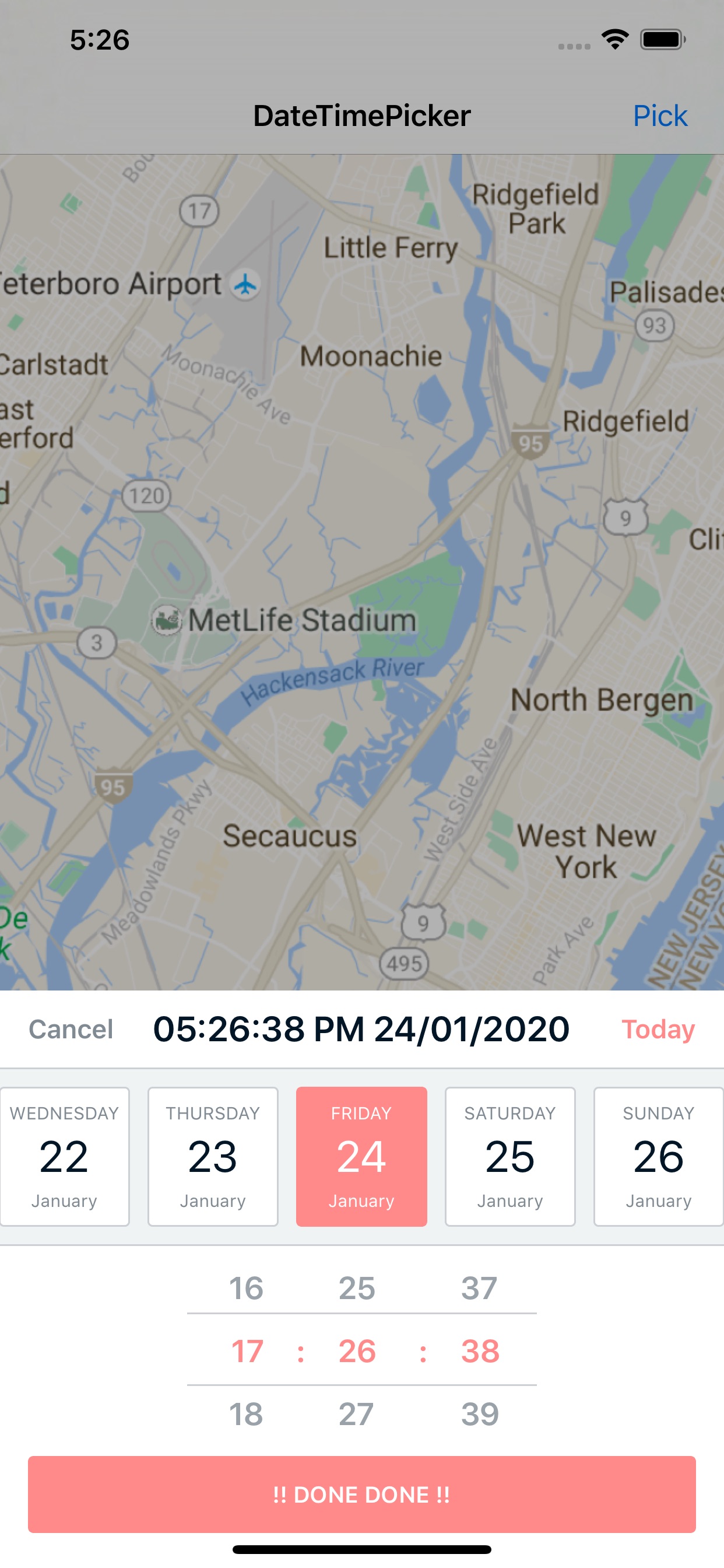
A nicer iOS UI component for picking date and time

DateTimePicker A nicer iOS UI component for picking date and time. Features Date and Time Picker / Date Picker only / Time Picker only - your choice!

A declarative, performant, iOS calendar UI component that supports use cases ranging from simple date pickers all the way up to fully-featured calendar apps.

HorizonCalendar A declarative, performant, calendar UI component that supports use cases ranging from simple date pickers all the way up to fully-feat

Carbon🚴 A declarative library for building component-based user interfaces in UITableView and UICollectionView.

A declarative library for building component-based user interfaces in UITableView and UICollectionView. Declarative Component-Based Non-Destructive Pr

:octocat: AdaptiveController is a 'Progressive Reduction' Swift UI module for adding custom states to Native or Custom iOS UI elements. Swift UI component by @Ramotion

ADAPTIVE TAB BAR 'Progressive Reduction' module for adding custom states to Native or Custom UI elements. We specialize in the designing and coding of

ESTabBarController is a highly customizable TabBarController component, which is inherited from UITabBarController.

ESTabBarController is a highly customizable TabBarController component, which is inherited from UITabBarController. Why? In real-world developmen

VKPinCodeView is simple and elegant UI component for input PIN. You can easily customise appearance and get auto fill (OTP) iOS 12 feature right from the box.

Features Variable PIN length Underline, border and custom styles The error status with / without shake animation Resetting the error status manually,

This component implements transition animation to crumble view-controller into tiny pieces.

StarWars Animation This component implements transition animation to crumble view-controller into tiny pieces. Check this project on dribbble. Also, r

This component allows for the transfer of data items between collection views through drag and drop

Drag and Drop Collection Views Written for Swift 4.0, it is an implementation of Dragging and Dropping data across multiple UICollectionViews. Try it

A Figma component preview for your SwiftUI views

FigmaPreviewSwiftUI A Figma component preview for your SwiftUI views. You can use Figma components instead of real views within your app until you imp

A Swift playground that comes pre-loaded with Plot, that can be used to explore the new component API.

PlotPlayground A Swift playground that comes pre-loaded with Plot, so that you can quickly try out the library and its new, SwiftUI-like API for build

Component containing supplementary content that are anchored to the bottom of the screen.

BottomSheetController UIKit component containing supplementary content that are anchored to the bottom of the screen. Requirements Installation Swift

SwiftUI TextEdit View - A proof-of-concept text edit component in SwiftUI & CoreText.

A proof-of-concept text edit component in SwiftUI & CoreText. No UIKit, No AppKit, no UITextView/NSTextView/UITextField involved.

Zeplin component preview for your SwiftUI views

A Zeplin component preview for your SwiftUI views. You can use Zeplin components instead of real views within your app until you implement them.

An example project of using the new Character Controller component in RealityKit 2.0

CharacterController in RealityKit 2.0 An example project of using the new Character Controller component in RealityKit 2.0. Demo Tweet Usage Install a

Example of how to embed a Lit web component into native platforms.

Lit Native Reuse lit web components on native platforms. Online Demo Supported Platforms iOS MacOS Android Web Getting Started npm run install npm run

GIFImage component for your SwiftUI app!

SwiftUI GIF Lightweight SwiftUI component for rendering GIFs from data or assets, with no external dependencies. As a bonus, there's an extension that

Releases(releasedev1.0)
Owner
Kien Pham
Project Manager email:[email protected] blogger:codedeman
Kien Pham
BottomSheet makes it easy to add custom bottom sheets to your SwiftUI apps.

BottomSheet About BottomSheet BottomSheet makes it easy to add custom bottom sheets to your SwiftUI apps. The result can look like this...or completel

Daniel Saidi 174 Jan 2, 2023
Multiplatform (iOS, macOS) SwiftUI bottom sheet drawer. Expandable bottomsheet. Slide out bottom menu

Multiplatform (iOS, macOS) SwiftUI bottom sheet drawer Features It does not re-render the background content while manipulating with the sheet iOS and

Igor 8 Nov 18, 2022
Whisper is a component that will make the task of display messages and in-app notifications simple. It has three different views inside

Description ?? Break the silence of your UI, whispering, shouting or whistling at it. Whisper is a component that will make the task of displaying mes

HyperRedink 3.7k Dec 25, 2022
Bottom Sheet component is widely used in Joom application

Bottom Sheet Bottom Sheet component is widely used in Joom application Installation Swift Package Manager Swift Package Manager is a tool for managing

Joom 101 Dec 29, 2022
BottomSheet Component 🧪🧪🧪

BCSComponent This Source code provide a bottom sheet which allow you custom own cell,you able to show it on the bottom sheet Get started First thing f

Kien Pham 3 Dec 1, 2022
BottomSheet makes it easy to add custom bottom sheets to your SwiftUI apps.

BottomSheet About BottomSheet BottomSheet makes it easy to add custom bottom sheets to your SwiftUI apps. The result can look like this...or completel

Daniel Saidi 174 Jan 2, 2023
BottomSheet lets you add custom bottom sheets to your SwiftUI apps.

BottomSheet lets you add custom bottom sheets to your SwiftUI apps.

Daniel Saidi 174 Jan 2, 2023
Multiplatform (iOS, macOS) SwiftUI bottom sheet drawer. Expandable bottomsheet. Slide out bottom menu

Multiplatform (iOS, macOS) SwiftUI bottom sheet drawer Features It does not re-render the background content while manipulating with the sheet iOS and

Igor 8 Nov 18, 2022
AlamofireImage is an image component library for Alamofire

AlamofireImage AlamofireImage is an image component library for Alamofire. Features Image Response Serializers UIImage Extensions for Inflation / Scal

Alamofire 3.9k Dec 29, 2022
AGCircularPicker is helpful component for creating a controller aimed to manage any calculated parameter

We are pleased to offer you our new free lightweight plugin named AGCircularPicker. AGCircularPicker is helpful for creating a controller aimed to man

Agilie Team 617 Dec 19, 2022